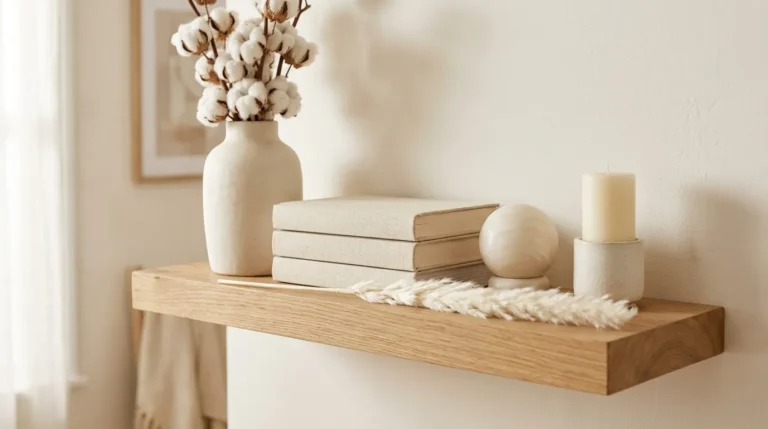
15 Cozy Shelf Styling Ideas for Your Living Room
Cozy shelf styling ideas for the living room are design-led approaches to arranging objects, books, plants, textiles, and lighting on shelving units to create displays that feel personally expressive, visually warm, and genuinely layered — transforming functional storage into the living room’s most characterful and most rewarding decorative feature. This article gives you exactly 15 cozy shelf styling ideas for your living room, spanning every shelf type from floating wall shelves to built-in alcove units to freestanding bookcases, every aesthetic from Japandi minimalism to maximalist eclecticism, and every budget from a free rearrangement of existing objects to a considered investment in new shelf accessories, with specific guidance and curated product tables for every idea.
There is a particular quality that separates a shelf that has been styled from one that has merely been filled — a quality of considered visual rhythm, of objects chosen and arranged in deliberate relationship to each other rather than accumulated by necessity, of the shelf reading as a composed vignette that rewards looking rather than simply providing storage. The living room shelf is one of the most personally revealing surfaces in any home — what a household chooses to display, how it chooses to arrange those objects, and how much care it invests in their presentation communicates something specific and true about the people who live there. Here are 15 ideas worth arranging — and saving.
Why Cozy Shelf Styling Ideas Work So Well
The shelf as a display surface has been a primary vehicle for personal expression in domestic interiors since the Renaissance, when the cabinet of curiosities — a collection of natural specimens, artistic objects, and scientific instruments arranged on shelves or within a purpose-built cabinet — became the defining domestic display tradition of the European educated classes. The contemporary living room shelf inherits this tradition: the objects we choose to display, the books we allow to be seen, the plants we tend, and the art we prop are all communications about our values, interests, and aesthetic sensibilities in the same way that a 17th-century gentleman’s cabinet of curiosities communicated his intellectual interests and cultural positioning. The cozy shelf styling movement specifically adds warmth to this display tradition — where the cabinet of curiosities prioritized rarity and intellectual prestige, the contemporary cozy shelf prioritizes warmth, livability, and the specific atmospheric quality that makes a living room feel genuinely inhabited rather than professionally staged.
The materials and objects that produce the most successful cozy shelf styling results are specifically characterized by their warmth, their natural material quality, and their varied textural and formal range: natural wood objects (turned bowls, driftwood pieces, carved figures, wooden candlesticks) provide the warm tonal grounding that unifies diverse collections; ceramic objects in warm whites, sage greens, terracottas, and warm greys provide tactile visual interest through varied surface quality (matte, slightly rough, hand-thrown); dried and living botanical elements (pampas grass, eucalyptus, trailing pothos, small succulents) provide organic form and seasonal variation; books with warm or neutral spines (or spine-faced inward for a cleaner aesthetic) provide the visual mass and vertical variety that shelves need; candles and small lighting elements (battery fairy lights, small LED book lights) provide warm light at shelf level that transforms the display in evening conditions; and personal objects (framed photographs, inherited pieces, travel souvenirs) provide the irreplaceable quality of genuine personal meaning.
Cozy shelf styling has become one of the most engaged categories in living room decorating content across Pinterest, Instagram, and home design publications — driven by the growing recognition that shelf styling is one of the highest-return decorating activities available, creating significant visual improvement in the living room at minimal cost by rearranging and recontextualizing objects already owned. The most consistently saved shelf styling content shows arrangements that combine clear visual structure (height variation, odd-number groupings, considered negative space) with warm material richness (natural wood, ceramic, botanical elements) and genuine personal character (books, photographs, inherited pieces alongside purchased accessories).
Small living rooms and apartments gain the most from cozy shelf styling because a beautifully styled shelf creates the sense of a curated, personally expressive interior without requiring floor area — the shelf surface is the one decorating canvas where every square centimeter is potentially visible and where design investment is concentrated rather than dispersed across a large floor-level area.
Style at a Glance
| Element | Trait 1 | Trait 2 |
|---|---|---|
| Philosophy | Composed vignette over casual accumulation | Personal warmth over showroom perfection |
| Materials | Natural wood, ceramic, dried botanical, linen | Brass, rattan, living plant, candle |
| Color Palette | Warm ivory, natural greige, dusty sage | Terracotta, antique brass, warm charcoal |
15 Cozy Shelf Styling Ideas for Your Living Room
1. The Three-Height Rule Vignette
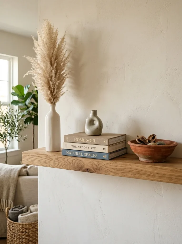
Vibe: The three-height vignette feels compositionally resolved — the arrangement that demonstrates the single most important principle in shelf styling through three objects and their deliberate relationship to each other.
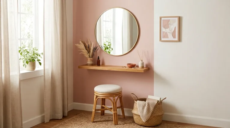
Why it works: The three-height rule is the foundational principle of shelf styling because it applies the same compositional logic used in fine art, garden design, and interior design to the specific constraints of a shelf surface — the eye is naturally drawn to arrangements that create a triangular profile (tall-medium-low) because the dynamic asymmetry of three heights is more visually engaging than the static uniformity of objects at equal heights. The design principle is triangular composition: any three objects placed at dramatically different heights automatically create the triangular silhouette that reads as “arranged” rather than “placed,” transforming a random collection of objects into a composed display. The negative space between the three elements is as important as the objects themselves — the empty shelf surface between them gives the eye room to move and the objects room to breathe.
How to get it: Choose three objects with dramatically different heights — minimum 15cm difference between each level. The tallest element should be approximately 5–6 times the height of the lowest. Position the tallest element off-center (left or right rather than central) for the most dynamic composition. Place the medium element near the center of the shelf, the low element at the opposite end from the tall element. Leave visible shelf surface between and around all three objects — a common mistake is adding additional objects to “fill the gaps,” which destroys the negative space that makes the three-height composition work.
Quick Win: Any three existing objects in a living room — a tall vase, a medium candlestick, and a low bowl — arranged at three different heights on an existing shelf immediately create the three-height composition for zero additional cost. The objects don’t need to be new or expensive; the arrangement quality is the design investment.
Shop The Look
| Product |
|---|
| Dried pampas stem large natural tall vase |
| Narrow ceramic vase tall white matte |
| Hardcover book set neutral spine display |
| Terracotta bowl wide low natural warm |
| Natural wood floating shelf 60cm oak |
Also view: 17 Chic IKEA KALLAX Bedroom Ideas for Storage
2. Book Colour-Block Shelf Styling (COLOR)

Vibe: The colour-block bookcase feels richly considered — the transformation of a functional storage unit into a wall-scale colour composition that makes the entire living room feel more designed.
Why it works: Colour-blocking books — grouping them by spine colour into distinct sections that flow across the bookcase in a considered palette sequence — is the shelf styling technique that creates the highest visual impact from existing objects because it transforms the bookcase from a repository of individual book spines competing for attention into a unified colour composition where the books’ visual contribution is colour and mass rather than individual title identity. The design principle is collective colour contribution: individual book spines are often visually noisy when mixed randomly; grouped by colour, the same books become large-scale colour fields that work as a designed palette. The ceramic accent objects at colour transition points serve as visual punctuation that breaks the colour sections and creates the rhythm that makes a long bookcase interesting across its full width.
How to get it: Remove all books and sort into colour families on the floor — warm neutrals (ivory, cream, white), mid tones (sage, olive, grey), and deeper tones (forest green, navy, deep burgundy). Decide the colour sequence across the bookcase before replacing — a gradient from light to dark reading left to right is the most visually natural sequence. Leave 20–30% of each shelf’s depth available for objects placed in front of the books — this foreground layer creates the depth that prevents the bookcase from reading as simply a coloured wall. Replace books with spines facing outward except for one or two clusters of spine-inward placement for textural variety.
Shop The Look
| Product |
|---|
| Small ceramic object set white matte |
| Trailing pothos plant top shelf display |
| Brass bookend set decorative minimal |
| Framed art print lean shelf natural |
| Dried botanical stem bookcase accent |
3. Japandi Minimal Shelf with Negative Space (COLOR / MATERIAL)
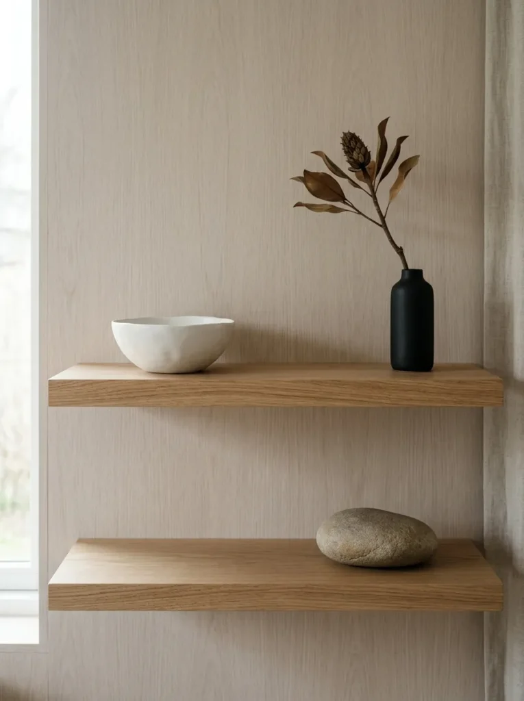
Vibe: The Japandi minimal shelf feels meditative and complete — two shelves so carefully edited that adding a single additional object would immediately diminish all three existing ones.
Why it works: The Japandi minimal shelf applies the wabi-sabi principle of finding beauty in simplicity, imperfection, and negative space to the living room shelf — treating the empty shelf surface as the composition’s primary element and the few chosen objects as accents within that space rather than the primary content. The design principle is edited authority: in Japandi shelf styling, fewer objects of genuine quality command more visual attention and communicate more design confidence than many objects competing for the same shelf space. A single river stone on a shelf communicates more design intent than a shelf crowded with 15 objects, because the act of choosing one thing and displaying it alone is itself a significant design statement.
How to get it: Clear the shelf completely before beginning — the Japandi approach cannot be achieved by editing an existing display, only by starting from emptiness and building up with maximum restraint. Choose a maximum of three objects across two shelves, applying three selection criteria: natural origin or handmade quality, visible material character (imperfection, texture, organic form), and material variety (each object from a different material family). Position each object with significant empty space around it — the space between objects should be at least twice the width of the objects themselves. Resist the urge to add more.
Shop The Look
| Product |
|---|
| Matte white ceramic bowl minimal Japandi |
| Black narrow ceramic vase tall minimal |
| Dried magnolia branch single stem natural |
| Smooth river stone large decorative |
| Hard wax oil floating shelf natural ash |
4. Layered Books and Objects Styling (LAYOUT)
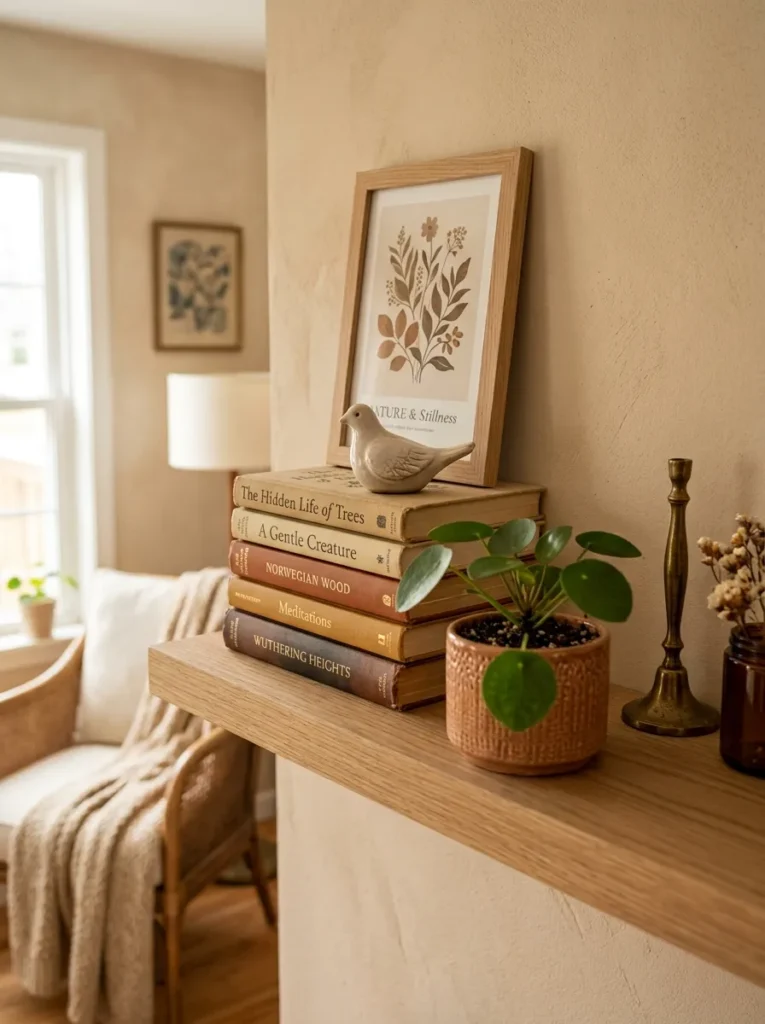
Vibe: The layered depth shelf feels warmly three-dimensional — the arrangement that creates the sense of a shelf with genuine physical depth rather than a flat line of objects.
Why it works: Layering objects at multiple depth positions — from the back of the shelf against the wall to the very front edge — creates a three-dimensional quality that single-plane arrangements cannot achieve. The design principle is depth plane differentiation: most unsuccessful shelf arrangements position all objects at the same depth (typically centered on the shelf from front to back), producing a flat, single-plane display; layering objects at wall-plane (leaning art), mid-shelf (horizontal book stacks, ceramic objects), and front-edge (plants, low objects) creates the visual depth of a three-dimensional composition. Horizontal book stacks are the most versatile layering tool — they serve simultaneously as objects with visual interest (spine colors, varying heights) and as plinths that elevate smaller objects to different heights.
How to get it: Begin with the back plane: lean a small framed print or postcard against the wall behind where other objects will sit — this establishes the background reference plane. In the mid-shelf zone, stack 3–4 books horizontally as a plinth and place a small ceramic object on top. At the shelf’s front edge, place a small trailing or low plant that spills slightly forward over the edge, breaking the shelf’s hard front line. Vary the position of each depth layer so that no single element is directly in front of another — slight lateral offsetting between layers maintains visibility of all depth planes from the primary viewing position.
Shop The Look
| Product |
|---|
| Small framed print 4×6 inch natural frame |
| Small ceramic figure object display |
| Trailing plant small pot shelf front |
| Horizontal book stack display natural |
| Brass small object decorative accent |
5. Seasonal Botanical Shelf Refresh (ACCESSORIES)
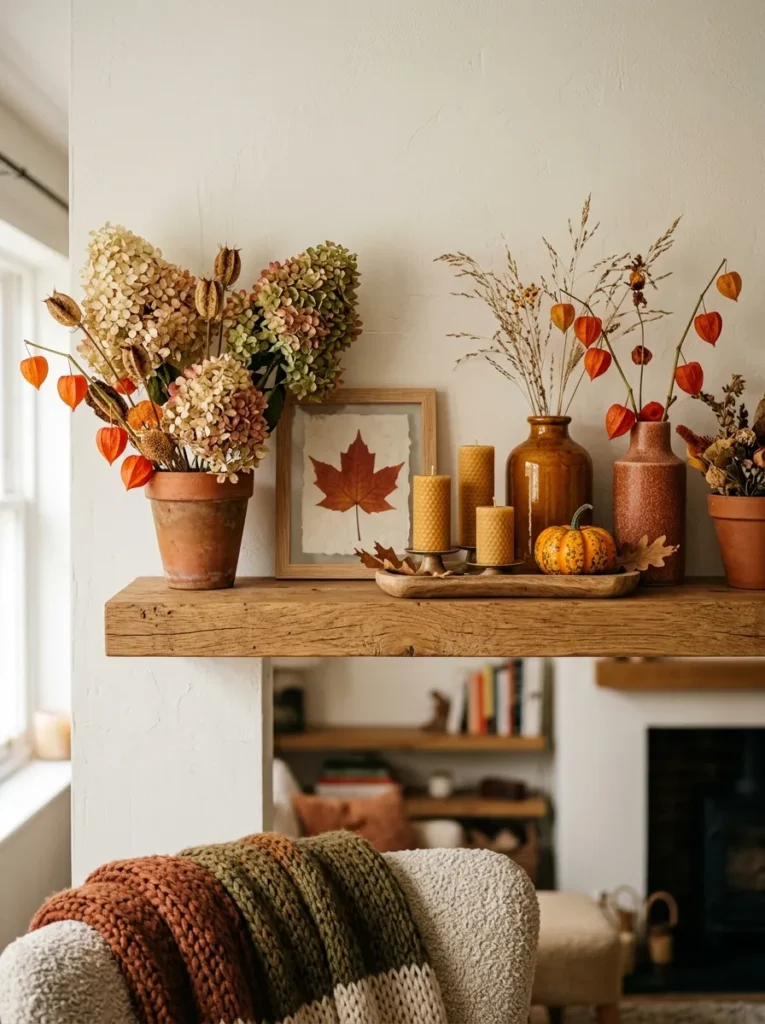
Vibe: The seasonal botanical shelf feels warmly autumnal — the shelf that changes with the natural world and makes every season feel specifically celebrated rather than generically decorated.
Why it works: A seasonally refreshed shelf creates the most ongoing visual interest and the most emotionally resonant home environment because it connects the interior space to the external natural world’s seasonal rhythm — making the home feel responsive and alive rather than static. The design principle is seasonal material specificity: using botanicals, colors, and objects that are genuinely characteristic of a specific season (dried physalis and miniature pumpkins in autumn, forced bulbs in spring, dried lavender in summer, bare branches in winter) creates an authenticity and specificity that generic “natural” decorating elements cannot achieve. The tray grouping for the candles is the organizational detail that prevents the seasonal arrangement from reading as a scatter of objects — the tray creates a defined zone within the shelf composition.
How to get it: Designate one shelf or one section of a larger shelf as the seasonal display zone — this allows the seasonal arrangement to be completely changed four times a year without disrupting the rest of the shelf styling. For autumn: gather dried hydrangea heads (cut and hung upside down in late summer before petals drop), dried physalis (dried naturally once the papery calyx turns amber), and a cluster of beeswax candles in honey amber and rust tones. Group the seasonal elements on a small wooden tray for a contained composition. Change completely at each season’s transition — the discipline of complete seasonal changes rather than partial updates maintains the arrangement’s specific seasonal character.
Shop The Look
| Product |
|---|
| Dried hydrangea head set natural cream |
| Physalis dried orange seasonal autumn |
| Beeswax pillar candle set honey amber |
| Small wooden tray shelf candle group |
| Small terracotta pot set seasonal display |
6. Gallery Shelf with Leaning Art (LAYOUT / ACCESSORIES)
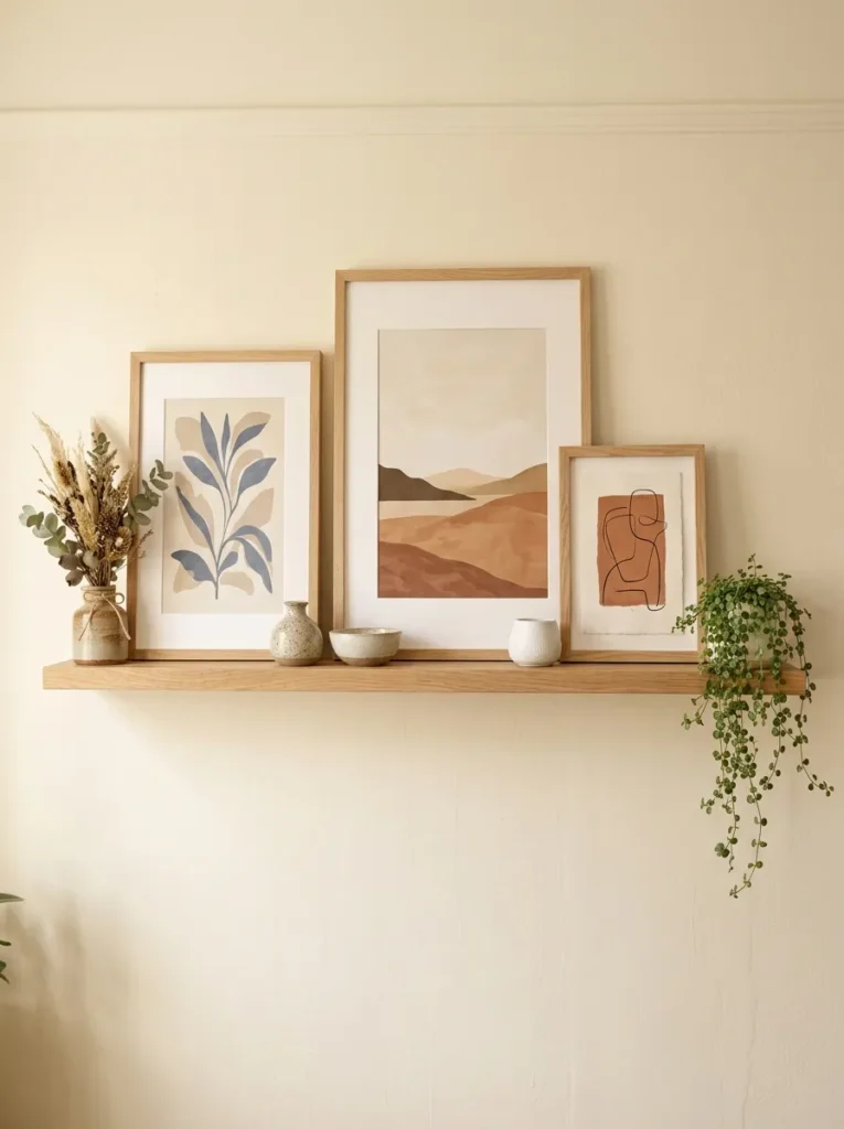
Vibe: The gallery shelf feels warmly editorial — the art display format that signals active curation rather than permanent installation, suggesting a home that is always being thoughtfully tended.
Why it works: A gallery shelf with leaning art creates a fundamentally different display dynamic from a hung gallery wall — the leaning format signals impermanence and editability, suggesting that the art is actively chosen and positioned rather than permanently fixed, which reads as design confidence rather than design casualness. The design principle is editorial flexibility: leaning art on a shelf can be changed, moved, swapped, and supplemented without tools, nail holes, or significant effort, making the gallery shelf the most actively maintained and most personally responsive form of art display. The ceramic objects positioned in front of the leaning frames create the foreground layer that prevents the display from reading as simply pictures propped against a wall and transforms it into a layered composition with genuine depth.
How to get it: Install the shelf at 160–175cm from the floor — the position that makes the art center approximately at eye level from a standing position, which is the optimal height for comfortable art viewing. Use picture ledge shelves (which have a small raised front lip to prevent frames from sliding forward) rather than flat shelves for safety. Start with the largest frame as the anchor, leaning it slightly off-center. Place smaller frames at graduated positions, overlapping slightly for a casual gallery quality. Place ceramic objects in front of frames rather than beside them — the object in front of the frame creates depth between the art and the viewer.
Shop The Look
| Product |
|---|
| Picture ledge shelf natural oak 90cm |
| Art print set botanical A4 A5 natural frame |
| Small ceramic vessel foreground object |
| Dried botanical small arrangement end |
| Small trailing plant pot gallery shelf |
7. Candle and Warm Light Shelf Styling (LIGHTING)
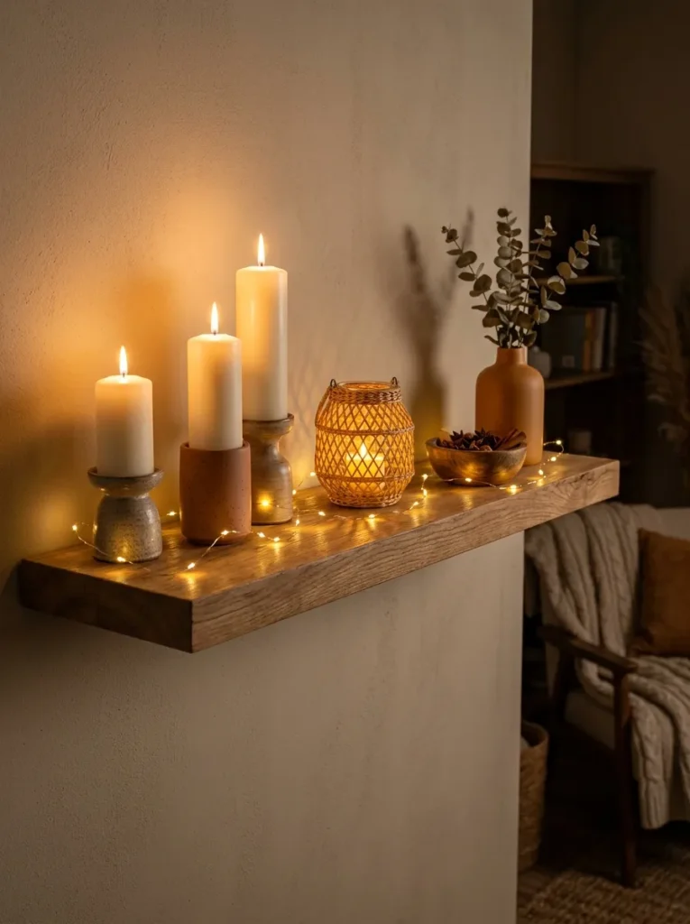
Vibe: The warm light shelf feels intimately atmospheric at evening — the shelf that doesn’t just look good but actively improves the quality of the entire room’s evening atmosphere.
Why it works: A shelf styled primarily as a warm light installation is the shelf approach that creates the most dramatic evening transformation in living room atmosphere because it positions warm light sources at eye level — the height where their atmospheric effect is strongest — rather than relying entirely on ceiling-level overhead lighting that produces flat, undifferentiated illumination. The design principle is eye-level warmth: candlelight and warm LED sources placed at shelf height (typically 120–160cm from the floor) create the intimate, layered lighting quality that most dramatically improves a living room’s evening atmosphere, because the warm light at standing-and-seated eye level creates the sense of being within the light rather than merely being illuminated from above.
How to get it: Combine three light source types for the richest atmospheric layering: pillar candles in ceramic holders for genuine flame flicker (most atmospheric but requiring presence when lit), battery-powered LED fairy lights looped along the shelf length for always-on ambient shelf glow, and an LED tea light in a woven rattan lantern for enclosed, focused warm light. Use only 2700K warm white LED sources — cooler white temperatures undermine the warm atmospheric quality. Arrange the light sources at varied heights using ceramic candle holders of different heights and ensure the fairy lights are looped (not laid flat) to create dimensional rather than flat light.
Shop The Look
| Product |
|---|
| Ivory pillar candle set 3 heights ceramic |
| Battery LED fairy light warm white 2m |
| Rattan lantern LED tea light holder |
| Ceramic pillar candle holder set 3 |
| Warm amber ceramic vase light shelf |
8. Trailing Plant and Botanical Abundance (ACCESSORIES / MATERIAL)
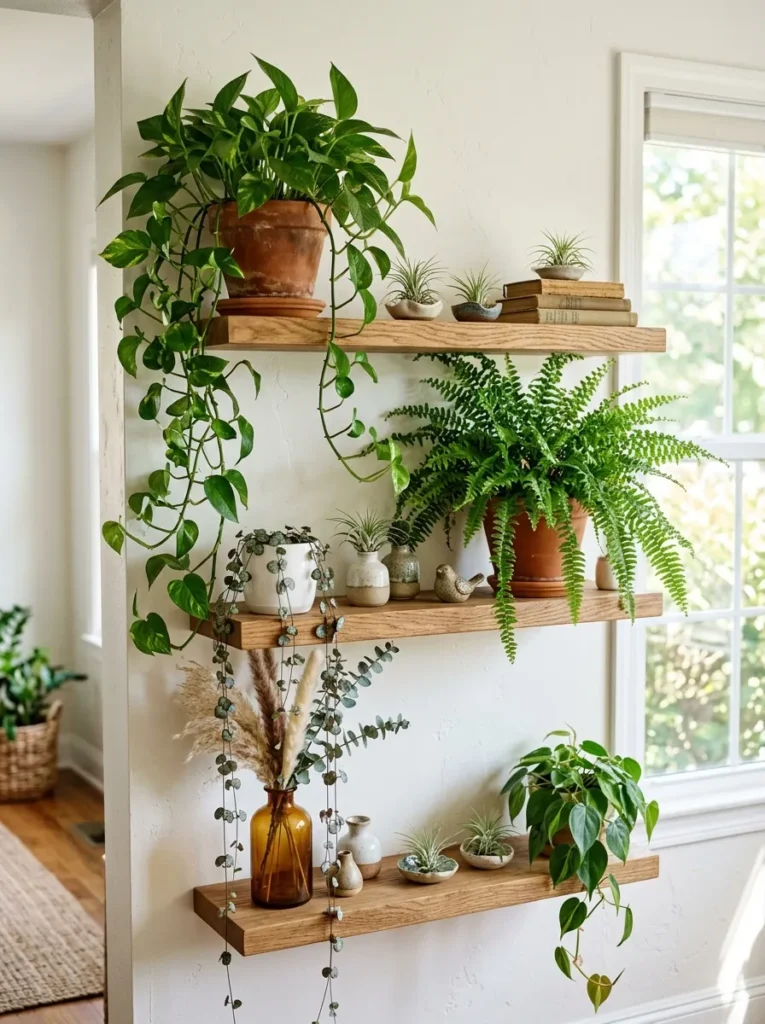
Vibe: The botanical abundance shelf feels lushly alive — the vertical plant display that transforms a set of plain shelves into the living room’s most biophilically rewarding feature.
Why it works: A multi-shelf botanical arrangement with deliberately chosen trailing plants creates the most dramatically living shelf display available because the cascading growth of trailing plants between shelf levels links the shelves into a single continuous vertical composition rather than three independent display levels. The design principle is vertical botanical continuity: when a trailing pothos on the top shelf sends growth downward to reach the middle shelf, and a trailing string of hearts from the middle shelf reaches toward the lower shelf, the three shelves read as a single living botanical column rather than three separate arrangements. This continuity is the quality that most distinguishes a genuinely botanical shelf from a shelf with a few plant pots placed on it.
How to get it: Choose plants specifically for their trailing quality rather than their upright form — golden pothos, string of hearts, string of pearls, trailing ivy, and burro’s tail all produce the cascading growth that links shelf levels. Position the most vigorous trailer (pothos) on the top shelf and allow it to grow naturally downward — do not cut back growth that hangs toward the lower shelf. Water trailing plants by removing from shelf over a sink and replacing after draining completely — this prevents water marking the shelves below. Supplement living plants with dried botanicals on the lowest shelf to provide botanical interest at the level where living plants are hardest to maintain.
Shop The Look
| Product |
|---|
| Golden pothos trailing plant top shelf |
| String of hearts trailing plant ceramic |
| Small fern plant terracotta pot shelf |
| Air plant tillandsia set ceramic dish |
| Tall ceramic vase dried pampas stem |
9. Wabi-Sabi Natural Object Collection (MATERIAL)
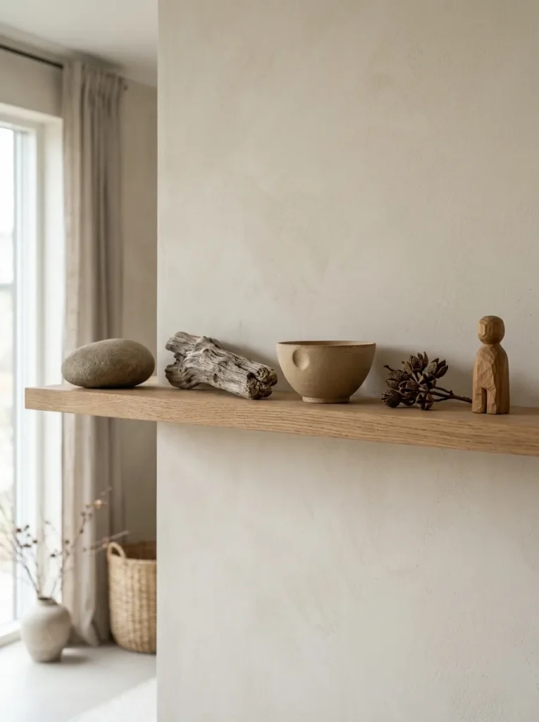
Vibe: The wabi-sabi collection feels naturally meditative — five objects so specifically chosen for their material character that each one rewards individual close attention.
Why it works: A wabi-sabi shelf collection applies the Japanese aesthetic philosophy of finding beauty in natural imperfection, impermanence, and the evidence of process to the living room shelf — treating each object as a specimen of natural or handmade material quality worthy of contemplative display. The design principle is material narrative: every object in a wabi-sabi collection should carry visible evidence of its origin or making — the river stone’s water-smoothing, the driftwood’s weathering, the ceramic’s throwing and the thumb-press of the maker, the seed pod’s botanical purpose. These material narratives make the shelf collection genuinely interesting to look at over time in a way that objects without visible material history cannot sustain.
How to get it: Source objects from natural settings (river stones, driftwood, interesting seed pods), artisan makers (hand-thrown ceramics from local potters or Etsy makers), and natural material carvers (small carved wooden objects in raw or simply finished wood). Apply five-object maximum — any more and the meditative quality of individual attention becomes impossible. Space objects so that the gap between each is at least twice the width of the narrowest object. Choose a shelf of natural wood with a hard-wax oil rather than varnish finish — the penetrating oil finish suits the wabi-sabi aesthetic better than the reflective surface of varnish.
Shop The Look
| Product |
|---|
| Smooth river stone large natural display |
| Driftwood piece natural 30cm decorative |
| Hand thrown ceramic bowl sand glaze |
| Dried seed pod cluster natural display |
| Small carved wooden figure natural wood |
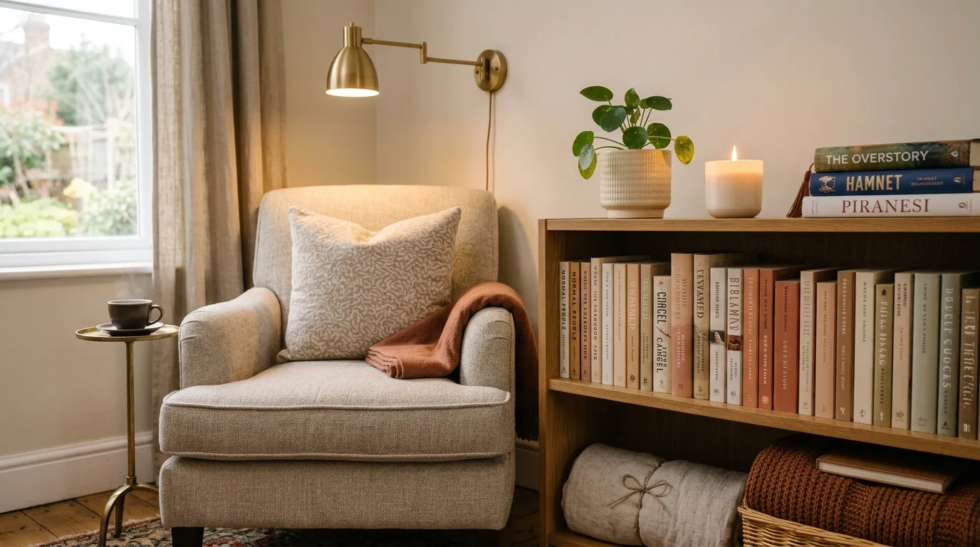
10. Cosy Reading Corner Shelf with Books and Throws (SMALL SPACE)
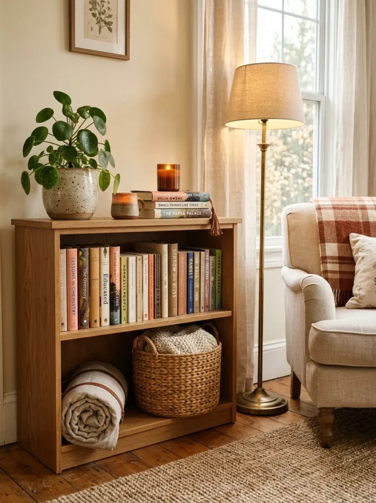
Vibe: The reading corner shelf feels cosily functional — the shelf that serves the reading experience as actively as it serves the room’s visual quality.
Why it works: A low shelf unit positioned as a reading corner companion creates the most functionally and aesthetically integrated shelf display in any living room because it allows the shelf’s styling to be explicitly organized around a human activity (reading) rather than abstract aesthetic principles. The design principle is activity-centered styling: when a shelf’s arrangement serves a specific daily activity — the currently-reading books within easy reach, the throw accessible for immediate use, the candle at lighting height for evening reading — the styling choices have a functional logic that makes them feel genuinely considered rather than decoratively applied. The bookmark visible in the current book is the specific detail that most vividly communicates active habitation of the reading corner.
How to get it: Position the shelf unit within arm’s reach of the reading chair — 60–90cm maximum from the chair’s arm position for comfortable reach without standing. Reserve the shelf’s top surface for the currently-in-use items: one or two books currently being read, a candle in a ceramic holder, and a small plant. Reserve the main shelves for the curated book selection — choose books with warm, neutral, or coordinating spine colors visible from the reading position. Store one rolled throw on the bottom shelf and a woven basket containing a second throw beside it — the two throws ensure that a throw is always immediately accessible for impromptu reading sessions.
Shop The Look
| Product |
|---|
| Woven storage basket medium throw hold |
| Natural linen throw blanket rolled shelf |
| Small ceramic plant pot reading shelf |
| Ceramic candle holder reading corner |
| Low bookshelf unit 90cm natural wood |
11. Alcove Shelf Transformation with Paint (COLOR / LAYOUT)
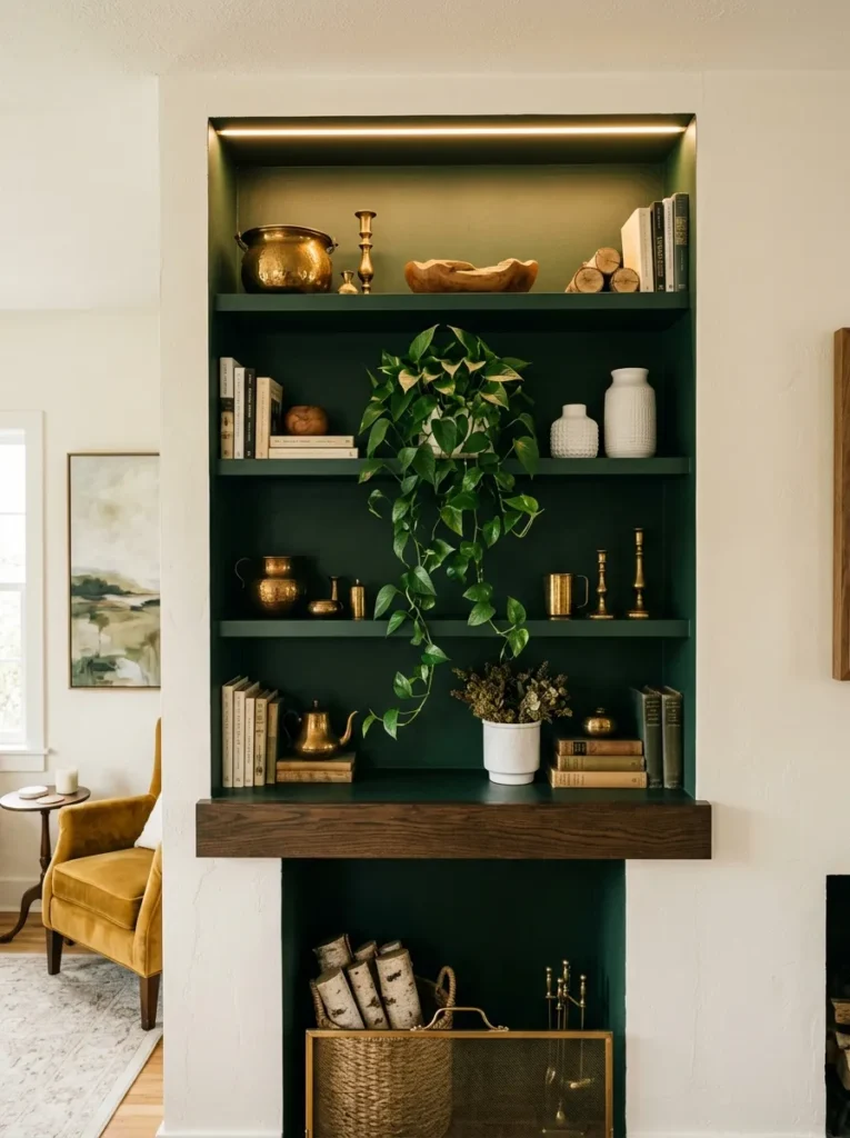
Vibe: The painted alcove shelf feels jewel-box intimate — the living room transformation that creates the most dramatic improvement in shelf display quality from the simplest intervention: one pot of paint.
Why it works: Painting the interior of a recessed alcove in a deeper tone than the surrounding room walls is the single paint intervention that most dramatically improves shelf display quality because the dark background makes every object placed against it appear more luminous, more three-dimensional, and more valuable — the same visual principle used in museum display cases and jewellery shops where objects are displayed against dark velvet backgrounds. The design principle is contrast elevation: objects displayed against a background of high contrast (warm brass and white ceramic against deep forest green) appear to glow with an inner warmth that the same objects against a white background cannot achieve, because the contrast amplifies the objects’ inherent color and material quality.
How to get it: Paint only the interior surfaces of the alcove — back wall, side walls, and ceiling of the recess — in the chosen deep tone. Apply painter’s tape at the alcove’s entry edge where it meets the surrounding wall to create a clean boundary between the two colors. Apply two coats of matte interior paint in the deep tone. Install a small warm white LED strip at the alcove’s top edge (concealed behind a small timber batten) to supplement the natural light within the recessed space — the LED strip dramatically improves the alcove’s visibility and warmth in evening conditions. Introduce warm-toned objects (brass, warm wood, terracotta) against the deep background for maximum contrast benefit.
Shop The Look
| Product |
|---|
| Deep forest green interior paint matte |
| LED strip warm white alcove concealed |
| Brass decorative object set shelf display |
| White ceramic vase pair alcove display |
| Painter tape precision edge clean cut |
12. Collected Travel and Memory Shelf (ACCESSORIES)
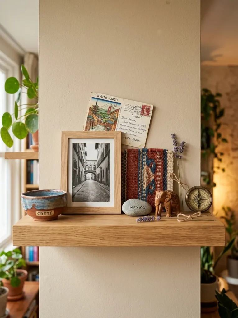
Vibe: The travel and memory shelf feels irreplaceably personal — the shelf that is the most honest portrait of its owner of any display format because every object was specifically chosen by an actual experience.
Why it works: A shelf styled as a curated travel and memory collection is the display approach that creates the most emotionally resonant and most personally expressive living room shelf because each object carries a specific story that the displaying household knows — the bowl from a specific market in a specific city, the stone from a specific beach on a specific afternoon, the postcard from a specific friend’s handwriting. The design principle is narrative object density: when every object on a shelf has a specific personal narrative behind its presence, the shelf collectively communicates the household’s history, values, and experiences in a way that no purchased display object can approach. The challenge is visual coherence — personal meaning and aesthetic quality must coexist, which requires choosing the most visually beautiful version of each personal object rather than displaying every memento regardless of visual quality.
How to get it: Edit ruthlessly from the full collection of personal objects — display only the most visually beautiful specimens that also carry genuine personal meaning, and store or retire items that have meaning but insufficient visual quality for display. Apply the same material diversity principle as any well-styled shelf — ensure the collection includes varied materials (ceramic, textile, stone, metal, paper) rather than all ceramic or all stone. Limit to 8–10 objects maximum to maintain the contemplative quality of individual attention that makes each object’s story discoverable.
Shop The Look
| Product |
|---|
| Natural wood picture frame small travel |
| Ceramic bowl small glazed display |
| Small brass object decorative travel |
| Postcard display prop small lean |
| Woven textile square display natural |
13. Styled Shelf with Consistent Material Palette (MATERIAL / COLOR)
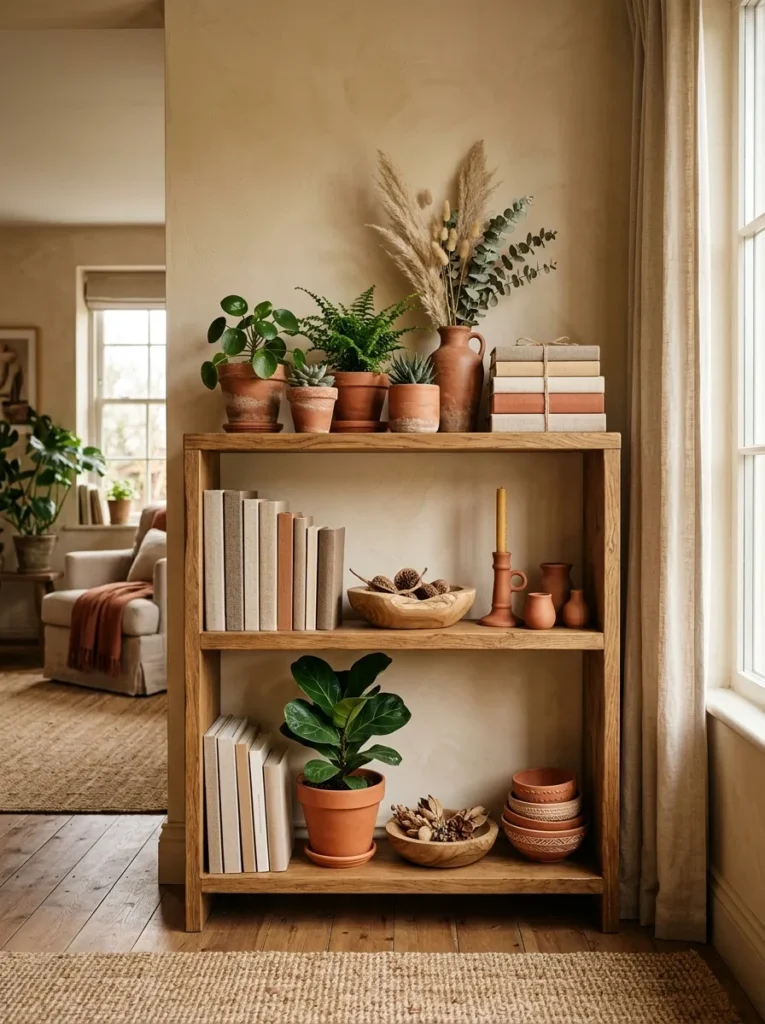
Vibe: The consistent material palette shelf feels warmly resolved — the discovery that visual unity achieved through material and color consistency is more satisfying than variety for its own sake.
Why it works: A shelf styled with a strictly consistent material and color palette — every object within the same tonal and material family — is the approach that most clearly demonstrates the power of editing and consistency over variety. The design principle is palette unity: when every object on a shelf shares the same material family (all terracotta, all natural wood, and all dried botanical in warm ivory tones), the shelf reads as a unified composition regardless of how varied the individual object types are — books, plants, candles, and bowls that all share the same warm terracotta and natural palette read as one cohesive display rather than a collection of different objects. The discipline of refusing to introduce any object outside the chosen palette is what makes this approach work.
How to get it: Choose the material palette before selecting any objects — terracotta and natural is the most versatile choice for a warm living room, but sage green and natural, warm black and brass, or warm white and natural all work on the same principle. Remove from the shelf every object that falls outside the chosen palette regardless of its individual quality or personal meaning. Source replacement objects from charity shops, garden centers, and homeware retailers strictly within the palette — a 20cm terracotta pot costs $3–$6 and immediately adds palette-correct volume to any shelf position.
Shop The Look
| Product |
|---|
| Terracotta pot set varied sizes shelf |
| Natural wood bowl set turned display |
| Terracotta candle holder ceramic warm |
| Dried botanical stem terracotta vase |
| Linen book cover set neutral plain |
14. Story-Book Nook Shelf with Fairy Lights (SMALL SPACE / LIGHTING)
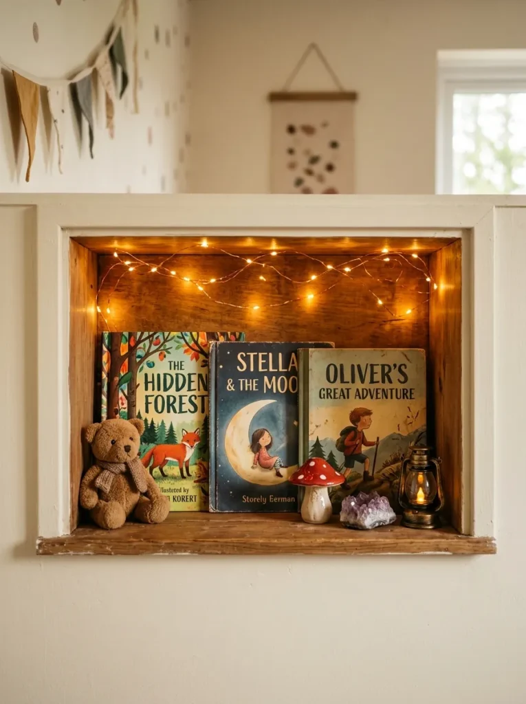
Vibe: The story-book nook shelf feels warmly magical — the miniature world that makes any shelf recess feel like an enchanted space worthy of its own quiet attention.
Why it works: A warm fairy light nook shelf creates the most atmospherically concentrated shelf display available because the enclosed space of a shelf recess, when lit from within by warm fairy lights, becomes a self-contained warm world that draws the eye with the same magnetic quality as a lit window on a dark evening. The design principle is light enclosure: enclosed spaces lit from within are irresistible to the human eye because they activate the instinctive attraction to warmth and shelter — the same visual principle that makes fireplace interiors, lanterns, and lit shop windows so compelling. The tiny, carefully chosen objects within the warm-lit nook are amplified in apparent value by their intimate lighting context, making even a small ceramic mushroom and a glass stone read as precious when enclosed in warm amber light.
How to get it: Install a short length of warm white LED fairy lights (2700K, approximately 1–2 meters for a small nook) along the ceiling of the shelf nook using small adhesive clips — the fairy lights should be as close to the ceiling of the nook as possible to cast light downward rather than directly outward. Install a small picture ledge within the nook at the back for face-forward book display. Choose only the most visually beautiful and personally meaningful small objects for the nook — the intimate lighting reveals detail at close range, making quality of choice more important here than anywhere else on a shelf. Limit to 5–7 objects maximum.
Shop The Look
| Product |
|---|
| LED fairy light warm white 1m nook |
| Adhesive LED clip small nook ceiling |
| Small picture ledge face-forward book |
| Tiny ceramic mushroom decorative small |
| Small crystal glass stone decorative |
15. The Maximalist Curated Shelf (COLOR / ACCESSORIES)
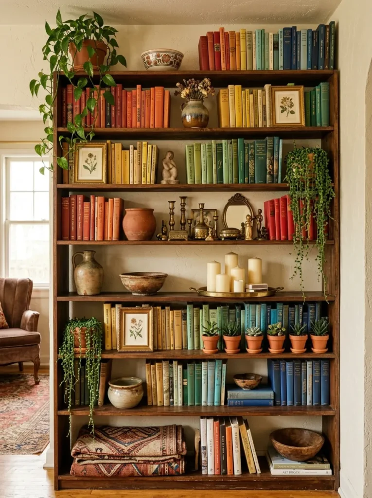
Vibe: The maximalist curated shelf feels warmly abundant and richly rewarding — the bookcase that earns the description “curated” rather than merely “full” through the disciplined application of material palette consistency to a genuinely generous collection.
Why it works: The maximalist curated shelf is the approach that most challenges the fundamental tension in shelf styling between abundance (more objects create more visual richness) and clarity (fewer objects create more visual order). The resolution of this tension is curation — the maximalist shelf that reads as richly beautiful rather than chaotically cluttered is one where every object has been specifically chosen for its visual contribution to the whole, where the material palette remains consistent (warm brass, warm wood, terracotta, natural botanicals) across all the shelf’s abundance, and where the few organizing principles (book colour-blocking, object grouping by type, trailing plants at consistent height intervals) create visual structure that prevents the abundance from dissolving into visual noise.
How to get it: Begin the maximalist shelf by establishing three non-negotiable organizing principles before adding any objects: a consistent material palette (warm brass, terracotta, and natural wood in this case), book colour grouping (even a maximalist shelf benefits from colour-blocked rather than random book arrangement), and one trailing plant at the top level that creates a vertical reference point for the whole composition. Add objects in groups rather than individually — a cluster of three vintage brass pieces on one shelf, a cluster of three terracotta pots on another, a cluster of pillar candles on a tray. The grouping discipline prevents the maximalist abundance from reading as random scatter.
Shop The Look
| Product |
|---|
| Vintage brass object set display shelf |
| Pillar candle brass tray cluster display |
| Small terracotta succulent pot set |
| Woven textile fold bottom shelf display |
| Ceramic object varied set warm shelf |
How to Start Your Cozy Shelf Styling Journey
Your single best first move is to completely clear one shelf before adding or purchasing anything — removing every object, every book, and every plant from one shelf and leaving it completely empty for 24 hours before making any arrangement decisions. This sounds counterintuitive, but the act of seeing a shelf completely empty changes your relationship to the decisions about what to put back — you move from the defensive position (justifying the presence of objects already there) to the creative position (choosing which objects earn their place from a fresh, open surface). Most people discover during this process that only a fraction of the objects previously on the shelf genuinely deserve to return, and that the shelf looks better after the edit than it did before it was cleared.
The most common mistake in shelf styling is filling every available inch of shelf space — the instinctive human desire to fill empty space with objects produces shelves that look cluttered even when every individual object is beautiful, because the absence of negative space prevents the eye from resting on any single object long enough to appreciate it. The cure for an over-filled shelf is not different objects but fewer objects — a shelf edited to 60% of its maximum object capacity almost always looks more considered than the same shelf at 100% capacity. Fix this by removing objects until you feel the shelf has too little on it, then add back two or three of the most important pieces — this slightly-too-little feeling usually corresponds to the correct degree of negative space.
Three specific objects under $30 each that create the most immediate improvement to any living room shelf: a tall dried botanical stem in a narrow ceramic vase ($12–$18 combined) that immediately creates the tallest element in the three-height composition and adds organic warmth to any shelf arrangement; a smooth river stone or piece of natural driftwood ($0–$8 sourced from nature or garden centers) that provides the low grounding element in the three-height composition and introduces the wabi-sabi material quality that manufactured objects cannot replicate; and a single trailing plant (pothos or string of hearts, $6–$14) that provides the living, cascading element that most immediately transforms a static shelf into something that feels genuinely alive.
A shelf styling refresh using only rearranged existing objects takes 30 minutes and costs nothing. A more considered shelf transformation adding three new purpose-selected objects costs $30–$60. A complete shelf system redesign including new shelving, a full complement of styled accessories, and botanical elements costs $200–$500 — producing shelf arrangements of the genuinely composed, personally expressive quality that makes visitors pause to look more closely and that makes the shelf’s owner feel good about the room every time they sit down in it.
Frequently Asked Questions About Cozy Shelf Styling for the Living Room
What is the most important principle in shelf styling?
The single most important principle in shelf styling is height variation — no other single factor has a greater effect on whether a shelf arrangement reads as composed and intentional or flat and casual. Objects at identical heights create static, undifferentiated arrangements regardless of how individually beautiful each object is; objects at dramatically varied heights create dynamic compositions that the eye navigates with pleasure. The specific application of height variation that works most reliably is the three-height principle: one tall element (a vase with stems, a tall candlestick, or a vertically-formatted book stack), one medium element (a ceramic object, a small plant, or a horizontal book stack with an object on top), and one low element (a bowl, a stone, or a small candle holder). Any three objects arranged at these three heights automatically create a more composed arrangement than ten objects at similar heights.
How many objects should I put on a shelf?
The correct number of objects depends on the shelf’s length, depth, and position, but a reliable starting guideline is that a shelf should feel slightly under-full rather than completely full — approximately 60–70% object coverage with 30–40% visible shelf surface. For a 90cm floating shelf, this typically means 3–5 objects in a single composed arrangement. For a full bookcase shelf (typically 80cm wide), this means books filling approximately two-thirds of the width and objects filling the remaining third, with the objects clustered rather than distributed evenly. The most common shelter over-filling mistake is filling the front-to-back depth of the shelf completely — leaving the back third of shelf depth empty (or used only for a leaning print against the wall) creates the spatial depth that makes the arrangement three-dimensional.
How do I style shelves that have to serve both storage and display purposes?
The most effective approach for shelves that must balance storage and display is zone differentiation — designating specific shelves or shelf sections for each function and treating the boundary between them as a design decision rather than an accident. Typically, lower shelves serve storage best (books, baskets, boxes) while upper shelves serve display best (objects, plants, art). Within a mixed shelf, use attractive storage vessels (woven baskets, ceramic canisters, linen-covered boxes) to contain functional storage items so that the storage element reads as part of the visual composition rather than disrupting it. A woven basket on a lower shelf containing charging cables and remote controls is simultaneously functional storage and a styled object — the basket’s natural material and warm honey tone contribute positively to the shelf’s overall aesthetic.
What is the best way to style a built-in alcove shelf?
Built-in alcove shelves benefit from the same principles as any shelf, with two additional considerations specific to the recessed format: the alcove’s back wall should be treated as a design element rather than ignored — painting it in a contrasting or complementary color (as in idea 11) dramatically improves the display quality of all objects placed against it; and the alcove’s ceiling can accommodate a concealed LED strip that dramatically improves evening visibility and creates the warm, jewel-box quality that is the alcove shelf’s specific aesthetic opportunity. Beyond these alcove-specific considerations, the three-height principle, depth layering, and material palette consistency apply exactly as they do to any other shelf format.
How do I stop my shelf looking cluttered even after I’ve edited it?
A shelf that still reads as cluttered after editing usually has one of three specific problems: insufficient height variation (all objects at similar heights despite varying numbers — reduce objects further and ensure dramatic height differentiation between the remaining ones); insufficient negative space within and between groups (objects placed too close together — enforce a minimum 5cm gap between all adjacent objects); or too many competing materials in the palette (too many different frame colors, too many different ceramic glaze colors — restrict to a maximum of three material/color families and remove anything outside that family). The most reliable single fix for persistent visual clutter is the cluster rather than scatter approach: instead of distributing objects evenly across the shelf surface, cluster them into one or two specific groups with significant empty shelf between and around the groups — the empty shelf surface between groups creates the negative space that allows the eye to read the groups as composed arrangements rather than an even distribution of objects.
Ready to Transform Your Living Room Shelves?
These 15 ideas span the full range of cozy shelf styling possibility — from the meditative restraint of the Japandi minimal shelf and the wabi-sabi natural object collection, through the warm atmospheric quality of the candle light shelf and the painted alcove transformation, to the botanical lushness of the trailing plant abundance and the personal depth of the travel memory collection, the functional elegance of the reading corner companion and the seasonal celebration of the botanical refresh, and the maximalist richness of the fully curated bookcase — covering every shelf type, every aesthetic, every budget, and every personal decorating priority from ecological mindfulness to maximum visual warmth to genuine personal expression. Begin with the clearing exercise — empty one shelf completely, leave it bare for a day, and then make the return decisions with fresh eyes rather than incumbent assumptions — because the shelf that earns its objects back from an empty starting point is almost always more considered and more beautiful than the shelf that accumulated its current arrangement gradually and defensively. Today’s specific action: identify the one shelf in your living room that most consistently bothers you when you look at it, apply the three-height principle to the objects you already own on that shelf, and assess the result before purchasing anything new — because the arrangement quality is almost always more within your control than the object quality, and the best shelf styling frequently requires less rather than more. When your living room shelves finally feel as considered, as warm, and as genuinely expressive as the best version of your own aesthetic sensibility — when you walk past them and feel pleased rather than vaguely dissatisfied — you will understand exactly why cozy shelf styling earns its devoted, active community and the permanent place it holds at the top of every living room decorating Pinterest board. Save your favorites now, especially the three-height vignette and the botanical abundance shelf — they are the two ideas that, once realized on your own shelves, change permanently how you see every flat surface in the house.