17 Elegant Living Room Paint Colors for Stylish Homes
Elegant living room paint colors are carefully selected wall tones — spanning warm neutrals, muted earth hues, soft botanicals, deep jewel tones, and sophisticated mid-tones — that create rooms of genuine visual quality, atmospheric warmth, and personal character rather than the safe, undifferentiated neutrality that most living rooms default to. This article gives you exactly 17 elegant living room paint colors for stylish homes, covering every architectural context from period plasterwork to contemporary open-plan, every lighting condition from north-facing winter rooms to south-facing sun-drenched spaces, and every design aesthetic from Japandi minimalism to maximalist eclecticism, with specific paint recommendations, furniture and material pairings, and curated product tables for every color.
There is a particular moment that every homeowner with a genuinely beautiful paint color on their walls has experienced — the moment when natural light shifts across the room during the day and the wall color responds in a way that a neutral beige never could, moving from warm amber in morning light to a rich, saturated depth in afternoon shade to a glowing velvet in evening candlelight. The right living room paint color makes the room alive to light in this way — it participates in the room’s daily rhythm rather than simply existing within it. These colors range from the warmest whisper of aged plaster to the most dramatic depth of midnight botanical green, all with the specific quality of elegance that only the most considered color choices achieve. Here are 17 colors worth choosing — and saving.
Why Elegant Living Room Paint Colors Work So Well
Color is the single most powerful tool available in interior design — it can make a room feel larger or smaller, warmer or cooler, more intimate or more expansive, more energized or more restful, without moving a single piece of furniture or installing a single new light fixture. The history of interior paint color is simultaneously the history of material availability (ancient pigments derived from minerals and plants, expanding to the full synthetic spectrum of the industrial era), cultural aspiration (the Georgian preference for cool Wedgwood blue, the Victorian love of deep jewel tones, the mid-century modernist’s embrace of white and grey), and aesthetic philosophy (the Arts and Crafts movement’s return to natural earth colors, the Scandinavian tradition of warm white and natural wood, the contemporary organic modern palette of terracotta and sage).
The colors that consistently produce the most elegant living room results share specific qualities: they have sufficient pigment depth to change appearance meaningfully with light variation (flat, single-dimension colors that look identical in all light conditions are inherently less interesting than colors with complexity); they contain the warm undertones that coordinate naturally with the wood, textile, and ceramic materials that furnish most living rooms; they are sufficiently resolved in their own aesthetic identity to make design decisions easier rather than harder (a color that is clearly a specific thing — a warm sage, a deep teal, a dusty rose — is always easier to furnish around than a color that is trying not to be any particular thing); and they age well, looking more rather than less beautiful as the surrounding furnishings develop patina and the paint itself settles into its context.
The contemporary living room paint color moment is characterized by a significant movement away from the default grey-and-white palette that dominated residential interiors from approximately 2010 to 2020 — toward warmer, more saturated, more personally expressive colors that reflect the post-pandemic revaluation of the home as a place of genuine comfort, beauty, and individual expression rather than a stage-set of universal neutrality. Paint brands’ bestseller lists reflect this shift clearly: warm whites with yellow or red undertones, terracotta and clay tones, dusty sages and forest greens, and deep navy and midnight tones are all significantly outperforming the cool grey neutrals that dominated the previous decade.
North-facing living rooms and rooms with limited natural light gain the most from the colors in this list because the right warm paint color can transform a perpetually dark north-facing room into a warmly atmospheric space that reads as deliberately moody rather than inadequately lit — the same quality that a poor color choice makes feel simply cold and uninviting.
Style at a Glance
| Element | Trait 1 | Trait 2 |
|---|---|---|
| Philosophy | Color as atmosphere creator | Personality over neutrality |
| Palette Family | Warm neutrals, earth tones, soft botanicals | Deep jewel tones, dusty mid-tones, aged plaster |
| Coordinating Materials | Natural oak, linen, ceramic, brass | Rattan, natural stone, wool, aged leather |
17 Elegant Living Room Paint Colors for Stylish Homes
1. Warm Aged White
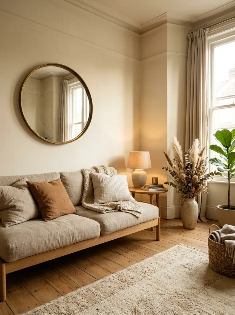
Vibe: Warm aged white feels timelessly luminous — the paint color that makes every room look like a beautifully restored period interior regardless of its actual age.
Why it works: Warm aged white — a white with perceptible yellow or red undertones that prevent it from reading as clinical or cool — is the foundational elegant living room color because it creates the warmest, most light-responsive wall surface available while maintaining the visual openness that makes rooms feel spacious. The crucial distinction from brilliant white is the undertone: brilliant white reads as flat and commercial regardless of the furnishings placed against it; warm aged white reads as architectural plaster, as aged lime wash, as the walls of a beautifully maintained older home, because its slight warmth suggests the mellowing of age rather than the uniform freshness of new paint. It responds to light in a way that brilliant white cannot — warming perceptibly in direct sun, deepening to cream in shadow, and glowing with genuine warmth in candlelight.
How to get it: The specific paint characteristic to look for is a warm white with a yellow or red LRV (light reflectance value) of 80–88 — bright enough to feel open and airy but not so bright that it reads as pure white. Farrow and Ball’s All White (warm undertone, not their coldest white) and Pointing, Little Greene’s Intelligent Matt in Lime White, and Benjamin Moore’s White Dove and Linen White are all in the correct register. Test any warm white extensively before committing — paint a 30x60cm test patch and observe across three days in morning, afternoon, and evening light conditions before deciding.
Pairs best with: Natural oak and ash furniture, warm linen and undyed cotton textiles, antique brass hardware and mirrors, terracotta and ceramic objects, dried botanicals in natural ivory and warm brown tones.
Quick Win: A warm aged white paint color in a living room with existing cool grey or brilliant white walls creates a perceptible warmth improvement that most people describe as the room feeling “more like a home” — the single highest-impact living room paint change available without any furniture or lighting modification.
Shop The Look
| Product |
|---|
| Warm white interior paint low sheen linen |
| Round brass mirror large wall display |
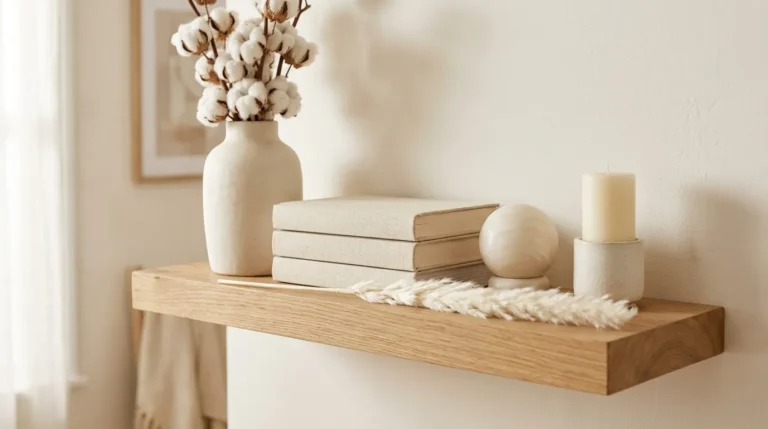
| Natural oak floating shelf warm tone |
| Dried botanical stem vase warm neutral |
| Warm linen sofa cushion set natural |
Also view: 17 Living Room Wall Decor Ideas for Every Style
2. Dusty Sage Green (COLOR)
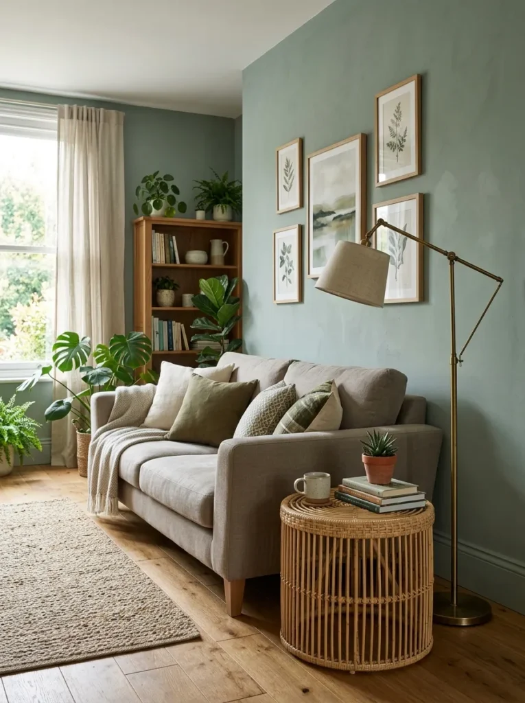
Vibe: Dusty sage green feels botanically calm and warmly organic — the color that makes every living room feel more considered, more connected to the natural world, and more genuinely restful.
Why it works: Dusty sage green has achieved consistent top-ten status in residential paint color choices for the past several years because it sits at the precise intersection of three desirable qualities: sufficient color identity to give a room a specific aesthetic character, sufficient warmth (from the grey and yellow undertones) to coordinate naturally with the wood and natural material palette of most contemporary living rooms, and sufficient muting (the dusty quality) to feel sophisticated rather than primary. A pure bright green would be too assertive for most living rooms; a pure grey would be too neutral; dusty sage occupies the specific middle territory that provides color richness without chromatic aggression.
How to get it: Look for sage greens specifically described as “muted,” “dusty,” or “greyed” rather than “soft” or “light” — the greyness of the sage is what creates the sophisticated quality rather than lightness per se. Farrow and Ball’s Mizzle, Pigeon, and Moudly have varying degrees of sage character; Little Greene’s Mid Azure Green and Aquamarine Light are useful comparators; Benjamin Moore’s Pale Avocado and Aganthus Green are in the correct muted territory. The LRV should be in the 35–55 range for a mid-tone sage — lighter reads as mint, darker reads as olive.
Pairs best with: Warm greige and natural linen textiles, natural rattan and wicker furniture, brass and antique gold hardware, warm oak and walnut wood tones, terracotta ceramic accents, dried botanical elements.
Shop The Look
| Product |
|---|
| Dusty sage green interior paint matte |
| Warm greige linen sofa cushion set |
| Natural rattan side table living room |
| Brass floor lamp warm tripod |
| Terracotta ceramic pot sage accent |
Also view: 15 Cozy Shelf Styling Ideas for Your Living Room
3. Warm Terracotta (COLOR / MATERIAL)
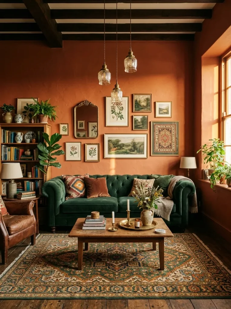
Vibe: Warm terracotta feels richly atmospheric and boldly confident — the paint color that transforms a living room into a genuine destination rather than a backdrop.
Why it works: Terracotta has been one of the defining residential interior colors of the past four years because it satisfies multiple simultaneous design needs: it is warm (carrying the red and yellow undertones that make rooms feel inhabited rather than clinical), it is naturalistic (referencing fired clay, sun-baked earth, and Mediterranean architecture), it is boldly specific (clearly a color rather than a neutral, giving rooms a strong identity), and it creates the most dramatic complementary contrast available in residential interiors when paired with forest green — the complementary relationship between red-orange terracotta and blue-green creates the visual tension that makes rooms feel genuinely alive rather than harmoniously inert.
How to get it: Choose a terracotta with sufficient red-brown depth to read as clay rather than orange — the distinction is in the brown component, which gives terracotta its earthy quality. LRV of 20–40 for a full-depth terracotta, 40–55 for a lighter clay tone. Farrow and Ball’s Sudbury Yellow and Red Earth flank the terracotta range; Little Greene’s Smoked Salmon and Etruscan Red are authentic terracotta references; Benjamin Moore’s Tequila Sunrise and Dusty Mauve bracket the appropriate territory from warm to cooled terracotta. The most elegant terracotta reads distinctly earthy rather than cosmetically coral.
Pairs best with: Deep forest green velvet or linen, warm brass and antique gold, Persian and Moroccan rugs in warm amber and forest, natural wood in darker walnut tones, ivory and cream textiles, antique mirrors with gilt frames.
Shop The Look
| Product |
|---|
| Warm terracotta interior paint matte |
| Deep forest green velvet cushion set |
| Brass pendant light ceiling warm |
| Persian style rug warm amber forest |
| Gilt frame round mirror vintage |
Also view: 15 Stylish Living Room Aesthetic Ideas That Actually Feel Like You
4. Deep Forest Green (COLOR)
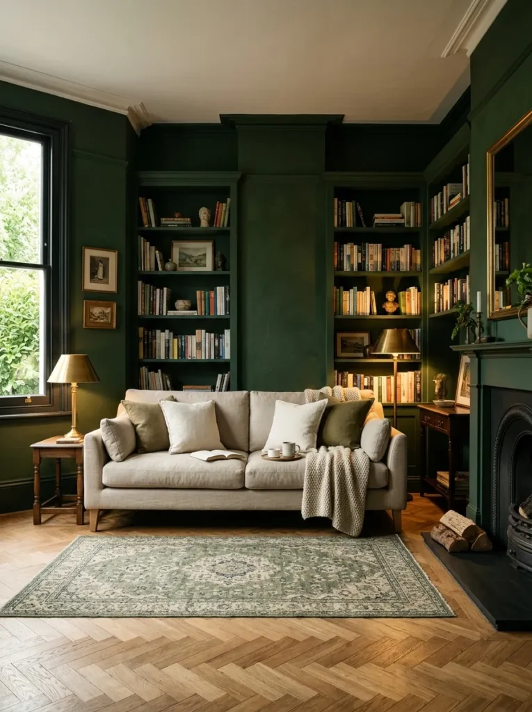
Vibe: Deep forest green feels dramatically enveloping and genuinely luxurious — the paint color that creates the most immersive, cocooning living room atmosphere available.
Why it works: Deep forest green is the living room paint color that most dramatically creates the sense of an immersive, enveloping interior environment — the feeling of being within a room rather than simply in a room. When applied to all four walls and extended to built-in shelving and woodwork, deep forest green creates the botanical canopy effect that reads as a genuinely designed interior statement of considerable confidence. The design principle is tonal immersion: when the walls, ceiling (if painted), and joinery share the same deep tone, the room loses its conventional box quality and acquires a tent-like, enveloping quality that makes it feel simultaneously larger (no visible wall boundaries) and more intimate (the depth of color absorbs light and creates visual warmth).
How to get it: Look for forest greens specifically in the dark-mid to dark tone range with LRV of 5–20 and warm, slightly brownish undertones rather than cool, blue undertones. Farrow and Ball’s Green Smoke, Studio Green, and Chappell Green are well-known examples; Little Greene’s Dark Bronze Green and Portland Stone Green are excellent alternatives; Valspar’s Succulent and Sherwin-Williams’s Aged Pewter (which reads as warm dark green) are accessible high-quality options. Extend the color to all woodwork and built-ins for the most dramatic, cohesive effect.
Pairs best with: Natural linen and undyed cotton in warm ivory, brass and antique gold fixtures and lamps, natural oak and walnut floors, warm white ceiling, antique and vintage furniture in dark wood, Persian rugs.
Shop The Look
| Product |
|---|
| Deep forest green interior paint matte |
| Brass table lamp warm pair living room |
| Natural linen sofa cushion ivory set |
| Persian rug vintage warm living room |
| Natural oak herringbone floor tile |
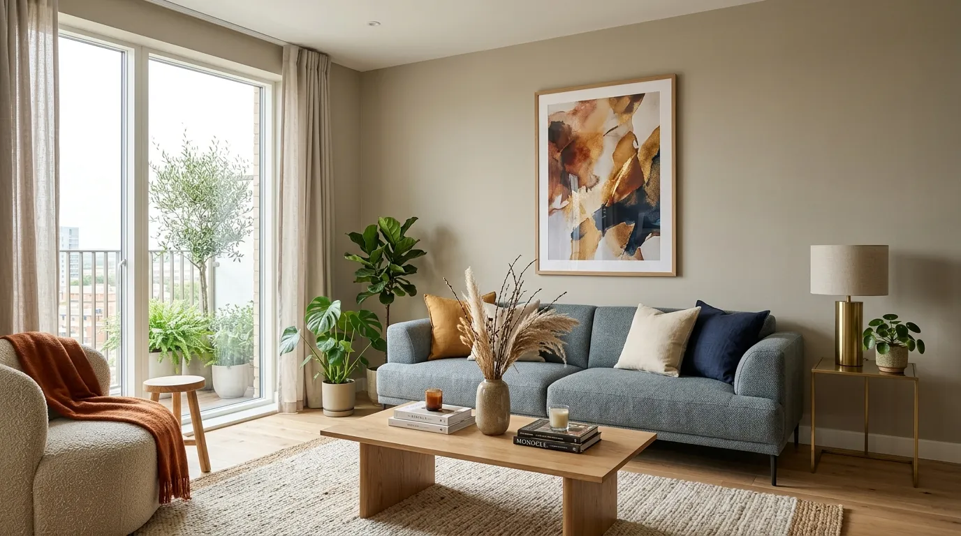
5. Warm Greige (COLOR / SMALL SPACE)
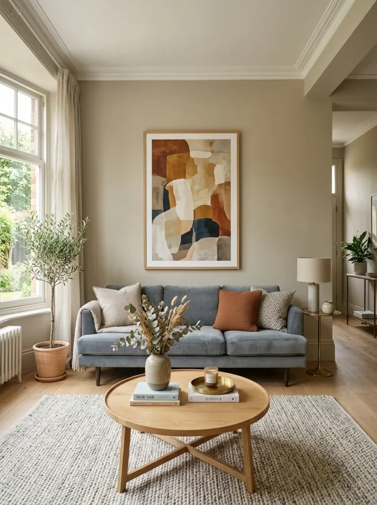
Vibe: Warm greige feels sophisticatedly versatile — the paint color that works with the widest range of furniture and textile choices while still reading as a genuinely considered color decision rather than an evasion of one.
Why it works: Warm greige is the most versatile elegant living room color because it is simultaneously a genuine neutral (working with virtually any furniture palette from deep navy to warm terracotta to sage green) and a genuine color (warm enough to make rooms feel inhabited rather than clinical, complex enough to change perceptibly in different light conditions). The design principle is warm neutrality: the distinction between warm greige and cool grey is entirely in the undertone — add yellow or red to grey and it becomes greige; keep it blue-purple and it remains grey. The warm undertone is what makes greige coordinate naturally with wood (which has yellow-brown undertones) while grey fights wood’s warmth rather than complementing it.
How to get it: The critical specification for warm greige is LRV of 50–65 (light enough to read as a neutral, dark enough to have visual presence) and warm undertones that test warm against white paper rather than cool. Farrow and Ball’s Elephant’s Breath and Hardwick White are canonical warm greige references; Little Greene’s French Grey Pale and Aged White; Benjamin Moore’s Revere Pewter (the ultimate mainstream warm greige), Pale Oak, and Edgecomb Gray. Test warm greige with the same warm white paper test used for any neutral — if the greige appears to have blue or purple reflection against the white paper, it is a cool grey-beige rather than a warm greige.
Pairs best with: Virtually any furniture colour, but specifically excels with warm oak and walnut wood, navy and deep blue textiles, forest green accents, warm ivory and linen, and natural brass and copper hardware.
Shop The Look
| Product |
|---|
| Warm greige interior paint matte finish |
| Natural oak coffee table round warm |
| Large abstract art print warm tones |
| Grey-blue sofa cushion set living room |
| Brass side table accent living room |
6. Chalky Dusty Pink (COLOR)
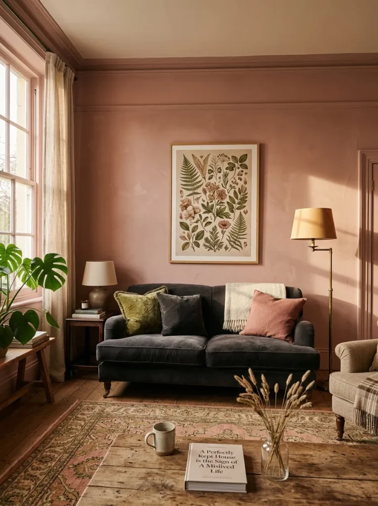
Vibe: Chalky dusty pink feels warmly unexpected and quietly bold — the color that surprises everyone who assumed it would be too sweet and pleases everyone who chose it with confidence.
Why it works: Chalky dusty pink — a pink so muted and warm-toned that it reads as a sophisticated neutral with a rosy quality rather than as a declarative pink statement — is the most underrated elegant living room color because it performs the warm-neutral function of greige while adding a specific warmth and femininity that makes rooms feel genuinely special rather than competently neutral. The key is the chalky, desaturated quality: add white and grey to pink until it loses its sweetness and acquires a dusty, powdery depth, and the result is a wall color of considerable sophistication. The deep charcoal velvet sofa is the pairing that most demonstrates the color’s sophistication — the contrast between the warm dusty pink and the deep cool charcoal creates a tension of genuine elegance.
How to get it: Look specifically for pinks described as “chalky,” “dusty,” “muted,” or “antique rose” rather than “blush,” “baby pink,” or “soft pink” — the chalky quality is the distinguishing characteristic. LRV of 55–70 and warm, red-biased undertone rather than cool, purple-biased undertone. Farrow and Ball’s Calamine, Dead Salmon, and Pink Ground are well-known examples; Little Greene’s Blush and Rose Dusk; Benjamin Moore’s Pink Damask and Corsair. Avoid any pink with perceptible purple or blue undertone — these read as cold and sweet rather than warm and sophisticated.
Pairs best with: Deep charcoal and dark navy velvet and linen, antique brass and vintage gold fixtures, botanical art prints in warm green and rose, natural warm wood, ivory and cream textiles, dried rose and botanical elements.
Shop The Look
| Product |
|---|
| Chalky dusty pink interior paint matte |
| Deep charcoal velvet sofa cushion |
| Antique brass floor lamp warm |
| Botanical art print rose green tones |
| Dried rose botanical display natural |
7. Navy and Midnight Blue (COLOR / SMALL SPACE)
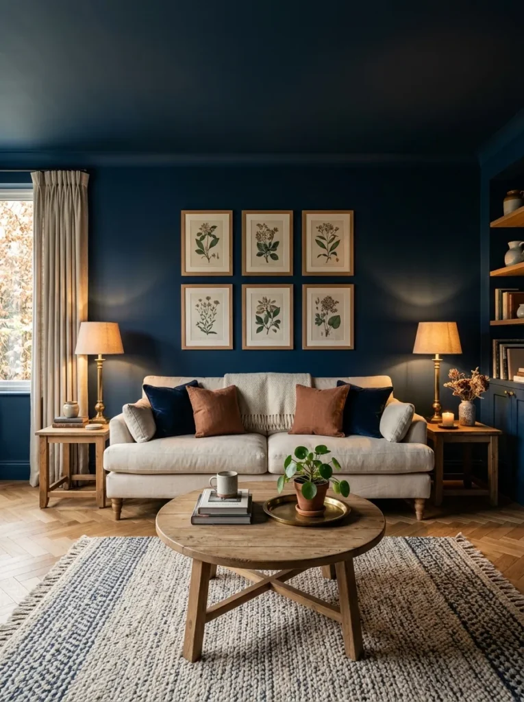
Vibe: Deep navy feels dramatically immersive and quietly opulent — the night-sky color that makes every evening in the living room feel like a genuinely special occasion.
Why it works: Deep navy applied to all four walls and ceiling creates the living room atmosphere that is most dramatically different between day and evening — in daylight, the deep blue creates a rich, saturated backdrop of considerable visual depth; in evening with warm lamp light, the navy walls absorb and soften the artificial light into a deeply atmospheric, almost theatrical environment that transforms the quality of social and domestic life within the room. The design principle is tonal immersion: a color applied to all surfaces (walls, ceiling, and ideally woodwork) creates a completely different spatial quality from the same color on one or two walls only — the total immersion eliminates the box quality of the room and creates an enveloping environment whose atmosphere changes dramatically with light conditions.
How to get it: Choose a navy with warm rather than cool undertones — a warm navy reads as midnight sky and aged indigo; a cool navy reads as institutional or corporate. LRV of 4–12 for full-depth navy. Farrow and Ball’s Hague Blue and Stiffkey Blue are widely referenced warm navies; Little Greene’s Pale Lupin and Velvet Underground offer comparable depth; Benjamin Moore’s Van Deusen Blue and Newburyport Blue are accessible warm navy options. Apply all in the same finish — estate eggshell for slight sheen that catches lamp light on the walls, or dead flat matte for the most dramatic light-absorbing quality.
Pairs best with: Warm ivory and natural linen, antique brass and warm gold fixtures, natural oak and walnut floors, botanical prints in natural frames, Persian rugs in warm amber, cream, and red.
Shop The Look
| Product |
|---|
| Deep warm navy interior paint matte |
| Brass table lamp antique warm pair |
| Warm ivory linen sofa cushion set |
| Natural oak parquet floor tile |
| Botanical print natural wood frame |
8. Warm Charcoal (COLOR)
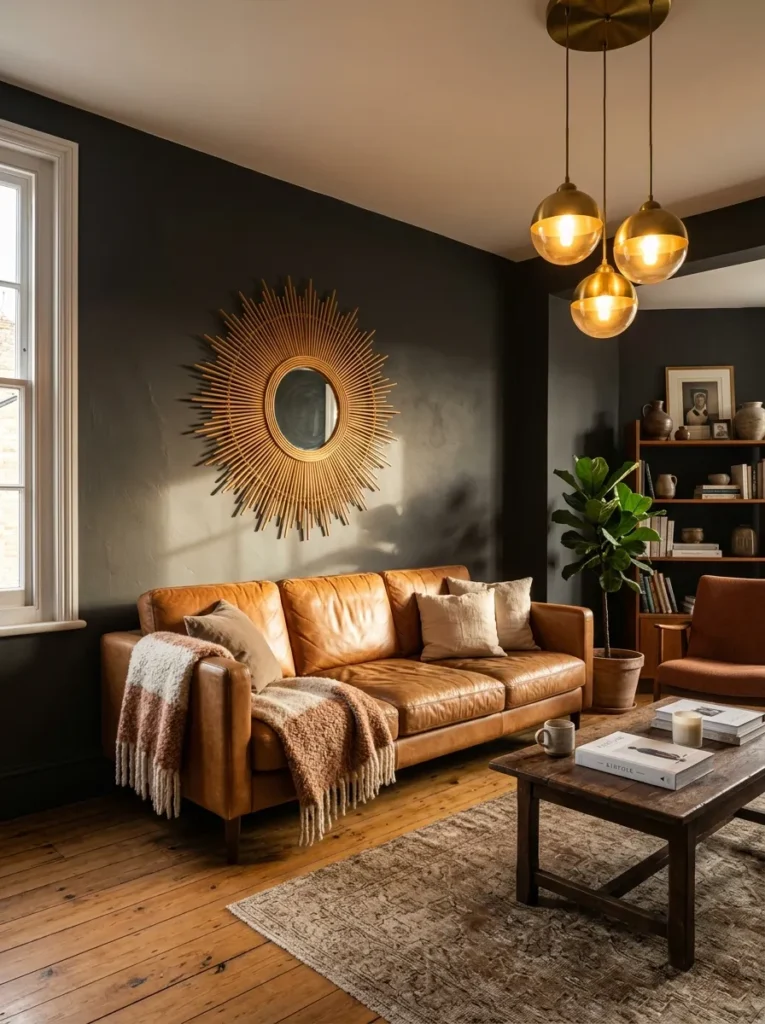
Vibe: Warm charcoal feels warmly dramatic and grown-up sophisticated — the paint color that makes a living room feel genuinely adult and considered in a way that no lighter color can achieve.
Why it works: Warm charcoal is the dark paint color that produces the most universally successful living room results because its warmth prevents it from reading as cold or oppressive — the specific quality that makes dark paint colors fail in domestic living rooms is cool undertone, which makes the darkness feel chilly and institutional rather than warm and atmospheric. A warm charcoal with yellow or red undertones creates the depth and drama of a dark color with the warmth and comfort of an earth tone — a combination that produces sophisticated, enveloping rooms of considerable atmospheric quality.
How to get it: Look for charcoal greys described as “warm,” “brownish,” or with “red undertones” rather than “cool,” “blue-grey,” or “slate.” LRV of 8–20 for full-depth charcoal. Farrow and Ball’s Off-Black and Railings read as warm charcoal with close inspection; Little Greene’s Lava and Lead Colour; Benjamin Moore’s Kendall Charcoal and Black Iron. Test by placing the paint swatch against a pure cool grey — the warm charcoal should read distinctly warmer, with a perceptible yellow-brown quality against the cool grey comparator.
Pairs best with: Warm caramel and cognac leather, natural rattan and wicker, brass and antique gold, warm terracotta accents, natural wood in oak and walnut tones, warm ivory and cream textiles.
Shop The Look
| Product |
|---|
| Warm charcoal interior paint matte |
| Sunburst rattan mirror natural large |
| Warm brass pendant light ceiling |
| Caramel leather sofa cushion accent |
| Terracotta accent ceramic warm display |
9. Dusty Lavender (COLOR)
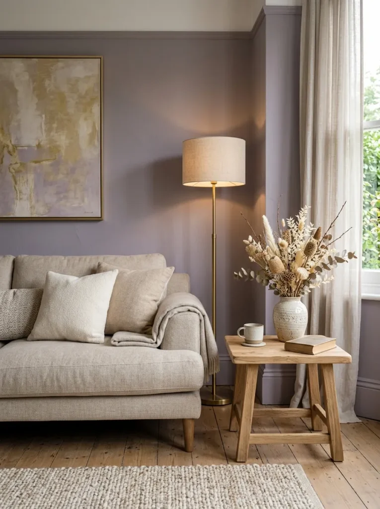
Vibe: Dusty lavender feels unexpectedly sophisticated — the color that nobody expected to love in their living room and everyone who chose it absolutely does.
Why it works: Dusty lavender — a purple so muted and grey-toned that it reads as a sophisticated cool neutral with a warm purple quality rather than as a declarative color statement — is experiencing a significant moment in contemporary residential paint because it satisfies the appetite for color beyond the sage-green-and-terracotta palette that has dominated the past five years while remaining genuinely neutral enough to work with most existing furniture palettes. The grey component of dusty lavender coordinates naturally with cooler-toned furniture (grey and blue-grey sofas, cool white textiles, natural stone surfaces), while the purple quality adds warmth and softness that pure grey cannot achieve. The result is a wall color with genuine visual complexity and psychological calm — lavender’s association with relaxation is well-documented in color psychology.
How to get it: Look for purples specifically in the greyed, muted, or dusty category with LRV of 50–65 and warm, red-biased undertone rather than cool, blue undertone. Farrow and Ball’s Brassica and Setting Plaster bracket the lavender territory from warm to cool; Little Greene’s Bluebell and Purpleheart; Benjamin Moore’s Lavender Mist and Purple Haze. Avoid pure violet or bright purple — the muting is essential for the sophisticated quality.
Pairs best with: Warm oatmeal and ivory linen, warm brass and antique gold, dried botanical elements in warm ivory and amber, natural wood in warm oak tones, forest green as a botanical accent.
Shop The Look
| Product |
|---|
| Dusty lavender interior paint matte |
| Oatmeal linen sofa cushion set natural |
| Warm brass floor lamp tripod living |
| Dried botanical arrangement ivory warm |
| Natural oak side table warm round |
10. Warm Stone and Limestone (MATERIAL / COLOR)
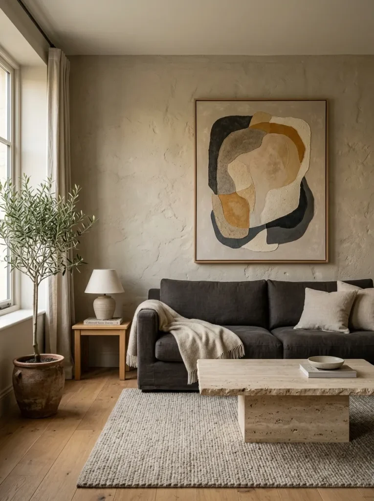
Vibe: Warm stone feels architecturally grounded and quietly authoritative — the paint color that makes a room feel as though its walls are genuinely constructed from beautiful natural material.
Why it works: Warm stone and limestone tones are the living room paint colors with the strongest architectural reference — they read not as a paint color applied to a wall but as the natural material quality of the wall itself, referencing the warm grey limestone of Georgian and Regency domestic architecture and the travertine interiors of contemporary luxury design. The design principle is material illusion through color: a paint color that references a specific natural material (limestone, travertine, warm Portland stone) acquires that material’s cultural associations — the permanence, the solidity, the geological time — in a way that abstract neutrals cannot. This material reference quality makes warm stone one of the most architecturally sophisticated paint color choices available.
How to get it: Look for warm stone colors that contain equal parts warm beige and warm grey without excess yellow or red undertone — the mineral quality comes from the balance between the beige warmth and the grey depth rather than from any primary color dominance. LRV of 40–58. Farrow and Ball’s Pavilion Gray and Peignoir flank the stone territory; Little Greene’s Stone and Portland Stone are precise references; Dulux’s Warm Stone and Natural Hessian are accessible alternatives. Compare against an actual limestone or travertine sample to calibrate the warmth level.
Pairs best with: Natural travertine and limestone, deep charcoal and warm grey upholstery, warm wood in pale oak and natural ash, organic abstract art in warm neutral tones, natural stone and ceramic objects.
Shop The Look
| Product |
|---|
| Warm stone interior paint matte grey |
| Travertine look coffee table natural |
| Deep charcoal sofa cushion contrast |
| Organic abstract art print warm neutral |
| Natural stone decorative object shelf |
11. Rich Burgundy and Wine (COLOR)
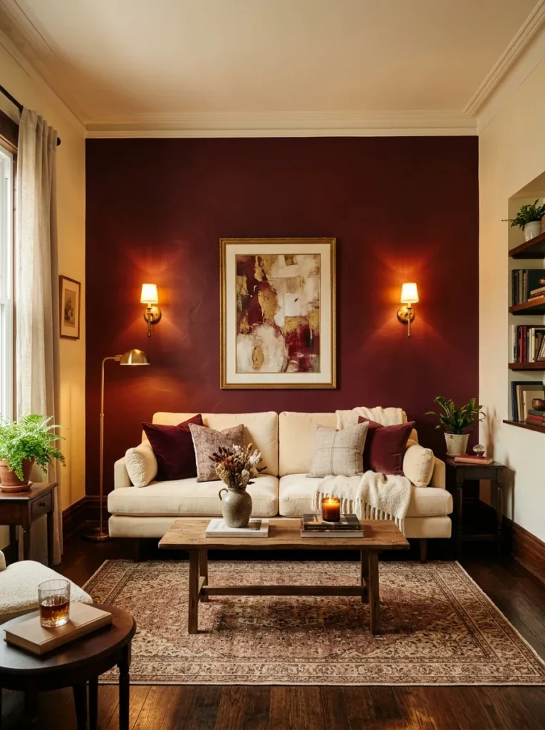
Vibe: Rich burgundy feels dramatically opulent and warmly indulgent — the paint color that immediately signals that the household values visual richness and genuine design confidence over safe neutrality.
Why it works: Rich burgundy is the most dramatic warm-toned paint color available for living rooms because it combines the depth and atmospheric power of a dark color with the warmth of a red-family tone, creating rooms that feel genuinely opulent without the corporate quality that dark navy or charcoal can sometimes carry. The design principle is warm darkness: where cool dark colors (navy, dark grey) create atmospheric drama through coldness and distance, warm dark colors (burgundy, deep terracotta, warm forest green) create atmospheric drama through richness and intimacy — the warmth pulls the room inward rather than pushing it outward, creating a deeply cocooning quality. Applied as a single feature wall behind the sofa rather than on all four walls, burgundy creates dramatic impact without total immersion.
How to get it: Look for burgundies with red-brown rather than blue-purple undertones — the warmth is in the red-brown component. LRV of 5–18 for full-depth burgundy. Farrow and Ball’s Incarnadine and Preference Red sit in the warm deep red territory; Little Greene’s Carmine and Crimson Lake; Benjamin Moore’s Heritage Red and Satchel. Test against a cool purple-red — the warm burgundy should read distinctly browner and more earthy against the cool comparator.
Pairs best with: Warm ivory and cream velvet and linen, antique brass and warm gold sconces and fixtures, warm Persian and Moroccan rugs, dark walnut furniture, deep forest green as a botanical accent in textiles or plants.
Shop The Look
| Product |
|---|
| Rich burgundy interior paint matte |
| Brass wall sconce pair warm amber |
| Warm ivory velvet sofa cushion set |
| Persian rug warm tones living room |
| Dark walnut side table display warm |
12. Warm Ochre and Amber Gold (COLOR)
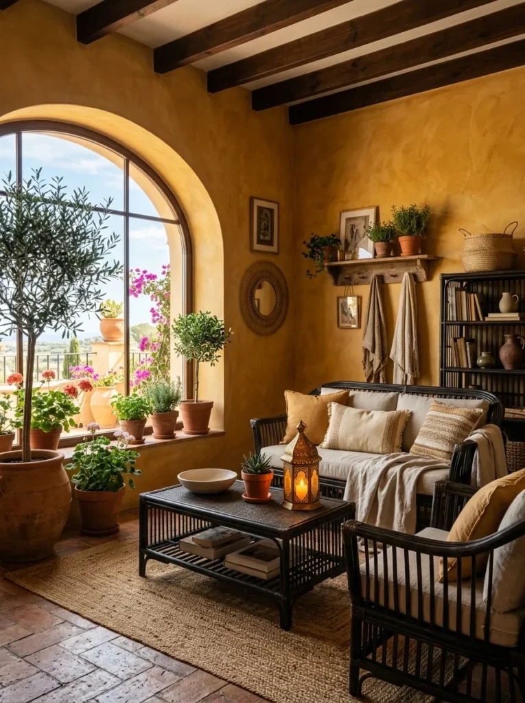
Vibe: Warm ochre feels perpetually sunlit and Mediterraneanly generous — the paint color that makes every morning feel like a summer morning regardless of what the weather outside is doing.
Why it works: Warm ochre — a golden-yellow so saturated with brown and orange earth undertones that it reads as mineral pigment rather than paint — is the living room color that most reliably creates a warm, sunlit atmosphere regardless of the room’s natural light conditions. Ochre’s specific quality of making rooms feel sunlit even in north-facing or low-light conditions is why it has been the dominant interior color of Mediterranean and North African architecture for centuries — it creates the light quality of sun-baked earth indoors. The design principle is pigment warmth: ochre is one of the oldest pigments in human use precisely because iron oxide produces a warmth and depth that no mixed or synthetic yellow can replicate.
How to get it: Look specifically for ochres with brown-orange undertones (iron oxide based) rather than lemon-yellow undertones — the brownish quality is what gives ochre its earthiness and prevents it from reading as a domestic yellow. LRV of 45–65 for a mid-tone ochre. Farrow and Ball’s Sudbury Yellow and Citron are in the ochre territory; Little Greene’s Bronze and Yellow-Pink; Benjamin Moore’s Golden Straw and Gold Finch. Test against pure yellow — the ochre should read clearly warmer, browner, and more earthen than the pure yellow comparator.
Pairs best with: Terracotta and clay ceramics, dark rattan and wicker, natural linen and warm ivory textiles, Moroccan and Middle Eastern lanterns, botanical plants with dark green foliage, deep forest green as accent.
Shop The Look
| Product |
|---|
| Warm ochre interior paint matte natural |
| Moroccan lantern warm amber light |
| Terracotta planter pot set large |
| Dark rattan furniture set living room |
| Natural linen textile warm ivory sofa |
13. Soft Duck Egg Blue (COLOR)
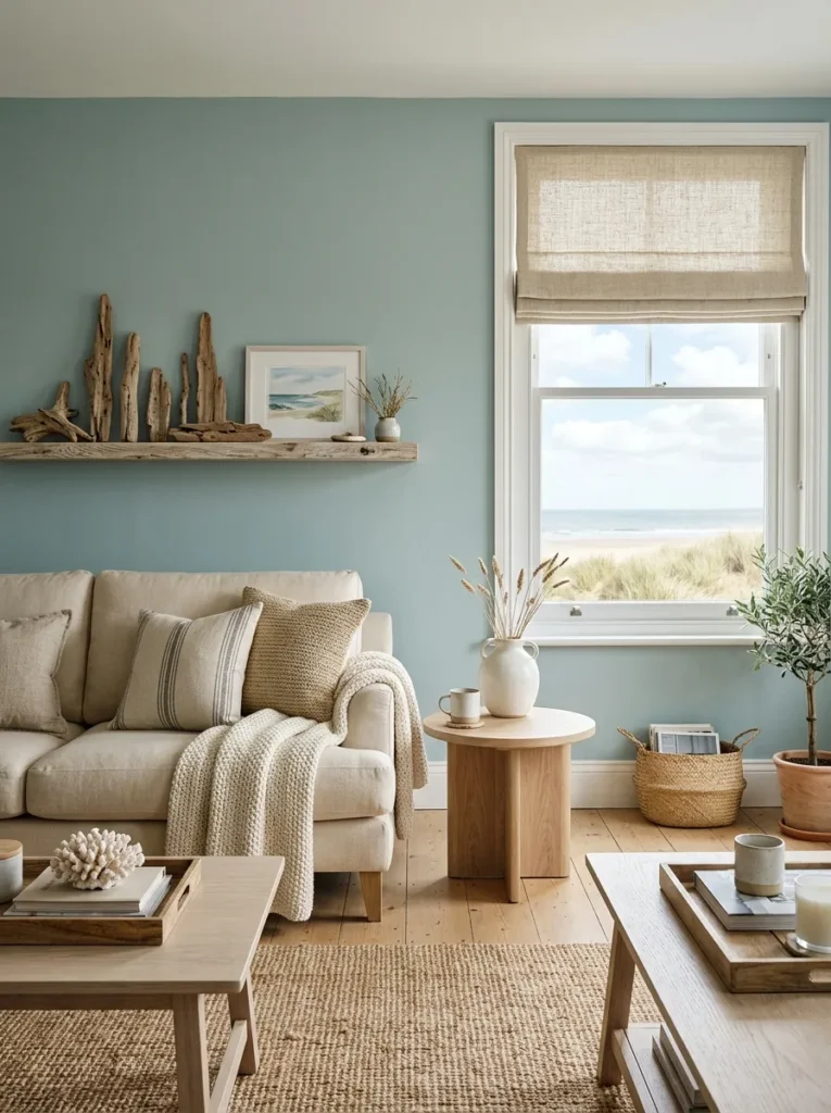
Vibe: Soft duck egg blue feels gently coastal and warmly aqueous — the paint color that immediately brings the quality of light near water into the living room without requiring proximity to any actual coast.
Why it works: Duck egg blue occupies a specific and valuable color territory — the intersection of blue, green, and grey that produces a muted, multi-dimensional tone with both the calming quality of blue and the organic warmth of green. The green component of duck egg blue is what prevents it from reading as cold blue — the slight yellow warmth of the green undertone creates a color that reads as natural and organic rather than artificial and corporate. The grey component provides the sophistication and muting that prevents duck egg from reading as turquoise or teal. The result is a color of considerable depth and complexity that changes perceptibly between morning (cooler, more green) and afternoon (warmer, more blue) light.
How to get it: Look for duck egg blues with perceptible green undertone rather than pure blue — the green component is what gives duck egg its warmth and organic quality. LRV of 50–65 for a mid-tone duck egg. Farrow and Ball’s Borrowed Light and Mizzle flank the duck egg territory; Little Greene’s Cape Clear and Aquamarine Light; Benjamin Moore’s Sea Salt and Palladian Blue. Test against pure grey-blue — the duck egg should read clearly greener and warmer than the pure grey-blue comparator.
Pairs best with: Warm cream and natural linen textiles, bleached and natural oak furniture, driftwood and natural coastal accessories, warm white ceramics, natural jute and rope accessories, soft copper and warm brass accents.
Shop The Look
| Product |
|---|
| Soft duck egg blue interior paint matte |
| Warm cream linen sofa cushion set |
| Bleached oak side table natural coastal |
| Driftwood decorative collection display |
| Warm white ceramic vessel coastal |
14. Deep Petrol Blue-Green (COLOR)
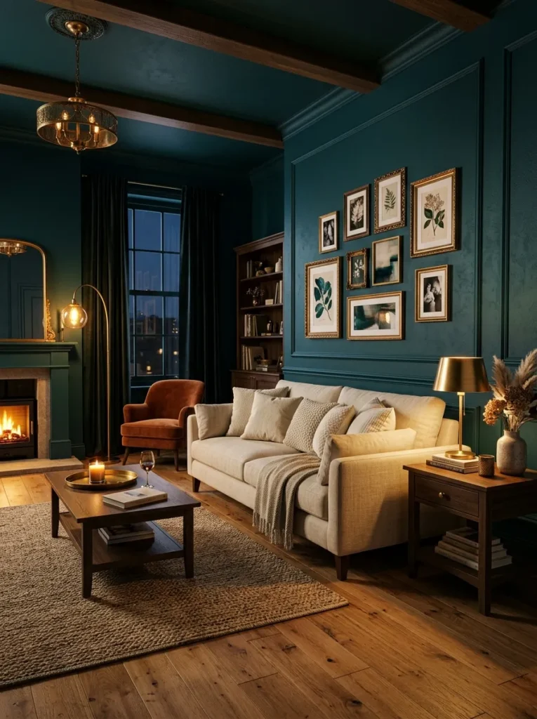
Vibe: Deep petrol blue-green feels jewel-tonally immersive — the most dramatically beautiful living room color for evening use, transforming every social occasion into an event.
Why it works: Deep petrol blue-green is the jewel-tone color that most powerfully creates a genuinely dramatic living room environment — its specific combination of blue depth (creating the atmospheric quality of deep water or night sky) and green warmth (adding organic life and preventing cold institutionalism) creates a wall color of remarkable complexity that changes perceptibly between day (rich, saturated, complex) and evening (deeply glowing, almost theatrical, dramatically beautiful). The brass accent response is specific to petrol blue-green: warm brass and gold against deep blue-green creates the complementary material contrast that makes both the gold and the green appear more saturated and more luminous than either would appear in isolation.
How to get it: Look for petrol tones that balance blue and green in roughly equal measure with warm rather than cold undertones — the warmth prevents the color from reading as institutional or clinical. LRV of 5–15 for full-depth petrol. Farrow and Ball’s Studio Green and Vardo are in the petrol territory; Little Greene’s Dark Lead and Bronze Green; Farrow and Ball’s Inchyra Blue for a cooler petrol. Apply in matte or estate eggshell rather than gloss for the deepest color experience.
Pairs best with: Warm brass and antique gold in every fixture and fitting, natural linen in warm ivory, warm wood floors in oak and walnut, warm white ceiling as the single light-reflecting surface, botanical prints and plants for organic reference.
Shop The Look
| Product |
|---|
| Deep petrol blue-green interior paint matte |
| Warm brass picture frame set gallery |
| Natural linen sofa cushion ivory warm |
| Brass floor lamp warm petrol room |
| Natural wood floor warm oak tone |
15. Warm Mushroom and Taupe (MATERIAL / COLOR)
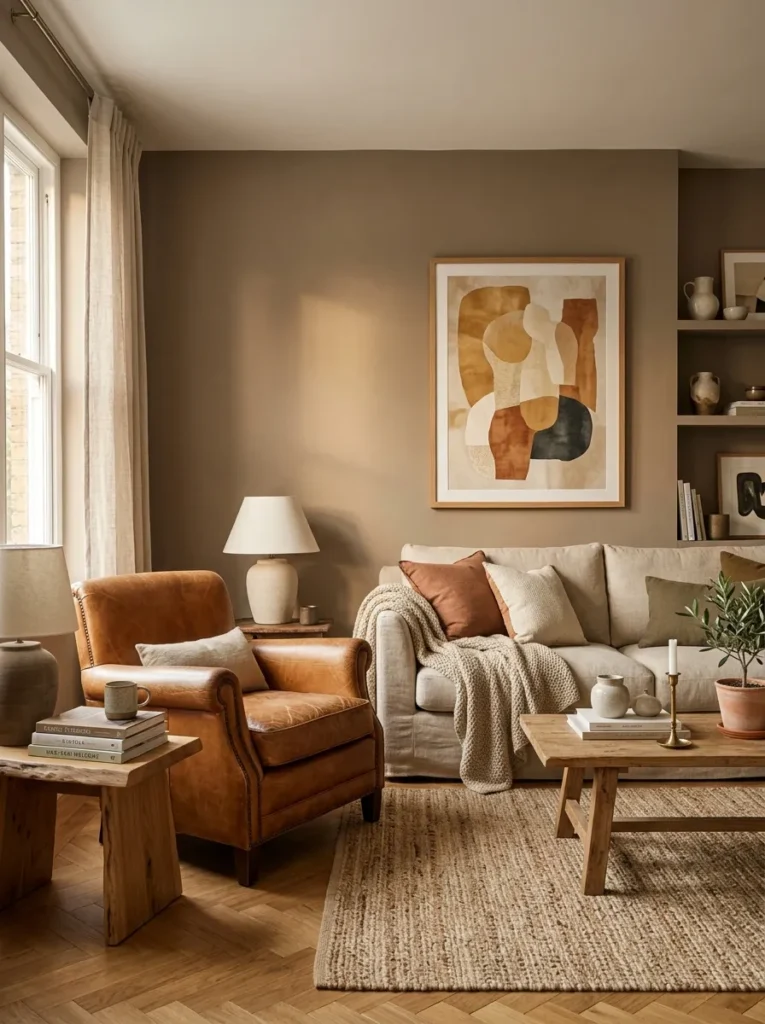
Vibe: Warm mushroom-taupe feels earthily sophisticated — the paint color that makes every material in the room look more expensive and more considered by lending them its warm, mineral seriousness.
Why it works: Warm mushroom and taupe tones represent the most sophisticated expression of the warm neutral concept — pushing warmth beyond the yellow-bias of greige into the brown-bias territory of natural earth pigments, these colors read as genuinely material (referencing the warm tones of dried mud, clay, and mineral earth) rather than as decorative neutrals. The material reference quality gives mushroom tones their specific authority — they read as something natural and inherent rather than applied, which makes everything placed against them appear more genuine and less decorative by association.
How to get it: Look for mushroom and taupe tones with brown-red rather than yellow-green undertones — the earthen warmth is in the brown-red component. LRV of 35–55. Farrow and Ball’s Mouse’s Back and Mole’s Breath are the canonical mushroom-taupe references; Little Greene’s Coffee Foam and Clay; Benjamin Moore’s Brandon Beige and Manchester Tan. Compare against both pure grey and pure beige — mushroom-taupe should read warmer than grey and darker or more mineral than standard beige.
Pairs best with: Caramel and cognac leather, warm oatmeal and camel textiles, warm oak and walnut wood floors, warm abstract art in earth tones, natural terracotta and ceramic accents, warm brass in restrained amounts.
Shop The Look
| Product |
|---|
| Warm mushroom taupe interior paint matte |
| Caramel leather armchair living room |
| Oatmeal linen sofa cushion set warm |
| Warm oak parquet floor tile plank |
| Abstract art print warm earth neutral |
16. Soft Blush and Antique Rose (COLOR)
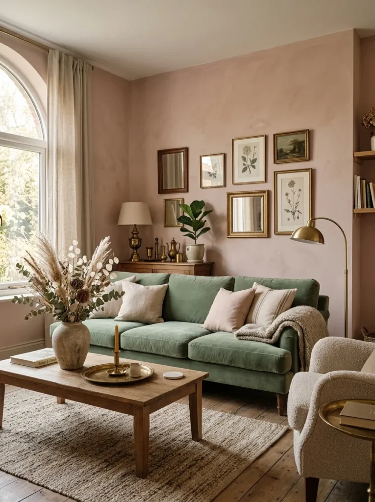
Vibe: Soft antique rose blush feels serenely aged — the paint color that sits so quietly between warm buff and dusty rose that it takes multiple days to fully perceive its depth and warmth.
Why it works: Soft antique rose blush is the most subtly sophisticated color in this list because its effect is cumulative rather than immediate — on first encounter, the walls read as warm white or warm buff; over days of living with the color, the rosy quality becomes increasingly perceptible until the room feels warmly bathed in the color without the color ever having announced itself loudly. This slow revelation quality is the hallmark of the most sophisticated paint colors — they reveal their depth and complexity progressively rather than asserting it immediately. The design principle is quiet depth: a color that reveals itself slowly over time is more enduringly satisfying than a color whose full effect is immediately apparent.
How to get it: Look for blushes and antique roses described as “washed,” “faded,” “aged,” or “barely there” — the extreme muting is what creates the sophisticated cumulative quality. LRV of 65–78 for the most subtle expression, 55–65 for a slightly more perceptible but still muted rose. Farrow and Ball’s Setting Plaster and Peignoir are the most widely referenced examples; Little Greene’s Blush and Pale Rose; Benjamin Moore’s Pink Ground and Faded Rose. These colors require generous test patches because they look almost white on the small swatch card — 30x60cm test patches are the minimum for accurate assessment.
Pairs best with: Sage and forest green velvet and linen, warm brass and aged gold, dried botanical elements in warm ivory, antique and aged furniture in dark wood, natural linen and oatmeal textiles.
Shop The Look
| Product |
|---|
| Soft antique rose blush interior paint |
| Sage green velvet sofa cushion set |
| Warm brass decorative object display |
| Dried botanical arrangement display |
| Dark wood side table antique warm |
17. Warm Off-Black (COLOR)
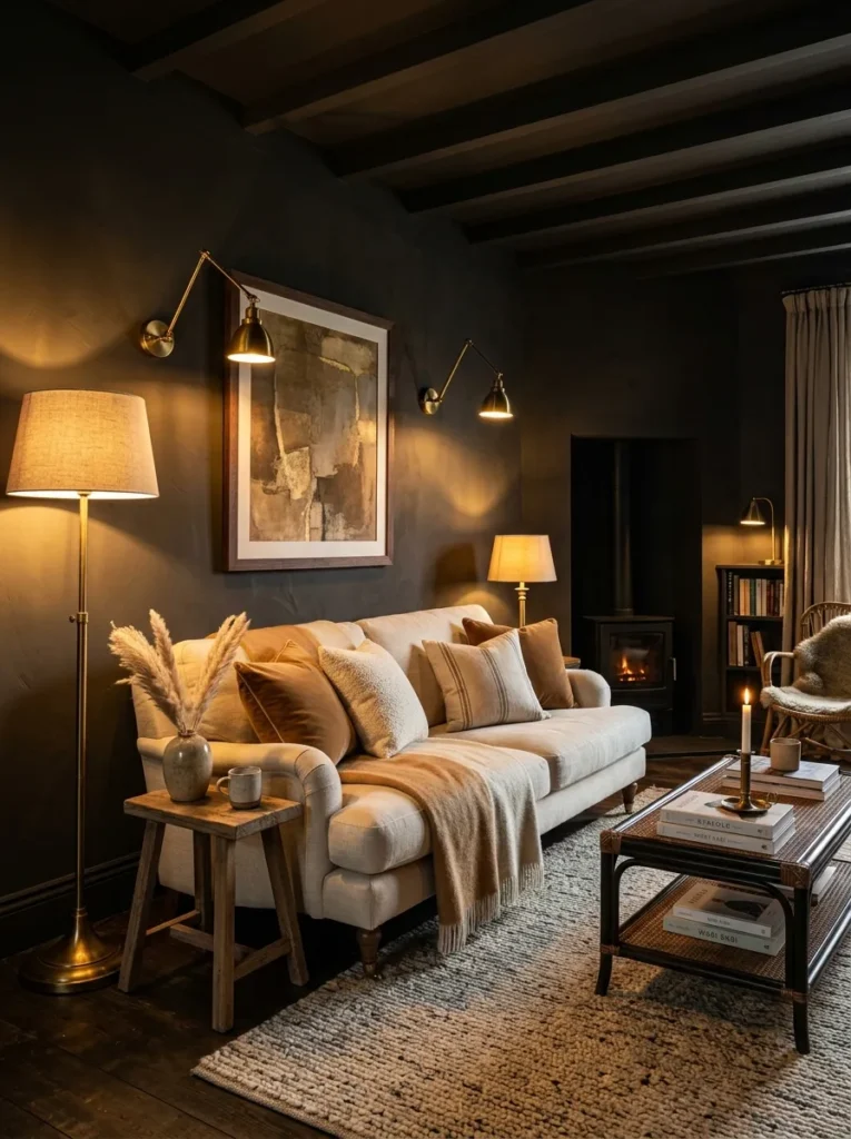
Vibe: Warm off-black feels dramatically cocooning and utterly confident — the paint color that requires maximum design courage and rewards that courage with the most dramatically beautiful living room atmosphere available.
Why it works: Warm off-black is the living room paint color of maximum atmospheric ambition — applied to all four walls, it creates the most dramatically different day-to-evening transformation of any color in this list, moving from a rich, complex near-black by day (whose warmth and undertone complexity reveal themselves in raking natural light) to the most deeply atmospheric, theatrical interior environment available by evening (when warm brass lamps create pools of golden warmth against the near-black ground). The design principle is maximum tonal drama with warmth: the critical distinction from flat black is the warm undertone — flat black absorbs all light uniformly and produces a dead, airless quality; warm off-black absorbs most light while reflecting a warm quality from its undertone that creates depth and life rather than flatness.
How to get it: Look specifically for near-blacks with warm rather than cool undertones — the warm quality should be perceptible when tested against a truly neutral cool black. LRV of 2–8. Farrow and Ball’s Off-Black, Railings, and Pitch Black offer varying depths; Little Greene’s Basalt and Black Lead; Valspar’s Black Forest and Benjamin Moore’s Mopboard Black. Test rigorously — any near-black with blue or purple undertone will read cold and harsh rather than warm and cocooning. The warmth of the undertone is the single most important selection criterion.
Pairs best with: Warm brass and antique gold in every fixture (table lamps, wall lights, picture frames, hardware), warm ivory and camel textiles, natural materials in warm wood, rattan, and wool, botanical plants, warm oak and walnut floors.
Shop The Look
| Product |
|---|
| Warm off-black interior paint matte |
| Warm brass table lamp set pair |
| Caramel and ivory cushion set sofa |
| Natural rattan decorative object warm |
| Warm oak side table living room |
How to Start Your Living Room Paint Color Journey
Your single best first move before purchasing any paint is to spend one week observing your living room’s natural light — noting at what time of day it receives direct sunlight (if any), how the quality and direction of light changes between morning and afternoon, what the dominant quality of the light is (warm and golden, or cool and blue-white), and which walls receive the most light and which are consistently in shadow. These observations determine which paint colors will work in your specific room and which will fail — the same paint color that creates a warm, glowing atmosphere in a south-facing room with warm afternoon light may read as flat and cold in a north-facing room with cool, indirect light. Light observation is the design research that no paint swatch can substitute for.
The most common mistake in living room paint color selection is choosing a color from a small paint swatch in a brightly lit paint shop or on a screen and expecting it to look the same on the walls of a specific room with a specific light quality. Small swatches systematically underrepresent the depth and impact of a color at full wall scale — a color that appears a pleasant, moderate tone on a 5cm swatch will read as significantly stronger, deeper, or more assertive on four full walls. Fix this by testing any color as a minimum 30x60cm patch painted directly on the walls in the most shadowed position in the room (where the color will read darkest) and observing across three days including both natural daylight and artificial evening light conditions before committing.
Three specific approaches that most reliably result in a successful living room paint color decision: using a color’s LRV (Light Reflectance Value) to predict its impact before painting (LRV above 70 for light, airy spaces; 40–70 for mid-tone, characterized spaces; below 40 for dramatic, immersive spaces); testing against the room’s dominant material — if the sofa is warm linen, test warm-undertoned colors; if the floor is cool grey stone, test cooler-undertoned colors; and choosing a color from the same brand as the existing white ceiling and woodwork paint to ensure the undertones are compatible and the colors read as deliberately chosen together rather than accidentally mismatched.
A single pot of test paint for wall sampling costs $5–$15 and provides the most valuable single investment in any living room paint project — multiple test pots across several candidate colors costs $20–$60 and eliminates the expensive mistake of painting a full room in a color that looks wrong in the actual space. Full room painting costs $80–$300 in materials for a standard living room — the test paint investment represents 5–20% of the total and prevents the 100% waste of repainting immediately.
Frequently Asked Questions About Elegant Living Room Paint Colors
How do I choose a paint color that will look good in a north-facing living room?
North-facing rooms receive only cool, indirect daylight — the blue-shifted light of reflected sky rather than direct sunlight — which means that colors with any degree of cool undertone (blue-grey, cool white, cool sage) will appear significantly cooler, more washed-out, and less warm than they do in warm, south-facing light conditions. The specific remedy for a north-facing living room is to choose colors from the warm end of every color family: warm white rather than brilliant or cool white, dusty sage with yellow-red undertone rather than blue-sage, warm charcoal rather than cool grey, warm navy rather than cool midnight. The warm undertone compensates for the cool quality of north-facing light, producing the warm atmosphere that the light itself cannot provide. Alternatively, commit fully to the north-facing room’s naturally cool, atmospheric quality by choosing a deliberately dramatic dark color (deep petrol, deep navy, or warm off-black) that reads as moody and atmospheric rather than trying unsuccessfully to appear warm.
What is the safest elegant paint color choice for a living room?
Warm aged white (idea 1) and warm greige (idea 5) are consistently the safest elegant paint color choices because they work with virtually any furniture and textile palette, improve perceptibly on brilliant white and cool grey without the commitment of a genuinely bold color choice, and provide the warm, light-responsive quality that distinguishes elegant paint from safe neutrality without requiring any significant design courage. If maximum safety is the priority, warm greige in the LRV 55–65 range is the single most universally appropriate living room paint color available — it reads as a genuine color choice rather than an avoidance of color, works with every furniture style and material, and creates a warm, characterful room without any stylistic risk.
Should I paint the ceiling the same color as the walls?
Extending wall color to the ceiling creates the most immersive, enveloping room effect — specifically appropriate for the deep, dramatic colors (deep forest green, deep navy, warm off-black, deep petrol) where the cocoon-like quality of total color immersion is the primary atmospheric goal. For mid-tone and light colors, painting the ceiling the same color as the walls creates a slightly enclosed quality that suits some rooms (smaller, more intimate spaces where coziness is the priority) but can reduce perceived ceiling height in rooms that already feel low. The most common approach — painting the walls in the chosen color and keeping the ceiling warm white — creates the cleanest, most widely appropriate result for the majority of living rooms. The specific exception is the dramatic dark color category, where extending to the ceiling is strongly recommended for the most striking and most considered effect.
How do I coordinate paint color with existing furniture I cannot change?
The most reliable coordination approach for a living room with existing furniture is undertone matching rather than color matching — identifying the primary undertone in the existing furniture (warm yellow-red for oak and walnut wood, cool blue-grey for contemporary grey upholstery, warm brown-red for leather, warm green for velvet) and choosing a paint color whose undertone coordinates with rather than fights the furniture’s dominant undertone. Warm-undertoned furniture (oak, walnut, warm leather, terracotta ceramics) coordinates most naturally with warm-undertoned paint colors across any color family; cool-undertoned furniture (grey concrete, cool grey upholstery, steel) coordinates more naturally with cooler-undertoned paint. A practical test: hold the paint swatch directly against the dominant furniture piece in the room’s natural light — if the two objects appear to belong to the same warm-cool temperature family, the combination will coordinate successfully.
How many paint colors should I use in a living room?
The most elegant living room paint schemes use a maximum of two to three paint colors across all surfaces — typically one dominant color for the walls, a contrasting or complementary color for the woodwork and joinery (most commonly warm white, which coordinates with every wall color), and occasionally a third accent color for a single feature element such as an alcove interior, a built-in bookcase back panel, or a chimney breast. Using the same color on walls and all joinery (architraves, skirting boards, doors, and windows) creates the most immersive and most contemporary effect, while the classic contrast of colored walls and white woodwork creates the most traditional and most crisp effect. In either case, ceiling color is typically warm white regardless of wall color, unless total color immersion (all surfaces in one color) is the deliberate design goal.
Ready to Paint Your Living Room?
These 17 colors span the full range of elegant living room paint color possibility — from the warm luminosity of aged white and the earthy sophistication of warm mushroom, through the botanical calm of dusty sage and the warm drama of terracotta, to the jewel-toned richness of deep petrol and the maximum atmospheric ambition of warm off-black — covering every lighting condition, every architectural context, every furniture palette, and every degree of design confidence from the reassuringly safe warm greige to the maximum-commitment dramatic off-black. Begin with the light observation week — seven days of genuinely watching how light moves through your specific living room at every time of day — because the paint color that works in your room is determined by your room’s specific light quality more than by any photograph, swatch, or trend report. Today’s specific action: identify the one quality your living room most lacks that paint could provide — warmth, drama, botanical calm, personality — and choose the color from this list that most directly delivers that quality in your specific lighting conditions. When your living room walls are finally the color they were always meant to be — when the morning light does something specific and beautiful to the wall surface, when the evening candlelight makes the room feel genuinely different from any room you have been in before — you will understand exactly why paint color is the single most powerful tool in interior design and why these 17 colors earn their devoted following among the most stylish homes in every design publication. Save your favorites now, especially the deep forest green and the warm off-black — they are the two colors that, once committed to, most completely transform the quality of daily life in any living room for every year you live with them.