15 Stylish Living Room Aesthetic Ideas That Actually Feel Like You
A living room aesthetic is really just a set of consistent choices — color, material, and light — repeated on purpose until a room stops looking accidental. This guide walks through 15 living room aesthetic ideas you can actually pull off, from a weekend paint swap to a full furniture rethink.
Some of these rooms are quiet and warm. Others lean bright, layered, or a little moody. What they share is restraint — nothing here relies on buying everything at once. Pick the ideas that match how you actually live, not just how a room photographs. Let’s get into it.
Jump To
- Warm Greige Walls as a Neutral Reset
- Unfinished White Oak Furniture
- Layered Lighting Over One Overhead Fixture
- A Boucle Sectional Anchor
- Terracotta and Rust Accent Layer
- Linen Drapery That Pools Slightly
- Gallery Wall With Uneven Frame Sizes
- Rattan and Cane Texture Break
- A Low-Slung Coffee Table Swap
- Sculptural Floor Lamp as a Focal Point
- Dusty Sage Accent Wall
- Vintage Rug Layered Over Jute
- Open Shelving Instead of a Closed Cabinet
- Mixed Metal Hardware and Fixtures
- A Small-Space Furniture Reconfiguration
Why This Style Works So Well
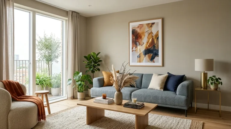
The look most of these ideas build toward is warm minimalism — a room that’s calm but not cold, built from natural materials like unfinished white oak, boucle, linen, and rattan, in a palette of warm greige, terracotta, and dusty sage. It’s having a moment because people are tired of trend-driven decor that dates fast; these materials and tones age well and mix easily. It works in small spaces too, as long as you prioritize one hero material first — usually the wood tone — and let everything else respond to it instead of competing.
| Element | Core Trait 1 | Core Trait 2 |
|---|---|---|
| Philosophy | Warmth over sterility | Texture over pattern |
| Materials | Unfinished white oak, linen | Boucle, rattan, cane |
| Color palette | Warm greige, terracotta | Dusty sage, warm white |
1. Warm Greige Walls as a Neutral Reset
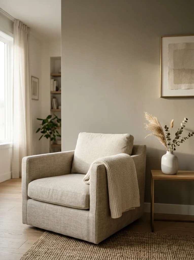
What it looks like: Quiet — the kind of neutral that shifts color slightly depending on the hour.
Why it works: Warm greige sits between beige and gray, so it avoids the yellow cast of old beige walls and the coldness of true gray. It reads as a backdrop, not a statement, which lets everything you layer on top do the talking.
How to copy it: Test a sample on the wall that gets the least direct light first — greige shifts more dramatically in shadow than most neutrals. Look for something in the 45–55% LRV range if you want it to still feel bright.
Best for: Renters testing a whole-room shift without committing to bold color.
🟡 Pro Tip: Paint a 2×2-foot swatch and check it at 8am, noon, and after sunset before committing — greige can read pink in warm light and cool in shade.
The next idea is one most people overlook entirely — and it costs almost nothing.
Also view: 15 Bedroom Light Ideas That Create a Luxe Feel
2. Unfinished White Oak Furniture
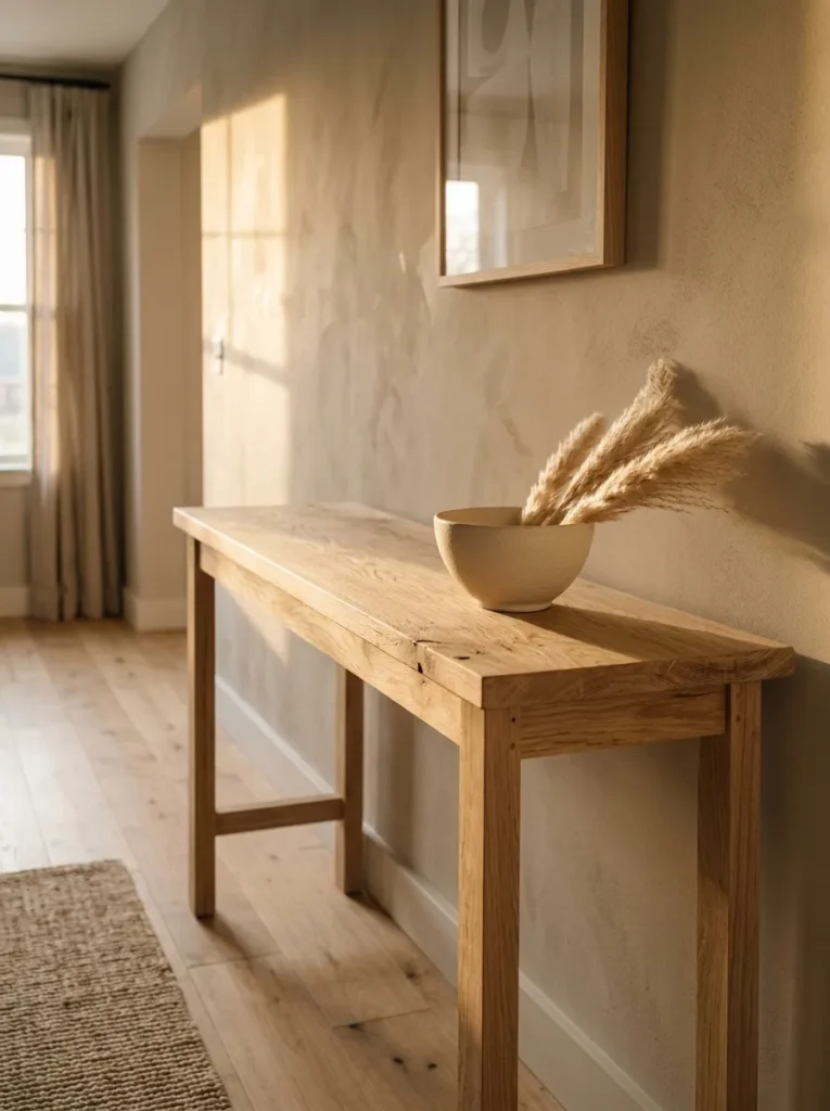
What it looks like: Raw — grain visible, no glossy stain flattening the texture.
Why it works: Unfinished or lightly oiled oak keeps the natural grain pattern visible, which adds texture without adding color or pattern competition. It’s a material choice, not a decor choice, so it works with almost any accent palette.
How to copy it: Start with one piece — a console or coffee table — finished in a hardwax oil rather than polyurethane, which keeps the matte, raw look instead of a plasticky sheen.
Best for: People building a room slowly, piece by piece.
📌 Important: Most people assume “unfinished” means untreated wood, but a hardwax oil finish is still recommended — it protects the wood while keeping the matte look intact.
3. Layered Lighting Over One Overhead Fixture
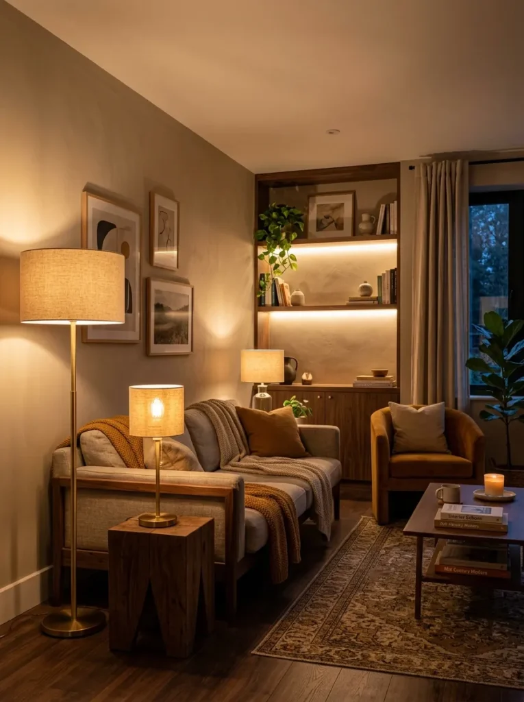
What it looks like: Layered — pools of warm light instead of one flat wash.
Why it works: A single overhead fixture creates one harsh light source and flattens shadows, which makes a room feel clinical. Three light sources at different heights create depth the way daylight through a window naturally does.
How to copy it: Add a floor lamp near the seating area, a table lamp on a side surface, and turn off the overhead entirely in the evening — use bulbs rated around 2700K for warmth.
Best for: Anyone whose living room currently relies on one ceiling light.
Shop This Look:
| Product |
|---|
| Arc floor lamp with linen drum shade |
| Table lamp with fluted glass base |
| Warm white 2700K dimmable smart bulbs |
| Plug-in LED strip lighting for shelving |
| Rotary dimmer switch adapter |
4. A Boucle Sectional Anchor
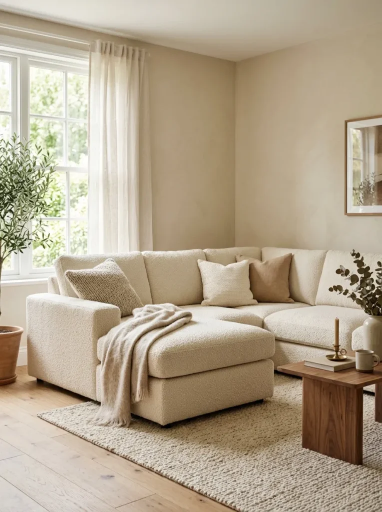
What it looks like: Soft — a texture you notice before you notice the color.
Why it works: Boucle’s looped weave catches and scatters light differently than flat upholstery, which gives a large piece visual softness instead of visual weight. On a big sectional, that matters — flat fabric on something that size can feel heavy.
How to copy it: If reupholstering isn’t realistic, a boucle slipcover or a few boucle throw pillows on an existing sofa gets you 80% of the texture effect for a fraction of the cost.
Best for: Households with a large, dated sectional they’re not ready to replace.
5. Terracotta and Rust Accent Layer
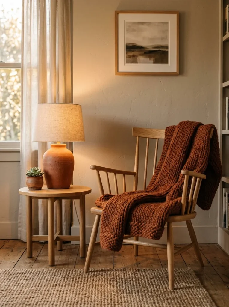
What it looks like: Sun-warmed — the one color note that keeps a neutral room from feeling flat.
Why it works: Terracotta and rust sit close to skin tones on the color wheel, which is part of why they read as warm rather than jarring next to neutrals. Used sparingly — one or two objects — they act as an accent, not competition.
How to copy it: Limit terracotta to two objects max in one sightline — a lamp base and a throw, or a vase and a pillow. More than that and it stops reading as an accent.
Best for: People who want color without repainting a wall.
🔴 Warning: Buying terracotta in bulk — three or more pieces at once — is the most common mistake here. It tips the room from “warm accent” into “themed,” which dates faster than a single well-placed piece.
Up next: the material choice that quietly anchors every room in this style.
6. Linen Drapery That Pools Slightly
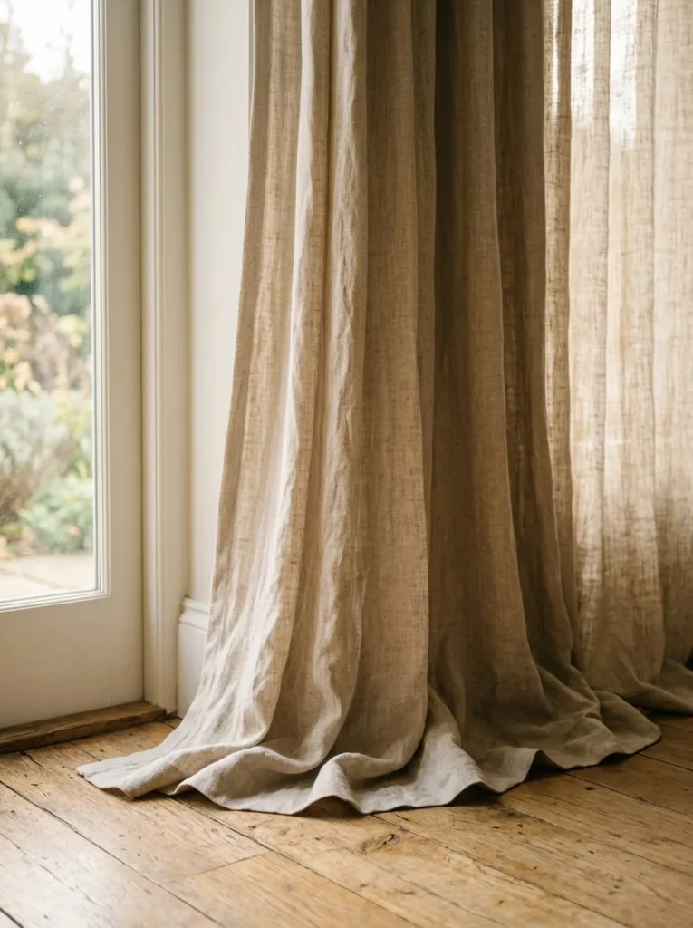
What it looks like: Luminous — fabric that filters light instead of blocking it.
Why it works: Linen has an irregular weave that diffuses light unevenly, which softens a room’s overall glare compared to cotton or synthetic blends. Hanging it a few inches longer than the floor, so it pools slightly, adds visual height to the whole window.
How to copy it: Mount the rod as close to the ceiling as your window allows, and buy panels a few inches longer than the wall height for the pooled effect — don’t hem them.
Best for: Rooms with low ceilings that need a height illusion.
📐 Small-Space Tip: Hanging curtains 4–6 inches above the actual window frame, rather than right at it, is the single fastest way to make a small room’s ceiling read taller.
7. Gallery Wall With Uneven Frame Sizes
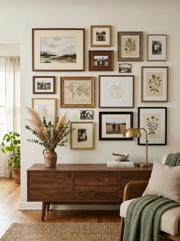
What it looks like: Layered — deliberately uneven instead of gridded.
Why it works: Uniform grid gallery walls create visual symmetry that reads as formal and a little stiff. Uneven sizing forces the eye to move around the wall instead of scanning it in a straight line, which creates more perceived depth.
How to copy it: Lay the arrangement out on the floor first, keep roughly 2–3 inches between frames, and anchor the largest piece off-center rather than in the middle.
Best for: People with an existing mix of art and photos they haven’t found a use for.
8. Rattan and Cane Texture Break
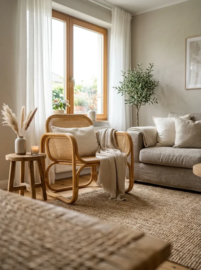
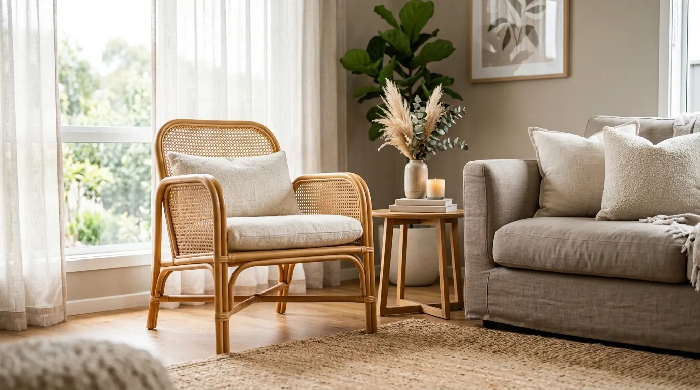
What it looks like: Layered — a woven texture that breaks up smooth upholstery and flat wood.
Why it works: Rattan’s open weave introduces visual lightness and shadow play that solid furniture can’t, which is especially useful next to something heavy like a boucle sectional — it keeps the room from feeling texturally one-note.
How to copy it: One rattan or cane piece — a chair, a mirror frame, or a pendant shade — is usually enough. More than two in one room starts to feel like a themed set rather than a natural mix.
Best for: Rooms that already feel a little heavy or overstuffed.
💰 Budget Version: A cane-front cabinet insert or a single rattan pendant shade under $60 gets the texture in without a full chair purchase.
This next one surprised even experienced decorators the first time they tried it.
9. A Low-Slung Coffee Table Swap
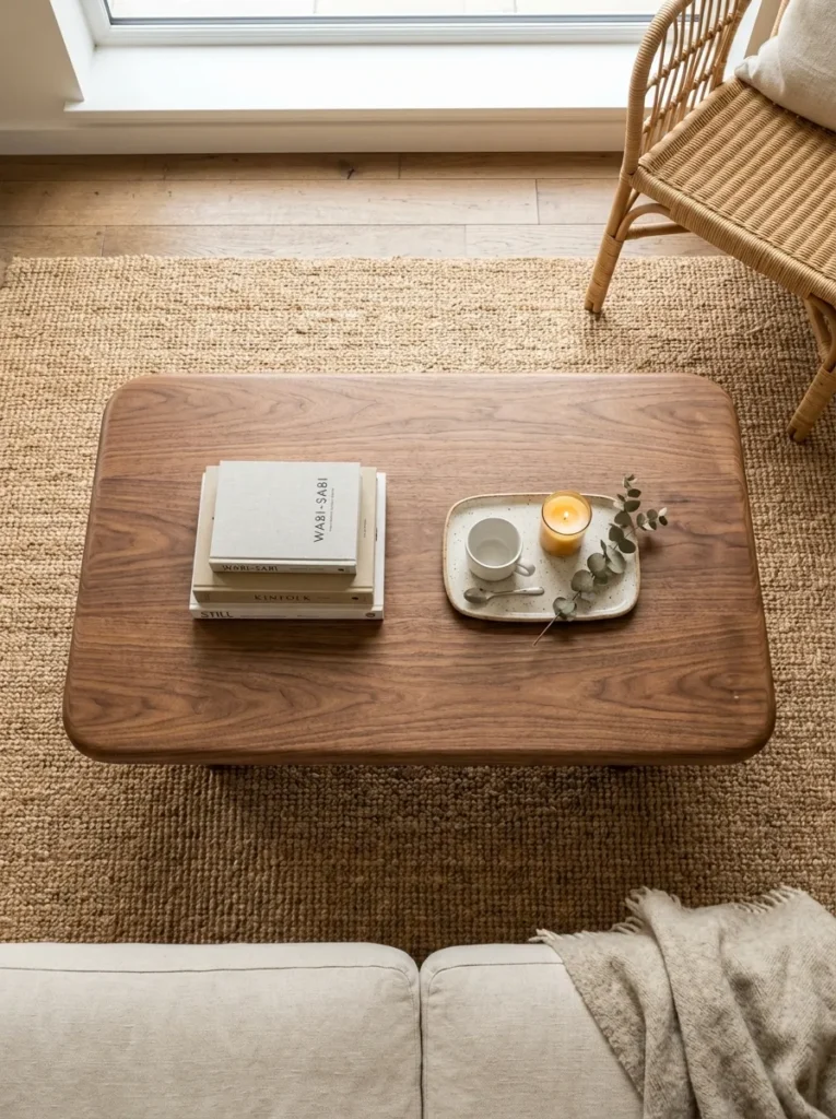
What it looks like: Grounded — closer to the floor than most modern tables default to.
Why it works: A lower table shrinks the visual mass in the middle of the room and opens up sightlines across it, which matters more in smaller rooms than people expect. Rounded edges also soften the geometry against a boxy sofa.
How to copy it: Look for a table 14–16 inches tall instead of the standard 18, and prioritize rounded or organic edges over sharp rectangular ones if the room already has a lot of straight lines.
Best for: Small or narrow living rooms where furniture feels cramped together.
10. Sculptural Floor Lamp as a Focal Point
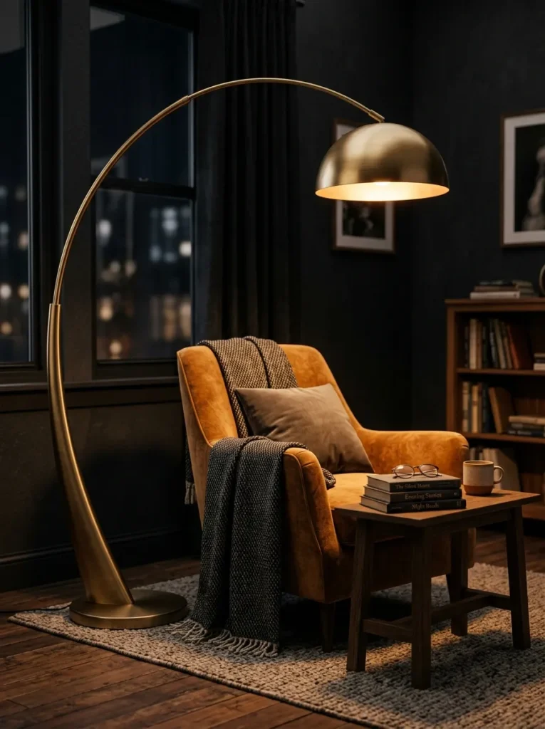
What it looks like: Moody — a single dramatic shape doing the work of a whole vignette.
Why it works: A sculptural lamp works as both function and focal point, which means it can replace a piece of wall art or a second accent object entirely. Its silhouette adds visual interest even when the light is off.
How to copy it: Place it beside — not directly behind — a reading chair, angled so the curved arm is visible from the main seating sightline, not hidden against a wall.
Best for: Renters who can’t hang heavy art but want a statement piece.
11. Dusty Sage Accent Wall
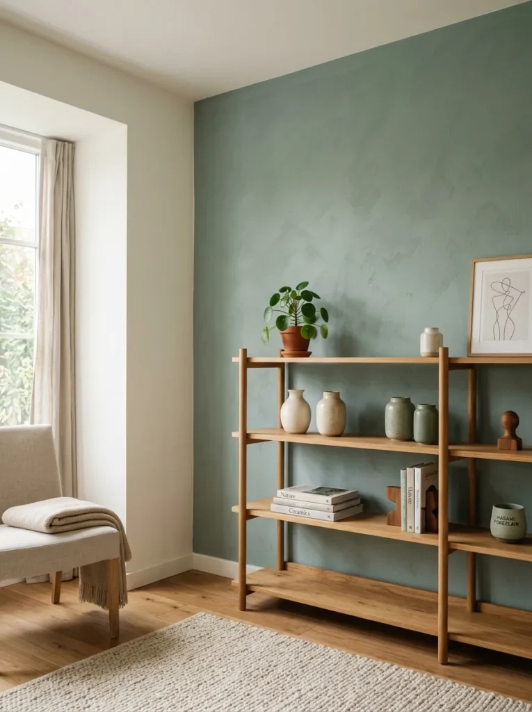
What it looks like: Still — a green muted enough to feel neutral from across the room.
Why it works: Dusty sage has enough gray mixed in that it behaves more like a neutral than a bold color choice, so it pairs with warm wood tones without fighting them the way a brighter green would.
How to copy it: Paint the wall behind your main furniture piece, not a random wall — sage works best as a backdrop for something, like shelving or a sofa, rather than standing alone.
Best for: People who want color commitment without a bold statement.
12. Vintage Rug Layered Over Jute

What it looks like: Layered — worn pattern on top of raw natural texture.
Why it works: Layering a smaller patterned rug over a larger jute one adds depth and defines the seating area without committing to a single busy rug covering the whole floor. The jute underneath also softens the transition to bare floor.
How to copy it: Size the jute rug to fit under the front legs of your seating, and layer a vintage or vintage-style rug roughly two-thirds that size, centered or slightly offset.
Best for: People styling a rental where a single large rug isn’t in the budget yet.
✅ Rug Layering Checklist:
- [ ] Measure your seating area to size the base jute rug first
- [ ] Choose a vintage-style rug roughly 60–70% the size of the base rug
- [ ] Center the top rug, or offset it slightly toward the main seating
- [ ] Add a rug pad underneath both layers to prevent slipping
- [ ] Vacuum on a low-suction setting to protect the vintage pile
13. Open Shelving Instead of a Closed Cabinet
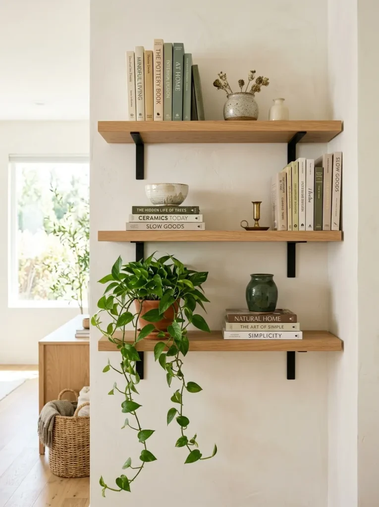
What it looks like: Airy — visually lighter than a solid cabinet in the same footprint.
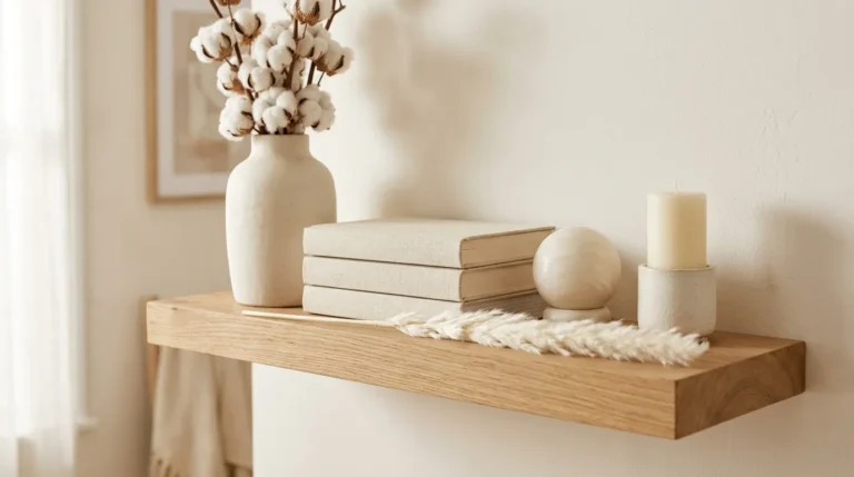
Why it works: Open shelving lets wall color show through between objects, which keeps a room feeling open even when it’s storing the same amount as a closed cabinet. It also forces more intentional styling, since clutter is visible.
How to copy it: Style each shelf with the rule of three — one object, one stack, one plant or greenery — and leave at least 30% of each shelf empty so it doesn’t read as crowded.
Best for: Small rooms where a bulky cabinet eats too much visual space.
In my experience, people always want to fill every inch of a new open shelf immediately — the shelves that actually photograph and live well have visible empty space between groupings, closer to 30% negative space than the 10% most first attempts land on.
14. Mixed Metal Hardware and Fixtures
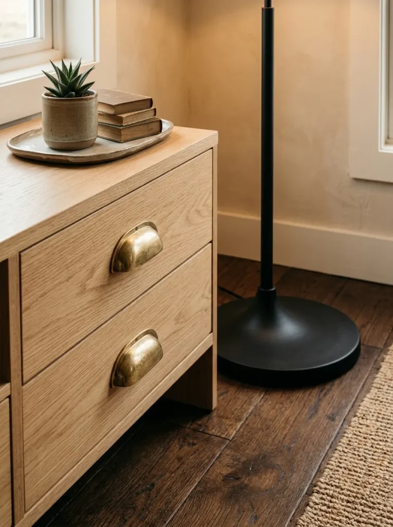
What it looks like: Grounded — two metals reading as intentional rather than mismatched.
Why it works: Mixing a warm metal like brass with a cool one like matte black creates contrast that keeps a neutral room from feeling too soft or too flat. The key is repetition — each metal needs to appear at least twice for it to look planned.
How to copy it: Pick two metals max, and use each one on at least two different objects — say, brass on lamp bases and drawer pulls, black on light fixtures and picture frames.
Best for: People updating hardware without replacing furniture.
15. A Small-Space Furniture Reconfiguration
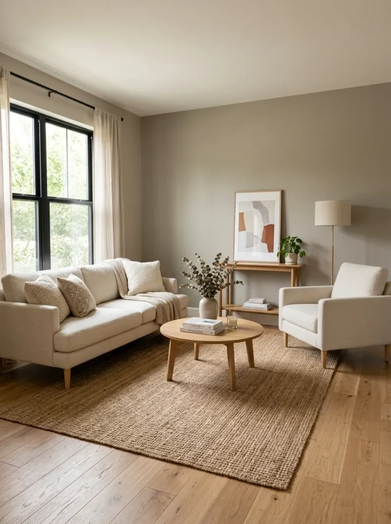
What it looks like: Open — a small room that finally has a clear sightline across it.
Why it works: Pushing furniture flat against every wall is the default instinct in a small room, but it actually makes the center feel like dead, unused space. Floating a sofa a few inches off the wall and angling pieces toward each other creates a defined seating area instead of a room that just holds furniture.
How to copy it: Pull your main seating piece 4–6 inches off the wall, and angle a chair or two toward the sofa rather than lining everything up in parallel rows.
Best for: Small-space decorators who feel like their room has no clear layout.
Get the Look:
| Product |
|---|
| Compact swivel accent chair |
| Slim console table for behind-sofa placement |
| Nesting side tables for flexible seating |
| Wall-mounted picture ledge |
| Storage ottoman with removable lid |
How to Start Your Living Room Transformation
What I’ve found with real spaces is that paint always comes before furniture. Choose your warm greige or dusty sage first, live with it for a few days, and let it dictate the undertones you pull for everything else — starting with furniture and working backward almost always creates mismatched warm-and-cool clashes down the line.
In practice, the most common fixable mistake is mixing warm wood tones with cool-gray upholstery without a bridge color between them. It breaks the room because the eye reads it as two separate design decisions instead of one. Fix it with a warm neutral throw or rug that touches both pieces.
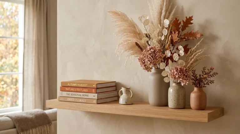
Three items under $50 that create immediate impact: a single stem of dried pampas grass in a matte ceramic bud vase, a chunky ribbed wool throw folded over an armrest, and a set of unlacquered brass drawer pulls swapped onto an existing console.
A full room refresh realistically takes 4–8 weekends if you’re doing it piece by piece, or one intense weekend if you’re only repainting and rearranging. Budget $300–$600 for a starter refresh using existing furniture, or $1,500–$3,500 for a fuller room with new upholstery and lighting.
Ready to Create Your Warm-Minimalist Living Room?
These 15 ideas cover a lot of ground — wall color, wood texture, layered lighting, and small-space layout tricks all working toward the same warm, grounded feeling. You don’t need to do all of it at once; even one or two changes, like swapping the coffee table or repainting a single wall, shift how the whole room reads. Start today with the cheapest move on this list: fold a wool throw over your sofa arm and see how much warmth one texture adds. The philosophy behind this style is simple — a room that feels lived-in on purpose, not staged. Pin your favorites now so you’ve got a visual reference ready when you’re standing in the paint aisle.