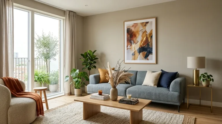
17 Living Room Wall Decor Ideas for Every Style
Wall decor is the fastest way to change how a living room feels without touching a single piece of furniture. This guide walks through 17 living room wall decor ideas — from a five-minute gallery rehang to a full wall treatment — that work whether your room leans modern, traditional, or somewhere in between.
Blank walls make a room feel unfinished even when everything else is styled well. A few of these ideas cost almost nothing and take an afternoon. Others are bigger commitments worth planning around. Either way, the goal is the same: walls that do more than hold paint. Let’s get into it.
What’s Inside
- An Anchor Piece Sized to the Wall, Not the Room
- A Gallery Wall Built From a Grid Template
- Picture Ledges Instead of Nail Holes
- A Statement Mirror Opposite the Main Window
- Woven Wall Hangings for Texture
- Plate Walls for an Unexpected Layer
- Floating Shelves Styled in Threes
- A Single Oversized Art Print
- Sconces Flanking a Sofa or Console
- A Textured Paint or Plaster Accent Wall
- Framed Textiles Instead of Traditional Art
- A Vertical Gallery for Narrow Walls
- Wall-Mounted Planters for Living Texture
- A Rotating Seasonal Display Ledge
- Mixed-Media Wall Art for Depth
- Behind-the-Sofa Wall Decor That Fills Negative Space
- Small-Space Wall Decor That Doesn’t Crowd the Room
Why Living Room Wall Decor Makes Such a Difference
Bare or under-decorated walls are one of the biggest reasons a fully furnished living room still feels incomplete — the eye reads empty vertical space as unfinished, no matter how good the furniture below it is. Wall decor works because it fills that space with intention: a mirror bounces light, a gallery wall adds personality, shelving adds function. It matters especially in small rooms, where going vertical is often the only real space left to work with. If you’re starting from scratch, prioritize one large anchor piece before adding smaller accents — a room with one confident choice reads better than a wall with five uncertain ones.
| Best starting point | One large anchor piece sized to at least two-thirds the width of your sofa |
| Biggest impact area | The wall directly above or behind main seating |
| Budget to start | $40–$150 for a starter piece; $300–$800 for a full wall treatment |
| Time to complete | A single accent piece: under an hour. A full gallery wall: one weekend |
1. An Anchor Piece Sized to the Wall, Not the Room
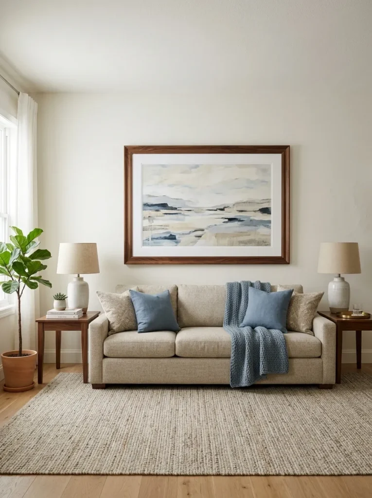
What it looks like: Grounded — a single piece large enough to anchor the whole wall instead of floating in the middle of it.
Why it works: Undersized art is the single biggest wall decor mistake — a small frame on a big wall reads as an afterthought because there’s too much empty space competing with it. Sizing to roughly two-thirds the width of the furniture below creates proportion the eye reads as correct.
How to copy it: Measure your sofa or console width, multiply by 0.66, and use that as your minimum art width when shopping — don’t round down.
Best for: Anyone who’s bought “one more small frame” and still feels the wall is empty.
⚠️ Warning: Buying art based on what fits your budget instead of what fits the wall is the most common version of this mistake — a cluster of small pieces almost never reads as intentional the way one correctly sized piece does. Measure first, shop second.
The next idea is one most people overlook entirely — and it costs almost nothing.
Also view: 17 Chic IKEA KALLAX Bedroom Ideas for Storage
2. A Gallery Wall Built From a Grid Template
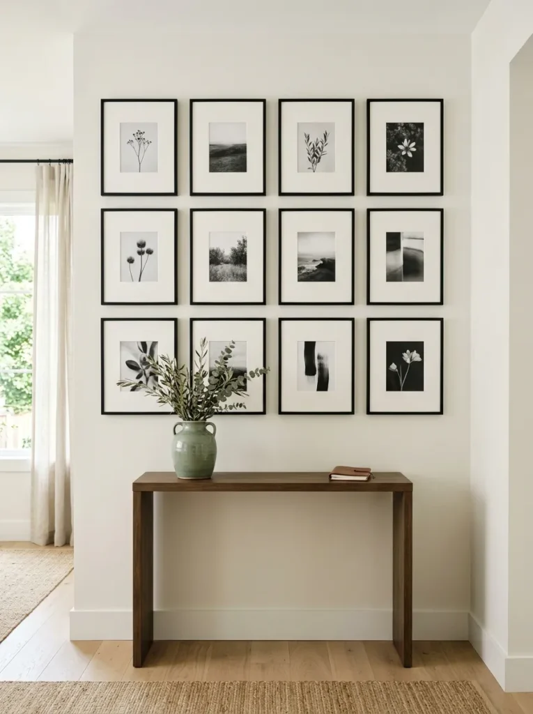
What it looks like: Organized — evenly spaced frames that read as one cohesive block.
Why it works: A grid layout works with almost any style because the structure does the visual organizing for you — even mismatched art content looks intentional when the spacing and frame color are consistent.
How to copy it: Cut paper templates to the exact frame sizes, tape them to the wall first, and keep spacing consistent at 2–3 inches between every frame before you commit to a single nail hole.
Best for: Beginners who want a gallery wall but are nervous about asymmetry.
Find It Online:
| Product |
|---|
| Matching black gallery frame set |
| Picture hanging kit with adhesive strips |
| Laser level for straight alignment |
| Museum-quality mat boards |
| Fine art print set |
3. Picture Ledges Instead of Nail Holes
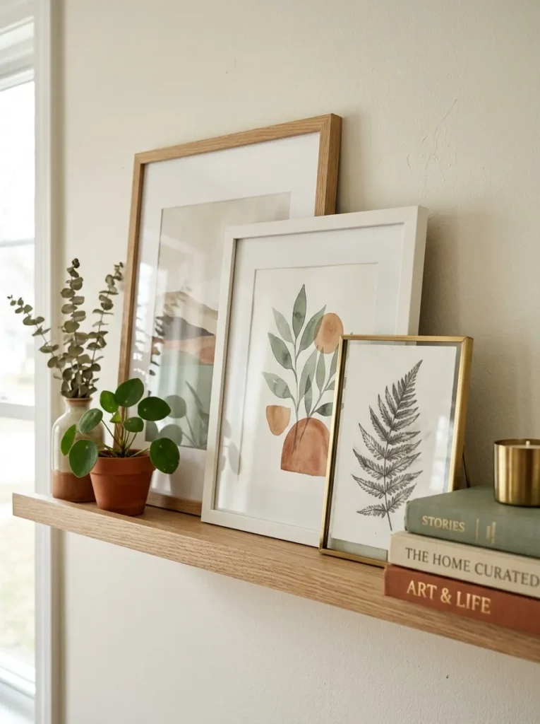
What it looks like: Casual — leaned, not hung, so nothing feels permanent.
Why it works: Ledges let you overlap and layer frames the way a gallery wall can’t, and because pieces lean instead of hang, you can rearrange or swap them out in minutes without new nail holes.
How to copy it: Mount the ledge at roughly eye level from a seated position — usually 55–60 inches from the floor — and overlap frames by about a third for the layered look.
Best for: Renters and anyone who likes to rotate their art seasonally.
🟡 Pro Tip: Attach a small strip of removable putty to the back bottom corner of each leaning frame — it stops pieces from sliding forward without leaving marks when you rearrange them.
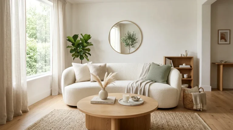
4. A Statement Mirror Opposite the Main Window
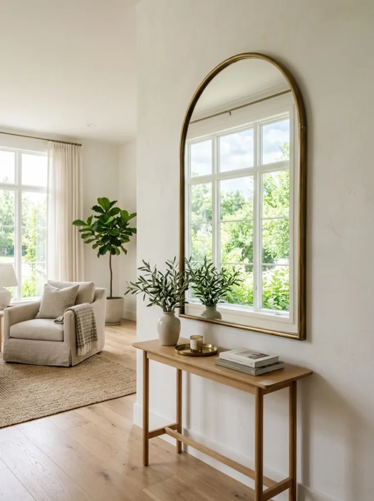
What it looks like: Airy — a room that suddenly reads bigger and brighter.
Why it works: A mirror placed directly across from a window bounces natural light back into the room rather than absorbing it into a wall, which is a genuine brightness gain, not just a visual trick.
How to copy it: Hang it directly opposite — not adjacent to — your main window, and angle it slightly if needed so it catches window light rather than reflecting a blank wall.
Best for: Rooms with only one main light source that still feel dim by afternoon.
5. Woven Wall Hangings for Texture
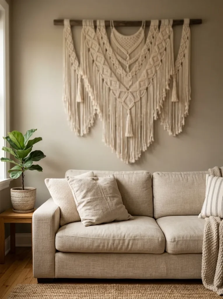
What it looks like: Textural — dimensional in a way flat framed art can’t be.
Why it works: A woven piece adds shadow and depth because the fibers catch light unevenly, which gives a wall visual interest without needing color or a busy pattern to do the work.
How to copy it: Size it to at least 30 inches wide for a standard sofa wall — smaller pieces tend to disappear once they’re up rather than reading as a feature.
Best for: Anyone who wants texture on the wall without adding another color to the room.
6. Plate Walls for an Unexpected Layer
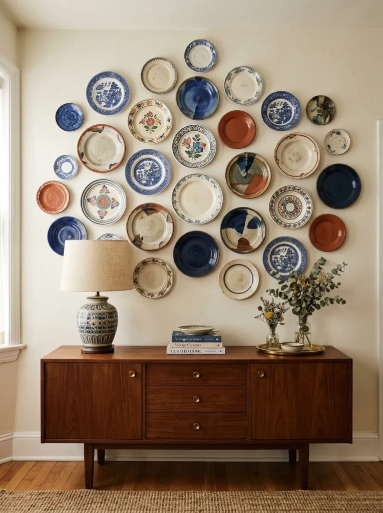
What it looks like: Collected — like it was gathered over years, not bought in one trip.
Why it works: Mixed ceramic plates add dimensional pattern that traditional flat art can’t, and because plates are naturally varied in glaze and size, the arrangement reads as curated even with just a handful of pieces.
How to copy it: Start with an odd number — five or seven — and vary the sizes rather than buying a matched set; use adhesive plate hangers rated for the plate’s actual weight.
Best for: People with an eclectic or maximalist streak who want a wall with personality.
Important: Most people assume plate hangers are one-size-fits-all, but hanger wire gauge needs to match the plate’s weight — a heavy stoneware plate on a thin wire hanger is a common cause of plates slipping or cracking months later.
Up next: the wall storage solution most people don’t realize doubles as decor.
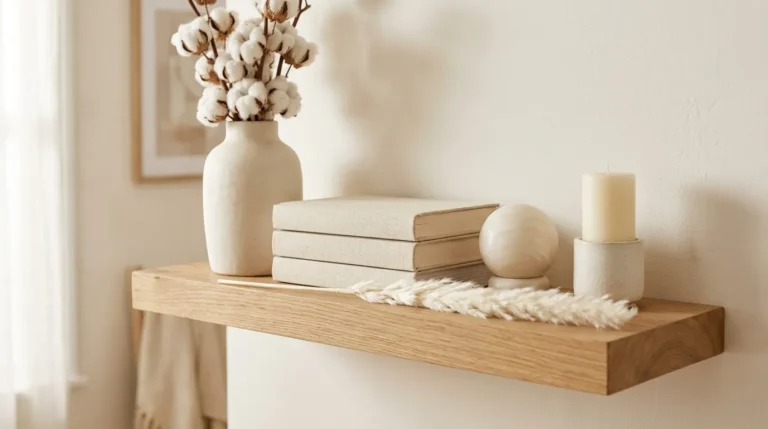
7. Floating Shelves Styled in Threes
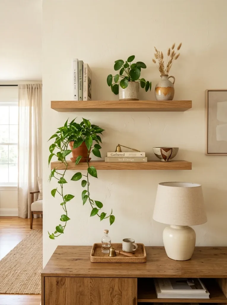
What it looks like: Curated — each shelf grouped, not scattered.
Why it works: Shelves give you decor and storage in the same footprint, and grouping objects in threes of varying height creates a visual triangle the eye naturally finds pleasing, rather than a flat, even row.
How to copy it: Style each shelf with one tall item, one short stack, and one small accent — never three objects of the same height in a row.
Best for: People who want function built into their wall decor, not just visual filler.
Where to Shop:
| Product |
|---|
| Floating wall shelf set with hidden brackets |
| Small trailing houseplant in ceramic pot |
| Stacked hardcover books for shelf styling |
| Small textured ceramic bowl |
| Miniature framed print for shelf leaning |
8. A Single Oversized Art Print
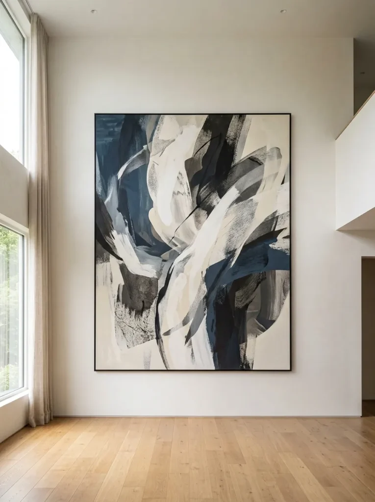
What it looks like: Confident — one piece, no clutter, no competition.
Why it works: A single oversized piece uses negative space as part of the design, which reads as more deliberate than a wall packed with smaller items — restraint is its own kind of statement here.
How to copy it: Resist the urge to add anything else to that wall — let the empty space around the print do some of the visual work instead of filling it.
Best for: People who find gallery walls overwhelming to plan.
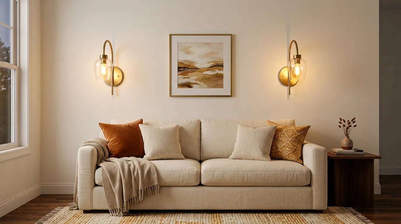
9. Sconces Flanking a Sofa or Console
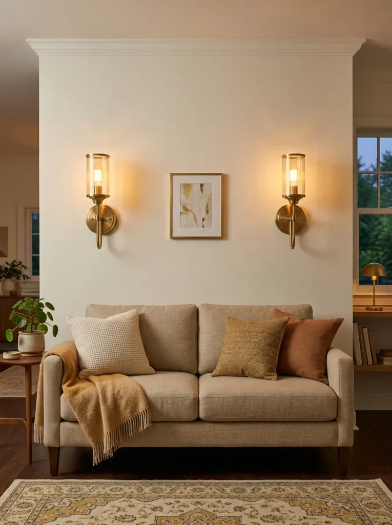
What it looks like: Warm — light and decor doing double duty on the same wall.
Why it works: Sconces free up floor and table space that lamps would otherwise take, while adding symmetry and a warm light source directly to the wall — function and decor in one fixture.
How to copy it: Mount sconces at roughly 60–66 inches from the floor, evenly spaced on either side of your central piece, and match them to your other metal finishes in the room.
Best for: Small rooms where floor lamps are eating up walking space.
💡 Quick Win: Plug-in sconces with a cord cover kit skip the electrician entirely — you get the same look without any wiring work.
10. A Textured Paint or Plaster Accent Wall
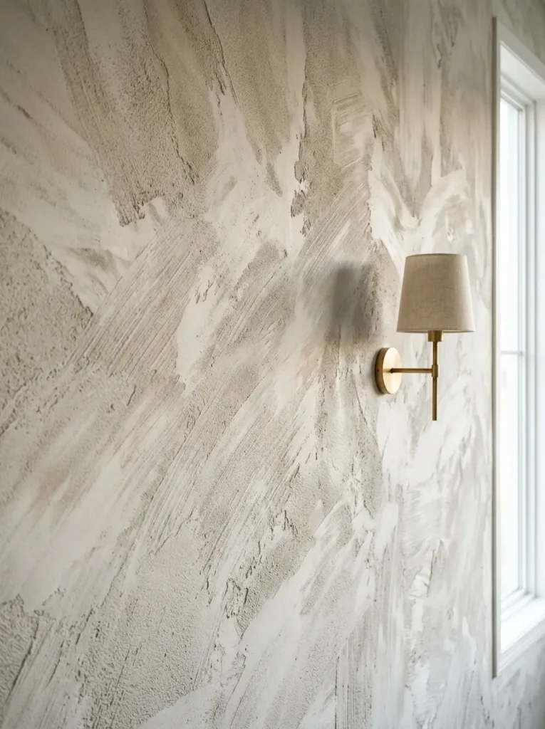
What it looks like: Raw — texture visible from across the room, not just up close.
Why it works: Textured finishes like limewash catch light unevenly across the wall, creating tonal variation that flat paint simply can’t produce — it becomes the decor rather than a backdrop for it.
How to copy it: Test a small section first — textured finishes are far harder to touch up or repaint over cleanly than flat paint, so commit only after seeing it dry fully.
Best for: People ready for a bigger, more permanent wall project.
⚠️ Warning: Skipping the test patch is the most expensive mistake here — limewash and plaster finishes dry several shades lighter than they look wet, and full-wall regret is a common, costly redo.
11. Framed Textiles Instead of Traditional Art
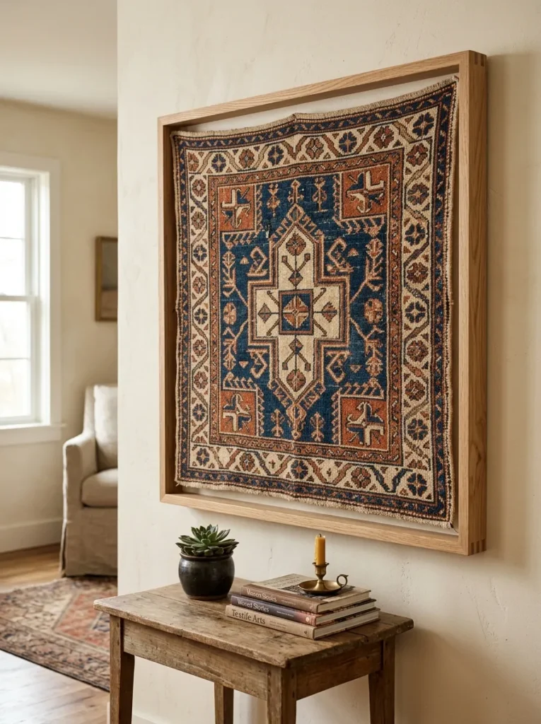
What it looks like: Unexpected — fabric doing the job a painting usually does.
Why it works: A framed textile brings in pattern and softness that a printed canvas doesn’t have, and because fabric absorbs rather than reflects light, it reads warmer than glossy framed prints in the same spot.
How to copy it: Use a shadow-box style frame without glass so the fabric texture stays visible, and stretch the textile taut over foam board before framing to avoid sagging.
Best for: People with a vintage scarf, tapestry, or fabric remnant they’ve been storing rather than displaying.
This next one surprised even experienced decorators the first time they tried it.
12. A Vertical Gallery for Narrow Walls
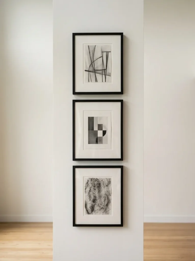
What it looks like: Elongated — height where a wide gallery simply wouldn’t fit.
Why it works: Stacking frames vertically instead of spreading them horizontally draws the eye upward, which makes a narrow wall or hallway-adjacent space feel taller and more resolved rather than cramped.
How to copy it: Keep every frame in the column the same width, and space them 2 inches apart maximum — wider gaps break the vertical line the eye is meant to follow.
Best for: Awkward narrow walls beside doorways or between windows.
13. Wall-Mounted Planters for Living Texture
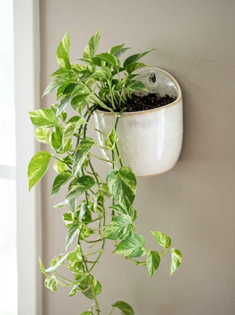
What it looks like: Alive — decor that changes and grows instead of staying static.
Why it works: A wall planter adds color and movement that framed decor can’t, since the trailing vine shape shifts over time — it’s one of the only wall decor options that’s genuinely never finished.
How to copy it: Choose a low-maintenance trailing plant like pothos or philodendron, and mount the planter where it gets indirect light, not direct sun through glass.
Best for: Plant owners who’ve run out of floor and shelf space.
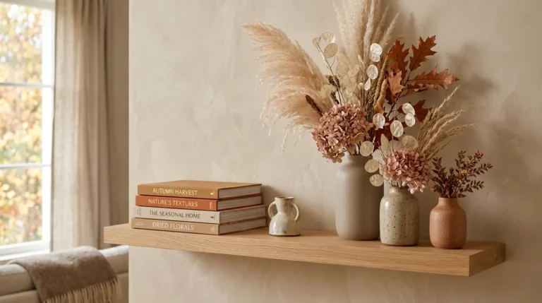
14. A Rotating Seasonal Display Ledge
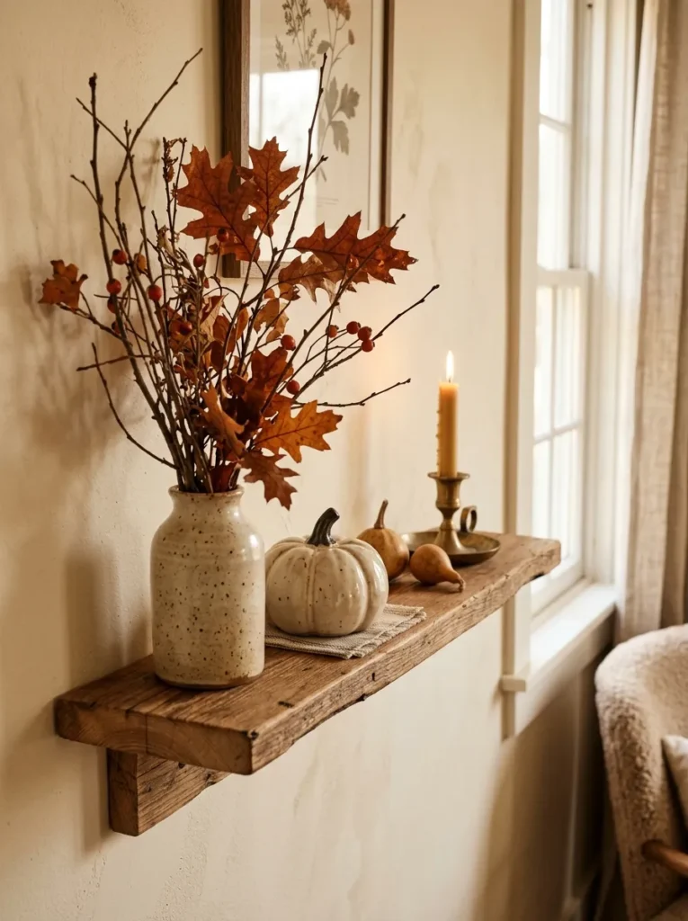
What it looks like: Casual — a wall spot that changes with the calendar instead of staying fixed.
Why it works: A dedicated small ledge gives you one low-commitment spot to update seasonally, which satisfies the urge to redecorate without touching the rest of the room’s permanent decor.
How to copy it: Keep the ledge itself neutral and let only the styled objects change — swap two or three pieces per season rather than restyling the whole thing each time.
Best for: People who like to decorate for holidays but don’t want it to take over the room.
In my experience, the wall spot people redecorate seasonally works far better around 30–36 inches wide — anything narrower and swapped-in seasonal pieces start to look cramped instead of intentional, which is the opposite of what a rotating display is supposed to feel like.
15. Mixed-Media Wall Art for Depth
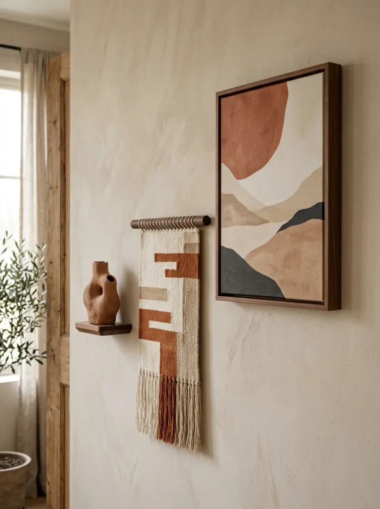
What it looks like: Layered — different materials sharing one wall without competing.
Why it works: Mixing a flat print with a dimensional object, like a small sculptural piece or a textile, creates depth that an all-framed wall can’t achieve — the varying materials catch light differently at every angle.
How to copy it: Anchor the group with one flat piece, add one dimensional object, and keep the color palette tight — no more than three colors total — so the material mix doesn’t turn visually noisy.
Best for: People who’ve collected a few different types of decor and aren’t sure how to combine them.
What You’ll Need:
| Product |
|---|
| Small framed abstract print |
| Sculptural wall-mounted wood object |
| Small framed textile swatch |
| Removable wall anchors for mixed weights |
| Museum putty for lightweight pieces |
16. Behind-the-Sofa Wall Decor That Fills Negative Space
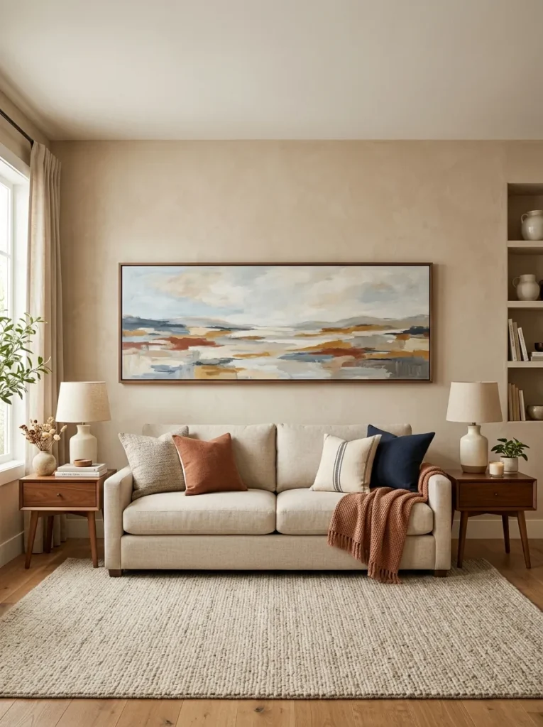
What it looks like: Balanced — the empty strip above the sofa finally resolved.
Why it works: The wall directly behind a sofa is usually the largest continuous empty space in a living room, and because it sits at eye level for anyone standing, it has an outsized visual impact relative to its size.
How to copy it: Hang the bottom edge of the art 8–10 inches above the sofa back, and center it to the sofa itself, not the wall, if the two don’t align.
Best for: Anyone whose sofa wall is still bare months after moving in.
17. Small-Space Wall Decor That Doesn’t Crowd the Room
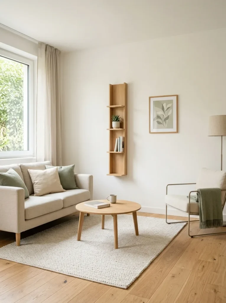
What it looks like: Open — decor that adds interest without eating into the room’s footprint.
Why it works: In a small room, wall decor that projects deeply off the wall — bulky frames, deep shelves — visually shrinks the space more than people expect, even though it doesn’t touch the floor plan at all.
How to copy it: Choose shelving under 8 inches deep and frames with slim, low-profile molding, and keep the total number of wall objects lower than you would in a larger room.
Best for: Small apartments and studio living rooms where every inch of visual space counts.
✅ Small-Space Wall Decor Checklist:
- [ ] Measure wall width and set a maximum decor footprint before shopping
- [ ] Choose shelving under 8 inches deep to avoid visually shrinking the room
- [ ] Pick slim, low-profile frame molding over chunky frames
- [ ] Limit wall objects to one anchor piece plus two smaller accents
- [ ] Leave at least 20% of the wall visibly empty around the grouping
How to Start Your Living Room Wall Decor Project
What I’ve found with real spaces is that measuring always comes before shopping. Measure your main wall and the furniture beneath it first, then shop with those exact dimensions written down — buying art you love without knowing if it fits the wall is the single most common reason people end up with pieces stacked in a closet.
In practice, the most common fixable mistake is hanging everything too high. Art and mirrors should generally center around 57–60 inches from the floor, or 8–10 inches above furniture — hung too high, even great pieces feel disconnected from the room below them.
Three items under $50 that create immediate impact: a set of adhesive picture-hanging strips that let you test placement without nail holes, a small framed print sized for a picture ledge, and a plug-in wall sconce with a cord cover kit for instant warm lighting.
A single accent piece can go up in under an hour. A full gallery wall or shelf styling project realistically takes one weekend, including planning and adjusting placement. Budget $40–$150 to start with one or two pieces, or $300–$800 for a full wall treatment with shelving, lighting, and art combined.
Ready to Fill Your Living Room Walls?
These 17 ideas cover a lot of ground — anchor art, texture, lighting, shelving, and layout tricks that all solve the same problem from different angles. You don’t need to tackle every wall at once; even one resized piece of art over the sofa changes how the whole room reads. Start today with the simplest move on this list: measure your main wall and note the exact width before you buy anything else. The right wall decor makes a room feel finished and considered, like it was arranged on purpose rather than assembled piece by piece. Save your favorites now so you’ve got a plan ready before your next trip to the frame shop.