15 Elegant Kitchen Counter Ideas That Look Expensive
An elegant kitchen counter is a horizontal work surface styled with the specific combination of material quality, compositional restraint, and deliberate object curation that makes a kitchen counter read as genuinely designed rather than merely functional — a surface where every visible object has earned its place through beauty, daily use, or both, and where the counter material itself is allowed to be seen and appreciated rather than buried under accumulated kitchen equipment. This article gives you 15 elegant kitchen counter ideas across material display, appliance editing, botanical and organic elements, cutting board and tray styling, lighting, and finishing details so every decision on your kitchen counter contributes to a surface that looks genuinely expensive regardless of the actual budget behind it.
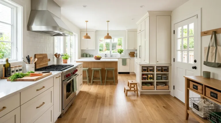
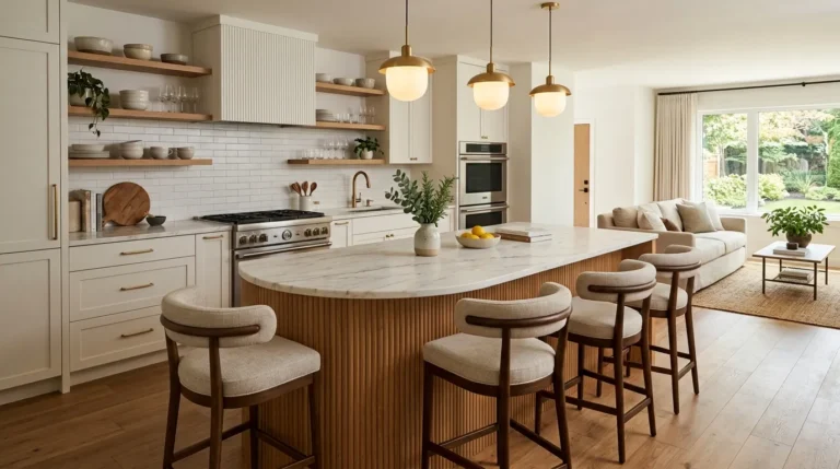
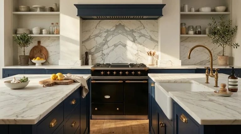
The quality that makes a kitchen counter look expensive is not primarily the counter material itself — it is the discipline exercised in what is placed on top of it and how those objects relate to each other and to the counter surface beneath them. A Calacatta marble counter buried under a toaster, a coffee maker, a bread box, a knife block, a fruit bowl, and a collection of mismatched appliances reads as cluttered and expensive; the same marble counter with three deliberately chosen objects reads as genuinely luxurious. The counter’s material quality and the space around it are more visible than anything placed on top of it. Here are 15 ideas worth saving — and implementing.
Why Kitchen Counter Styling Creates Expensive-Looking Kitchens
Kitchen counter styling draws from the visual principles that govern the most admired kitchen interiors in residential design and editorial photography — specifically the understanding that kitchen counters are the room’s primary horizontal visual surface, visible from the kitchen’s entry, from the adjacent dining or living areas in open-plan homes, and from every position in the kitchen itself. The counter surface is simultaneously the kitchen’s most-used work surface and its most consistently visible design element, which means the styling decisions made on that surface affect the kitchen’s perceived quality every moment of every day.
The design traditions most directly relevant to kitchen counter styling are the French farmhouse kitchen (where the counter holds only the objects used daily — a single mortar and pestle, a ceramic oil cruet, a bunch of fresh herbs in a jar of water), the contemporary quiet luxury kitchen (where the counter’s material quality is the primary design statement and objects are minimized to allow that material to speak), and the Japanese kitchen aesthetic (where every object is chosen for genuine quality, kept in perfect condition, and stored away when not in immediate use). All three traditions share the core principle: the kitchen counter’s most important function is to be seen as well as used, and how it is seen is determined more by what is removed than by what is added.
What to Prioritize
| Priority | Detail |
|---|---|
| First | Subtract — remove 50% of current counter objects before adding anything |
| Second | Material quality in what remains — one quality object reads better than three mediocre ones |
| Third | Consistent material palette — limit counter objects to two or three material families |
| Fourth | Counter surface visibility — the counter material itself should be seen between objects |
15 Elegant Kitchen Counter Ideas That Look Expensive
1. Marble or Stone Pastry Board as Permanent Styling Object
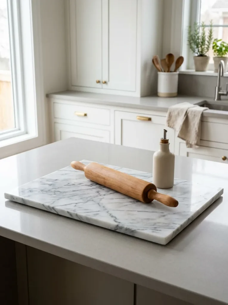
Vibe: The board is professional — a large marble pastry board as a permanent counter element creates a professional kitchen quality at the counter surface level, where the marble board’s natural veining and cool mineral surface adds a second layer of luxury material to the counter composition.
Why it works: A large marble board positioned on a counter surface creates two simultaneous improvements to the counter’s visual quality. It introduces a second luxury material at counter level (marble on quartz, or marble on laminate, or marble on wood) that adds material depth and interest to the counter zone without any vertical height. It also provides a designed zone within the counter surface — the board creates a compositional boundary that defines the objects resting on it as belonging to a specific area rather than being randomly distributed across the counter. Marble boards are genuinely functional objects (used for pastry, chocolate, and cheese work because the cool stone surface prevents butter from melting) rather than purely decorative, which means their counter presence communicates that the kitchen is used by someone who cooks seriously.
How to get it: Genuine marble pastry boards are available from kitchen specialty retailers and stone suppliers at $60–$200 for quality versions in the 16×20-inch to 18×24-inch sizes appropriate for counter display. A marble board in the same stone family as the counter — or deliberately contrasting with it — creates the best material relationship. On a white quartz counter, a Carrara marble board (white with grey veining) creates a subtle material layering; on a dark counter, a white marble board creates a dramatic material contrast.
Quick Win: A single large marble or slate board on a kitchen counter creates an instant “styled zone” that reads as expensive within any counter composition — it is the single most impactful counter addition available for under $100.
Shop The Look
- Marble pastry board Carrara large
- White marble board kitchen 18×24
- Stone pastry board kitchen display
- Calacatta marble board counter
- Natural stone pastry board quality
Also view: 15 Living Room Decor Ideas That Look Expensive
2. Single Large Ceramic Vessel as Counter Anchor
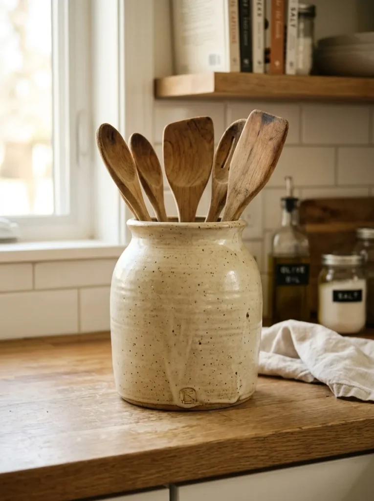
Vibe: The vessel is anchoring — a single large ceramic vessel of genuine quality creates the kitchen counter’s most powerful single-object composition, where the ceramic’s scale, material quality, and warm glaze create more visual presence than any collection of smaller objects could approach.
Why it works: A single large ceramic vessel works as a counter anchor because it resolves the counter composition’s most fundamental challenge — providing visual weight and designed presence without accumulation. A large vessel (10–14 inches tall) has the vertical dimension that most kitchen counter objects lack, creating the compositional height that prevents the counter from reading as flat and undifferentiated. A quality ceramic glaze (hand-thrown or quality production rather than mass-produced) communicates material quality at close inspection range where kitchen counter objects are regularly viewed. And the vessel’s functional role (holding herbs, utensils, or standing independently) gives it the honest presence of a used object rather than a purely decorative one.
How to get it: Large quality ceramic crocks, jugs, and vessels are available from studio pottery makers (Etsy ceramic artists, local pottery studios), specialty kitchen retailers, and home decor stores at $40–$200 for genuine quality pieces. The glaze color should coordinate with the kitchen’s material palette — warm cream and terracotta work beautifully in warm-toned kitchens, cool grey and white in cooler palettes. Studio-made ceramics with visible throwing marks and slight glaze variations read as more expensive than perfectly uniform production pieces because they communicate genuine craft.
Shop The Look
- Large ceramic crock kitchen artisan
- Hand-thrown ceramic vessel large
- Terracotta crock kitchen counter
- Cream ceramic jug kitchen large
- Studio pottery kitchen vessel
Also view: 17 Living Room Wall Decor Ideas for Every Style
3. Wooden Cutting Board Collection as Wall Art
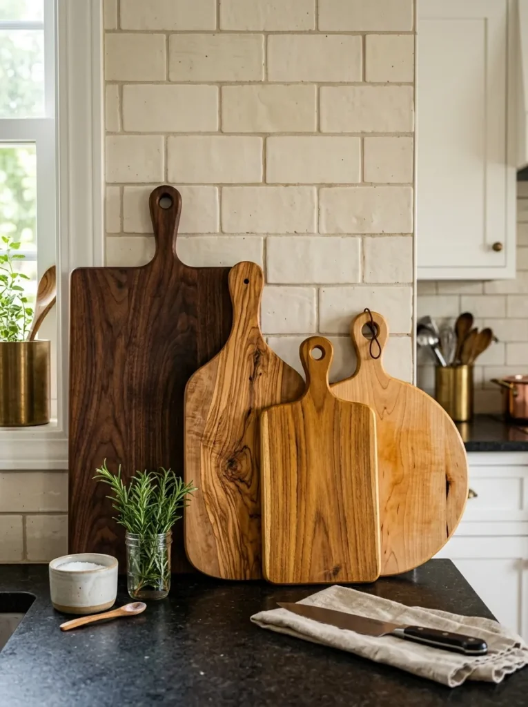
Vibe: The collection is warm — a collection of quality wooden cutting boards in varied wood tones displayed at the counter’s back edge creates a warm natural material composition that functions as both kitchen art and daily-use tool display simultaneously.
Why it works: Wooden cutting boards displayed vertically (leaned or hung) rather than stored flat accomplish multiple design goals simultaneously — they display the warm, varied grain of quality natural wood in a material composition that warms the kitchen’s primary work zone, they demonstrate that the kitchen is actively used for serious cooking (cutting boards are daily-use objects, not decorative pretense), and they create the vertical dimension at the counter’s back edge that prevents the counter composition from reading as entirely flat. The key quality distinction is in the wood itself — end-grain walnut, olive wood, and quality maple have grain patterns that reward close inspection; cheap pine or birch boards have undistinguished grain that reads as utilitarian rather than designed.
How to get it: Quality cutting boards in display-worthy materials are available from kitchen specialty retailers (Williams-Sonoma, Sur La Table) and dedicated cutting board makers at $30–$120 each depending on wood type and size. Olive wood boards are among the most visually distinctive — the swirling, highly varied grain of olive wood is unlike any other domestic wood and reads as genuinely luxurious at close range. A collection of three boards in graduated sizes (small, medium, large) in two or three wood types creates the most interesting display composition.
Shop The Look
- End grain walnut cutting board quality
- Olive wood cutting board display
- Maple cutting board quality large
- Cutting board wall display hook
- Teak cutting board quality kitchen
4. Elevated Cake Stand or Compote as Fruit Display
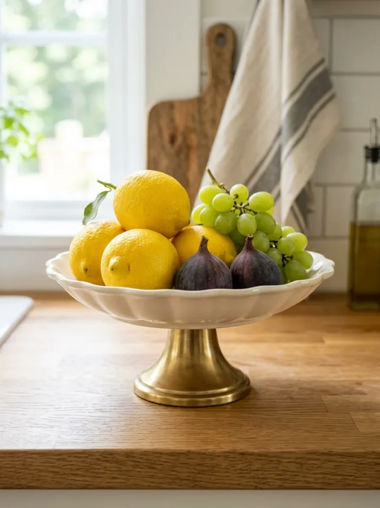
Vibe: The display is composed — elevating a small selection of fruit on a pedestal cake stand transforms the functional fruit display from kitchen utility into a composed counter still-life that references centuries of still-life painting tradition — fruit as beautiful object, not merely as food storage.
Why it works: The elevation created by a cake stand or compote does more compositional work than any other single counter object change — it takes a flat, horizontal collection of fruit (visually competing with the counter surface for attention) and lifts it to a vertical form with a foot that creates the impression of a designed object rather than a stored item. The fruit selection on an elevated stand also benefits from curation rather than abundance — three lemons, a cluster of grapes, and two figs on a pedestal is a composition; a pile of mixed fruit in a bowl is storage. The pedestal creates the frame that demands compositional intention from whatever is placed on it.
How to get it: Quality ceramic and porcelain cake stands are available from kitchen and home decor retailers at $25–$80 for well-made versions. The stand’s material should coordinate with the kitchen’s other ceramic and metallic objects — a brass-footed clear glass stand works beautifully in most kitchen palettes; a simple white ceramic pedestal on its own foot is the most versatile option. The fruit selection should rotate seasonally and be limited to two or three types for the most composed appearance.
Shop The Look
- Ceramic cake stand white pedestal
- Footed compote dish kitchen display
- Brass footed cake stand clear glass
- Porcelain cake plate pedestal warm
- Kitchen counter fruit display stand
5. Fresh Herb Pots in Coordinating Ceramic Planters
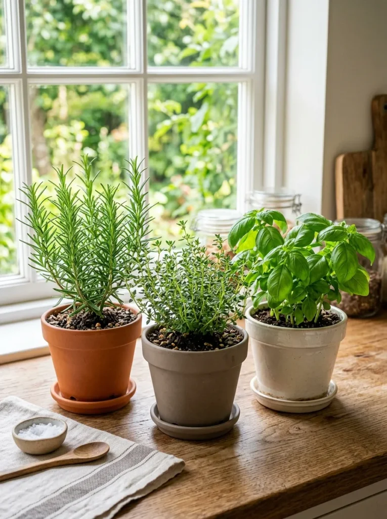
Vibe: The herbs are functional beauty — a small collection of fresh herb pots in coordinating ceramic planters on the kitchen counter creates the most genuinely honest kitchen counter display available — objects that are simultaneously beautiful and daily-functional, communicating a kitchen that is seriously used.
Why it works: Fresh herbs in quality ceramic planters are the kitchen counter element that most effectively bridges the gap between decoration and genuine use — they are living plants that improve the kitchen’s visual quality with their organic green forms, they provide genuine culinary value through daily harvest, they release fragrance when brushed or harvested (creating an olfactory dimension to the kitchen’s quality), and they communicate that the kitchen is inhabited by someone who cooks with fresh ingredients. The coordinating ceramic planter requirement is the design discipline that prevents the herb display from reading as miscellaneous — three pots in the same ceramic material and style read as a designed collection; three pots in mismatched plastic and terra cotta read as accumulated plants.
How to get it: Small ceramic herb pots in consistent glaze colors are available from garden centers, home decor stores, and pottery retailers at $5–$15 per pot. Plant with rosemary (most architectural, with its upright needle form), thyme (most delicate, with its fine leaf texture), and basil (most lush, with its large fragrant leaves) for the most visually varied and culinarily useful herb collection. Position near the kitchen’s best natural light source for plant health.
Shop The Look
- Small ceramic herb pot set matching
- Terracotta herb planter small set
- Kitchen herb pot ceramic white grey
- Fresh herb growing kit kitchen
- Coordinating ceramic planter set small
6. Linen or Linen-Look Dish Towel as Counter Textile
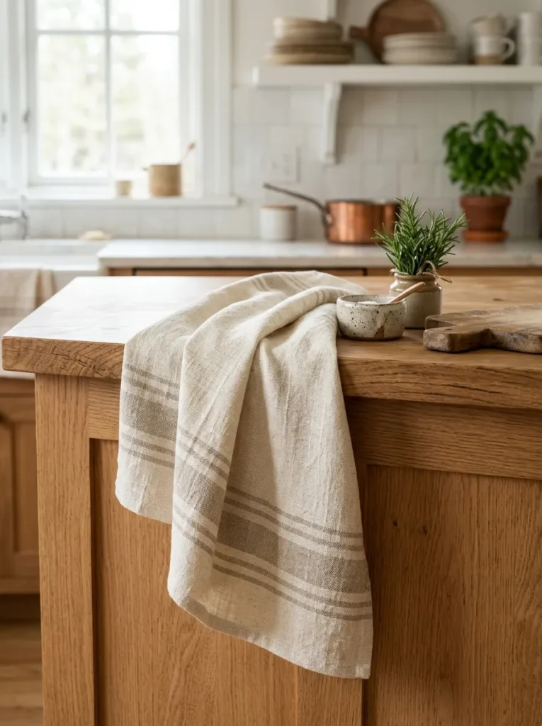
Vibe: The towel is warm — a quality linen dish towel folded or casually draped at the counter’s edge introduces the kitchen’s most important and most overlooked design element — a natural textile accent that provides warmth and texture at the counter’s primary visual zone.
Why it works: The kitchen dish towel is the most consistently present textile in any kitchen — it is used multiple times daily and rests on the counter or oven handle between uses. A quality linen towel (with the specific texture, weight, and natural material quality of genuine linen) reads as designed kitchen equipment rather than a utility item, while a thin cotton or synthetic towel reads as a cleaning supply regardless of how neatly it is folded. The linen towel’s natural fiber texture also provides the textile warmth that the kitchen’s harder material surfaces (stone, ceramic, metal) need — the counter composition of stone, ceramic, and metal without any textile reads as cold and clinical; the same composition with a linen textile reads as warm and genuinely inhabited.
How to get it: Quality linen dish towels are available from specialist linen brands (Cultiver, Tekla, Fog Linen Work) and kitchen specialty retailers at $12–$30 for genuine linen construction. The towel should be in the kitchen’s color palette — warm cream or natural linen for warm-toned kitchens, soft grey or blue-grey for cooler palettes. Fold in thirds lengthwise and drape over the oven handle or fold flat and position at the counter’s edge near the sink — both positions communicate daily use rather than display.
Shop The Look
- Linen dish towel kitchen quality cream
- Fog Linen kitchen towel natural
- Striped linen dish towel quality
- Quality kitchen towel natural fiber
- Linen kitchen towel set neutral
7. Brass or Copper Kettle as Counter Statement
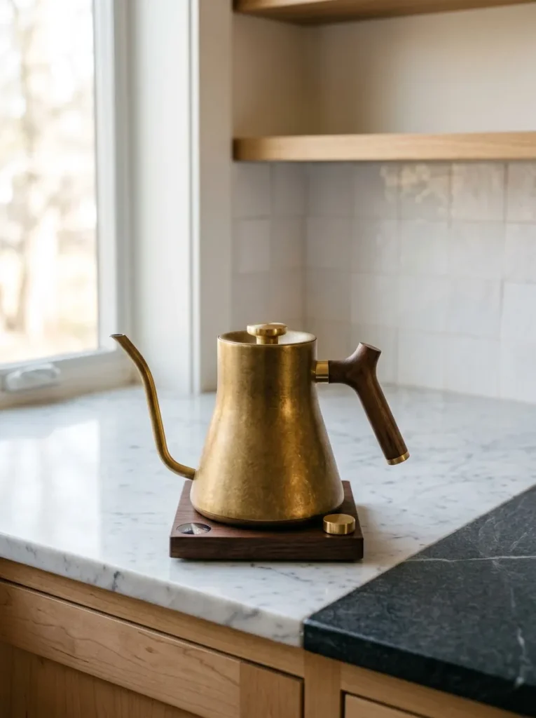
Vibe: The kettle is material — a quality brass or copper kettle on a cleared section of kitchen counter creates the most material-rich counter statement available from a single functional object, where the warm metallic surface catches and reflects light with the specific quality of genuine metal rather than chrome or stainless steel approximations.
Why it works: The kettle is among the few kitchen counter appliances whose material quality justifies its permanent counter presence — a brass or copper kettle in quality construction is a functional object of genuine material beauty that communicates both the kitchen’s quality and the owner’s material sensibility. The warm metallic quality of brass and copper is specifically appropriate for kitchen counter presence because it references the traditional kitchen’s copper cookware tradition — copper pots, brass fittings, and warm metallic surfaces have the longest and most respected association with serious professional kitchens. The gooseneck electric kettle format is the contemporary functional design that most effectively marries the brass aesthetic with modern kitchen use requirements.
How to get it: Quality brass gooseneck electric kettles are available from Fellow (Stagg EKG in matte black with brass detail, $165) and Bonavita at $60–$180 for quality electric versions. Genuine copper stovetop kettles in quality hammered or polished copper are available from French and Japanese cookware specialists at $80–$300. Either format should be positioned on a cleared counter section that allows the kettle’s material quality to be visible without competition from adjacent objects.
Shop The Look
- Brass gooseneck electric kettle quality
- Copper stovetop kettle kitchen
- Fellow Stagg kettle brass gold
- Hammered copper kettle stovetop
- Gooseneck kettle warm metallic
8. Stone or Marble Canister Set in Matching Material
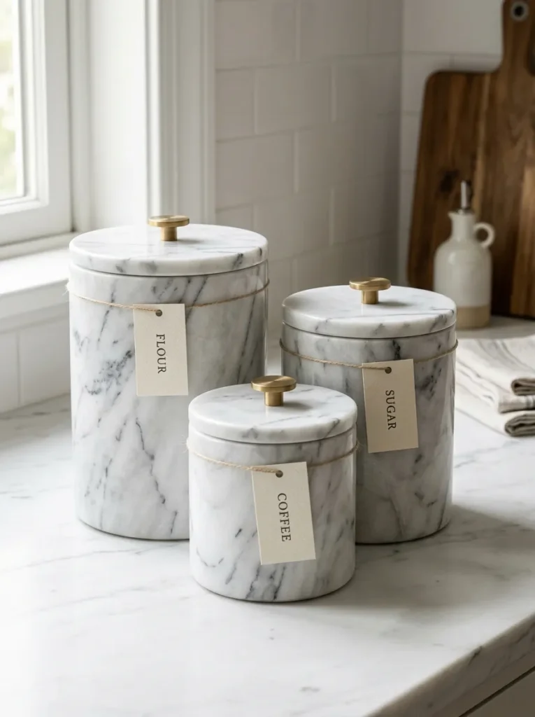
Vibe: The set is organized luxury — a matching marble or stone canister set transforms necessary kitchen counter storage (flour, sugar, coffee) from utilitarian containers into a luxury material composition that reads as the most expensive possible solution to the most basic kitchen storage requirement.
Why it works: The canister set is one of the most practically necessary kitchen counter elements (dry goods that are used daily are most efficiently stored in accessible counter containers) and also one of the most visually impactful because it occupies a consistent position on the counter and is seen every day. Replacing plastic, ceramic, or glass canisters with a matched marble or stone canister set immediately elevates the counter’s material register because natural stone is among the most expensive counter materials available — stone canisters on a counter communicate that material quality is valued at every scale of the kitchen’s design, from the counter surface itself to the objects resting on it.
How to get it: Marble and stone canister sets are available from specialty kitchen and home decor retailers at $80–$250 for quality matched sets. Genuine marble (with unique veining in each piece) reads as more luxurious than engineered stone (with uniform patterning); the slight variation between matched marble pieces communicates genuine natural material rather than manufactured consistency. Simple metal or wooden lids in brass, walnut, or matte black are the most appropriate lid materials for a luxury stone canister set.
Shop The Look
- Marble canister set kitchen graduated
- Stone kitchen canister set matched
- White marble storage jar set kitchen
- Black granite canister set kitchen
- Kitchen canister set luxury material
9. One Quality Small Appliance in Matte or Metallic Finish
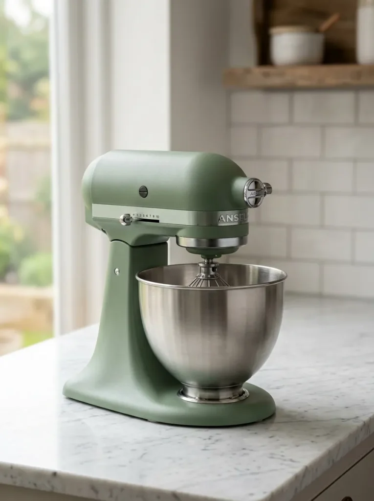
Vibe: The appliance is deliberate — one quality small appliance in a premium finish, positioned on a cleared counter section, reads as a deliberately chosen design object rather than an accumulated convenience item — the difference between a kitchen that has been styled and one that has merely been equipped.
Why it works: The principle of one quality appliance on a cleared counter section is the most direct application of the quiet luxury aesthetic to kitchen design — it communicates that the kitchen’s owner has chosen quality over quantity and confidence over accumulation. A matte black espresso machine on a cleared white marble counter, or a brushed gold KitchenAid on a cleared dark counter section, reads as an intentional material statement rather than a utilitarian presence. The cleared counter on both sides of the single featured appliance is the compositional decision that makes this approach work — the empty counter space gives the appliance room to read as a designed object rather than one of many crowded items competing for attention.
How to get it: The most consistently design-appropriate premium small appliances for counter display are espresso machines in matte black or copper finish (De’Longhi, Sage/Breville), stand mixers in quality color options (KitchenAid in brushed gold, sage green, or cream), and retro-style appliances in matte pastel or cream finishes (Smeg, KitchenAid). The appliance should be chosen first for function (it should be genuinely used daily) and second for its visual contribution to the kitchen’s palette. An appliance that is not used is a display object; an appliance used daily that also looks beautiful is a kitchen design asset.
Shop The Look
- Matte black espresso machine premium
- KitchenAid stand mixer brushed gold
- Sage green small appliance kitchen
- De’Longhi espresso machine counter
- Smeg appliance retro kitchen premium
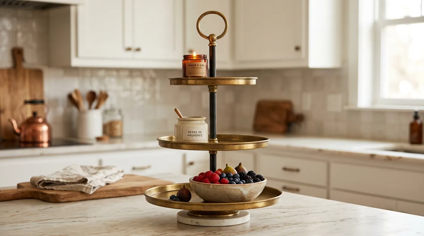
10. Tiered Stand for Elegant Multi-Level Display
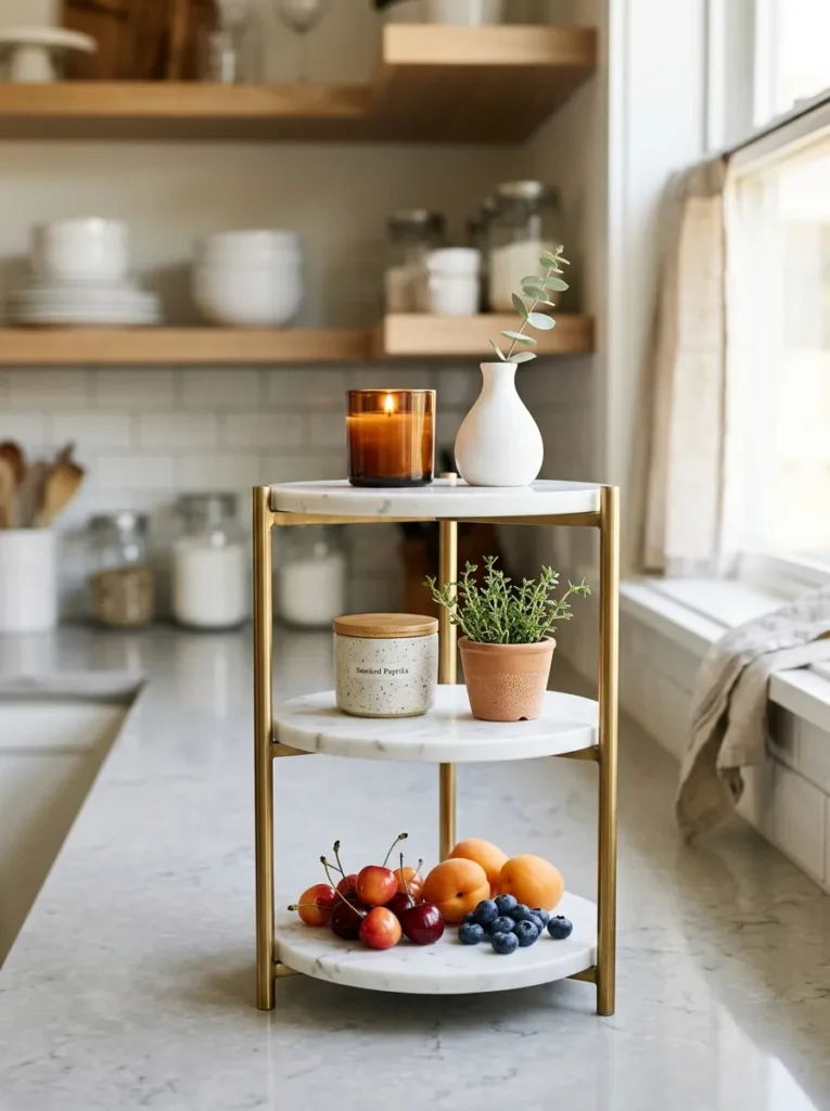
Vibe: The stand is vertical — a tiered stand creates the kitchen counter’s most space-efficient three-dimensional composition, where three levels of curated objects occupy the footprint of one while creating the vertical presence that flat counter arrangements cannot achieve.
Why it works: The tiered stand solves the kitchen counter’s most fundamental spatial challenge — the counter’s horizontal plane offers only limited real estate, but most of the kitchen counter’s visual interest must come from objects that occupy that limited plane rather than using the available vertical dimension above it. A tiered stand uses vertical space efficiently by stacking multiple object positions within a compact footprint, creating a three-level composition that reads as more visually interesting than any flat arrangement of equivalent objects and that uses approximately 50% less counter surface area. The key styling principle for a tiered stand is graduated object size — larger objects on lower tiers, smaller objects on upper tiers — which reinforces the compositional logic of the graduated structure.
How to get it: Quality tiered stands in kitchen-appropriate materials are available from home decor retailers at $30–$120 for well-constructed versions in brass, matte iron, and mixed marble-and-brass constructions. The stand’s material should coordinate with the kitchen’s hardware and fixture finishes — a brass tiered stand in a kitchen with brass fixtures creates material cohesion; a matte black stand in a kitchen with black hardware reads as deliberately consistent.
Shop The Look
- Tiered stand brass kitchen counter
- Three tier kitchen counter stand
- Marble brass tiered display stand
- Matte black tiered kitchen stand
- Kitchen counter tiered organizer
11. Beeswax or Quality Candle as Counter Warmth Accent
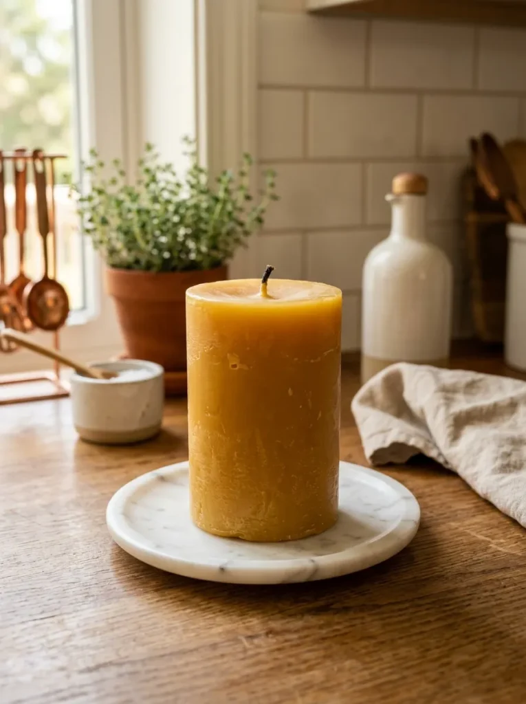
Vibe: The candle is warm — a quality beeswax pillar or designer glass candle vessel on the kitchen counter provides the warm amber visual accent and the atmospheric potential of a light source that can be activated at any time — a counter element that is beautiful whether lit or unlit.
Why it works: A quality candle on a kitchen counter performs the counter’s most overlooked styling function — providing a warm, amber-toned vertical accent in a space dominated by horizontal surfaces and cool material colors. The beeswax pillar specifically is the most visually sophisticated candle format for kitchen counter display because its natural warm honey color relates to the kitchen’s warm material tones (wood, brass, copper), its substantial form gives it the visual weight of a genuine object rather than a mere decoration, and its natural material quality (genuine beeswax from honeybees) communicates the same material honesty that quality ceramic and natural wood communicate in the broader counter composition. The marble or stone plate beneath the candle grounds it compositionally and protects the counter surface.
How to get it: Genuine beeswax pillar candles are available from specialty candle makers and natural products retailers at $15–$40 for quality pillars in the 3–4-inch width and 4–8-inch height range appropriate for counter display. Quality glass vessel candles from design-aware brands (Aesop, Boy Smells, Diptyque for kitchen display) provide the alternative of a beautiful glass vessel that continues to serve as a quality object after the wax is exhausted. Position on a small marble, stone, or wooden plate ($10–$25) for grounding and surface protection.
Shop The Look
- Beeswax pillar candle large natural
- Quality glass candle vessel minimal
- Marble candle plate small counter
- Kitchen counter candle display
- Natural beeswax candle counter
12. Olive Oil in a Quality Glass or Ceramic Decanter
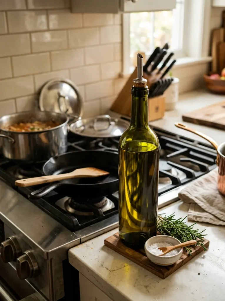
Vibe: The decanter is culinary — a quality olive oil decanter beside the cooking zone replaces the utilitarian commercial bottle with a beautiful functional vessel that communicates daily cooking engagement and material appreciation simultaneously.
Why it works: Olive oil is a daily-use kitchen ingredient that must be on the counter for practical cooking access — the choice of how it is stored and displayed is therefore a pure styling decision with genuine design impact. A commercial supermarket olive oil bottle (plastic or generic glass with a commercial label) reads as functional storage; the same olive oil in a quality dark glass or ceramic decanter reads as a considered design choice that communicates that the kitchen’s materials — even the temporary storage of cooking ingredients — is given aesthetic attention. The decanter also performs the practical function of standardizing the oil’s packaging to a consistent, permanently beautiful vessel regardless of which brand is currently in use.
How to get it: Quality glass oil decanters in dark green or amber glass with pour spouts are available from kitchen specialty retailers and online kitchenware stores at $20–$60. Ceramic oil cruets in quality glazes are available from specialty pottery retailers and kitchen stores at $25–$80. The vessel should be sized appropriately — a 500ml capacity is sufficient for a counter-displayed vessel that will be refilled regularly from a larger storage bottle stored in a cabinet.
Shop The Look
- Glass olive oil decanter dark green
- Ceramic oil cruet pour stopper
- Amber glass oil bottle pour spout
- Kitchen oil dispenser quality ceramic
- Olive oil pourer decanter quality
13. Fresh Flowers or Botanicals in a Quality Vase
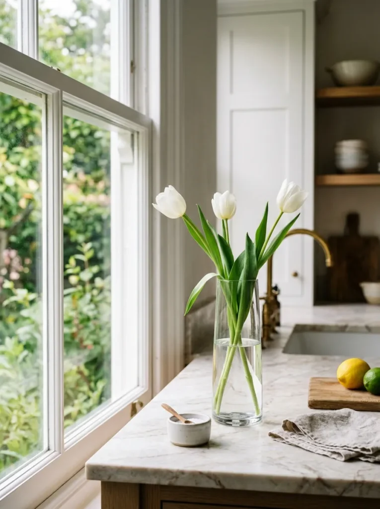
Vibe: The botanical is organic — a simple stem arrangement in a quality vase introduces the kitchen counter’s only living or organic element, providing the natural warmth and imperfect organic form that the counter’s hard materials (stone, ceramic, metal) systematically lack.
Why it works: Fresh flowers or quality dried botanicals are the kitchen counter element with the most significant warmth-adding function because they introduce the one material category that no manufactured object can replicate — genuine organic form. The specific imperfection of a real flower (the slight variation between petals, the natural lean of stems, the gentle droop of a mature bloom) creates a warmth and liveliness that no artificial flower achieves regardless of its craft quality. The styling discipline for kitchen botanical arrangements is maximum restraint — three stems of a single flower type in a quality vase read as more expensive and more considered than a mixed bouquet in an elaborate arrangement, because the simplicity communicates confidence in the material itself rather than compensating through complexity.
How to get it: Source single-variety fresh flowers from florists, farmers markets, and specialty grocery stores — white tulips, white ranunculus, white peonies, and single-stem garden roses are the most consistently elegant choices for kitchen counter display. Place in the minimum quantity that creates visual presence (3–5 stems for a small vase, 5–7 for a larger vessel) in a quality vase in ceramic, glass, or stone. Change flowers weekly for the fresh botanical quality that dried alternatives cannot provide.
Shop The Look
- Slim ceramic vase kitchen counter
- Clear glass bud vase minimal kitchen
- White tulip stem fresh cut flower
- Dried pampas small arrangement kitchen
- Simple botanical vase arrangement
14. Tray Styling to Group and Contain Counter Objects
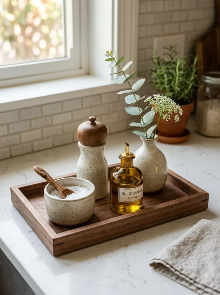
Vibe: The tray is containing — a quality tray on the kitchen counter creates an instant organized zone that transforms a collection of individual objects into a single composed visual unit, making the same objects that would read as counter clutter without the tray read as a deliberately composed kitchen vignette.
Why it works: The tray is the kitchen counter’s most powerful organizational and compositional tool because it creates visual containment — it defines a zone within the counter surface where a collection of related objects belongs, separating them from the counter’s broader surface and from each other. Without a tray, three objects on a counter are three separate objects that may or may not read as related; on a tray, the same three objects become a single composed arrangement. The tray’s material quality matters — a natural wood tray, a marble tray, or a quality seagrass tray reads as designed containment; a cheap plastic or thin MDF tray reads as organizational afterthought. The tray should be sized so the objects on it have some visible tray surface between them rather than being crowded to the tray’s edges.
How to get it: Quality counter trays in kitchen-appropriate materials are available from home decor retailers and specialty kitchen stores at $20–$80 for well-made versions. Natural acacia or teak wood trays are the most versatile counter option; marble trays provide the most luxury-material presence; woven seagrass or rattan trays add organic warmth. The tray should be sized one size larger than initially seems necessary — a tray that seems too large before it is styled typically appears correctly sized once objects are placed on it with adequate spacing.
Shop The Look
- Natural wood tray kitchen counter
- Marble tray rectangular kitchen
- Seagrass tray kitchen counter display
- Wooden serving tray counter organize
- Kitchen counter tray quality material
15. Under-Cabinet Lighting to Illuminate the Counter Surface
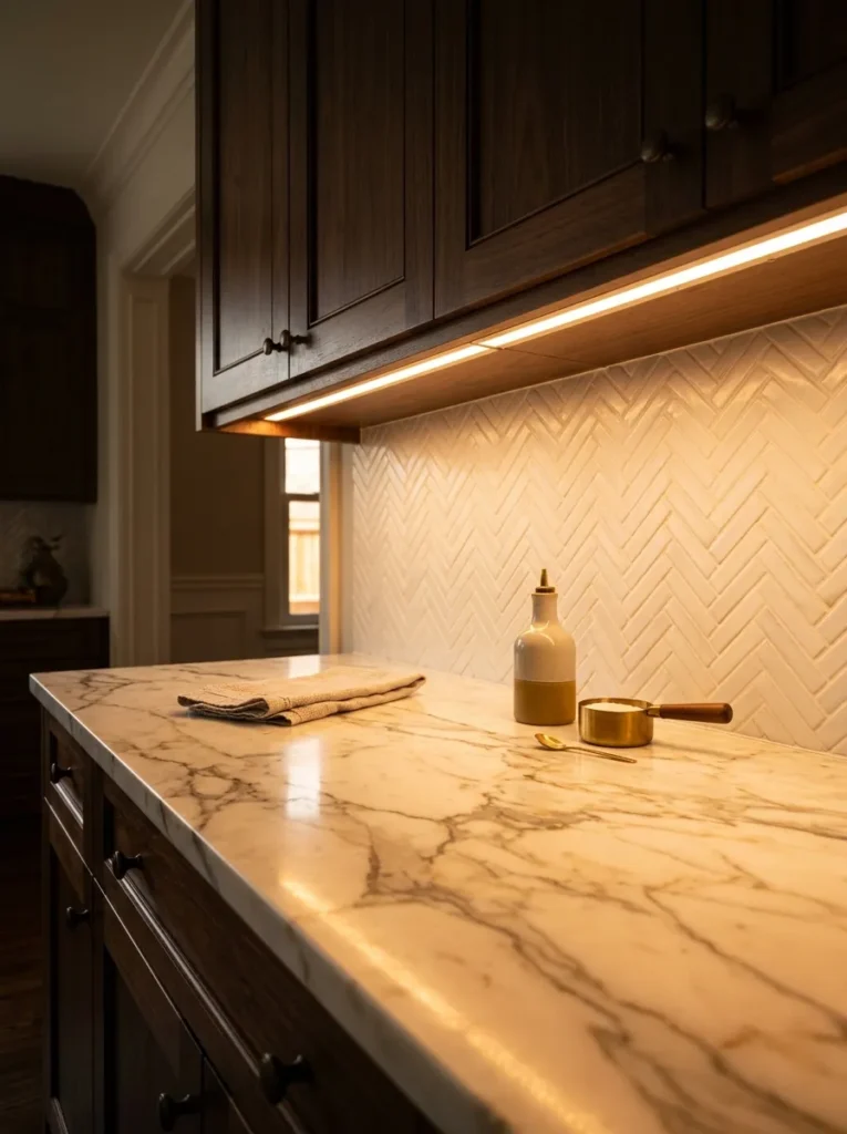
Vibe: The lighting is material-enhancing — warm under-cabinet lighting transforms the kitchen counter from a surface passively illuminated by overhead fixtures into a warmly lit zone where the counter material’s quality — its veining, texture, and depth — is actively revealed by directional warm light from above.
Why it works: Under-cabinet lighting is the kitchen counter upgrade with the highest ratio of visual impact to cost because it improves the appearance of everything on the counter simultaneously — the counter material, the styled objects on top of it, and the overall kitchen atmosphere all benefit from the warm, directed light that under-cabinet fixtures provide. The counter material specifically benefits most dramatically — marble veining appears deeper and more dimensional under warm directional light than under flat overhead illumination; stone textures that read as flat under ceiling lights become three-dimensional under angled under-cabinet light; and the warm 2700K color temperature makes every material on and near the counter appear warmer and richer. This lighting improvement applies regardless of the counter material — even a laminate counter appears more expensive under warm under-cabinet lighting than a marble counter under harsh overhead fluorescent.
How to get it: LED strip lights in warm 2700K (adhesive-backed, installed to the underside of upper cabinets along their front edge) are the most accessible and most cost-effective under-cabinet lighting solution at $20–$60 for a standard kitchen installation. Hardwired under-cabinet puck lights or strip lights ($80–$200 installed by an electrician) provide the cleanest, most permanent installation. The critical specification is color temperature — warm 2700K is the correct specification for counter-enhancing under-cabinet light; cool white or daylight spectrum strips undermine the warm counter atmosphere rather than enhancing it.
Shop The Look
- LED strip warm 2700K under cabinet
- Under cabinet lighting kit kitchen
- Warm white under cabinet strip light
- Under cabinet LED puck light warm
- Kitchen under cabinet lighting 2700K
How to Style Your Kitchen Counter for Elegance
The single most important kitchen counter styling principle is the subtraction-first approach — before adding any new object to the kitchen counter, remove 50% of what is currently on it and keep it removed for two weeks. The counter that remains after this systematic removal is almost always more elegant than the counter before the edit, and it reveals which objects genuinely belong on the surface (those whose absence creates a functional problem or a clear visual gap) versus which are present through habit, accumulation, or convenience. The objects that remain after a genuine subtraction exercise are the foundation of an elegant counter; the removed objects should be organized in accessible cabinets rather than returned to the counter when their use is complete.
The most common kitchen counter styling mistake is attempting to solve a disorganized counter through addition — purchasing new organizers, new canisters, and new decorative objects to improve a surface that needs subtraction rather than supplementation. A counter with twelve objects and a new marble tray still has twelve objects; a counter with six carefully chosen objects has elegance. The tray, the canister set, and the tiered stand in this article all work best on counters that have already been edited to their essential objects — they organize and elevate a curated selection rather than contain an overflow.
Three kitchen counter improvements under $50 that create immediate, significant visual elegance: decanting the counter’s open cooking ingredients (olive oil, salt, pepper) into quality vessels ($20–$40 total) that immediately replace commercial packaging with designed objects; adding a single quality linen dish towel in the kitchen’s color palette ($12–$25) that introduces warm textile quality to the counter’s material composition; and clearing the counter to a maximum of seven objects total including the kettle and any counter appliance, regardless of how many spaces or zones the counter has — the edited counter at six or seven objects reads as genuinely elegant at any material quality level.
A complete elegant kitchen counter — a styled zone anchored by a marble pastry board or quality tray, a single ceramic vessel holding herbs or utensils, a brass kettle, one or two quality botanical stems, a quality linen towel, warm under-cabinet lighting, and a maximum of two additional carefully chosen objects — is achievable within any kitchen regardless of the counter material or the cabinet style, at a total additional investment of $80–$300 for quality versions of all elements. The counter’s elegance is determined by the editing discipline applied to it rather than by the budget invested in it — the most expensive kitchen counter in the world looks cluttered if it is covered with accumulated kitchen equipment, and the most modest kitchen counter looks genuinely elegant when it holds only what has been deliberately chosen.
Frequently Asked Questions About Elegant Kitchen Counters
How many objects should be on a kitchen counter to look elegant?
The maximum number of objects on any kitchen counter for an elegant appearance is seven to nine total — including appliances, functional items, and decorative objects combined. This total seems low until it is applied: a kettle (one), a canister set (three), a wooden cutting board leaned at the back (one), a ceramic herb pot (one), and a linen towel at the edge (one) equals seven objects, which is a full, warm, and elegantly styled kitchen counter that still has significant visible counter surface between each object. The visible counter surface between objects is as important as the objects themselves — without clear space between objects, even quality pieces read as cluttered.
What counter material looks most expensive?
Natural stone — specifically quartzite, Calacatta marble, Carrara marble, and leathered granite — consistently reads as the most expensive counter material because genuine natural stone has the unique characteristic of varying veining and mineral pattern that no manufactured surface can replicate. However, the appearance of an expensive counter is more significantly determined by styling than by material — a Calacatta marble counter covered with accumulated kitchen equipment reads as less luxurious than a clean white quartz counter with three carefully styled objects. The counter material’s quality is maximized by the visibility of the counter surface, which requires keeping fewer objects on top of it.
How do I keep kitchen counters looking clean and styled daily?
The most effective system for maintaining daily kitchen counter elegance is the one-in-one-out rule combined with a designated home for every object — every appliance and ingredient that is used in the kitchen has a specific storage location in a cabinet or drawer, and it returns to that location immediately after use rather than resting on the counter between uses. Applied consistently, this system means the counter’s permanent objects are only those that genuinely benefit from counter display (the kettle, the cutting board display, the herb pots, the decorative objects) while everything used and then stored returns to its cabinet immediately. The two biggest counter clutter sources are appliances used daily but not requiring counter display (toasters, air fryers, coffee makers) and ingredients used in cooking that could be in a pantry between uses — moving both categories to cabinet storage immediately improves counter elegance dramatically.
What is the most impactful single counter change for looking expensive?
Clearing the counter to a maximum of seven objects and keeping that limit consistently for two weeks is the single most impactful counter change available at any budget level because it reveals the counter’s material quality (which is hidden by accumulated objects) and creates the negative space that makes every remaining object appear more valuable and more deliberately chosen. If one styled addition must be chosen rather than subtraction, the under-cabinet lighting installation produces the broadest improvement because it enhances the appearance of the counter material and every object on it simultaneously.
Should kitchen appliances be kept on the counter or stored in cabinets?
The elegance-maximizing approach is to keep only the appliance used at least once daily on the counter (typically the kettle or coffee maker) and store everything else in cabinets. A toaster used daily is used for 3 minutes per day and occupies a permanent 12×8-inch counter position for the remaining 23 hours and 57 minutes — this is an inefficient use of the counter’s visual and spatial resource for an object that does not improve the counter’s appearance. A quality kettle or espresso machine used daily and beautiful to look at is the exception that justifies counter presence. The specific question to ask of every appliance currently on the counter: is this used daily, and does it look good enough to justify permanent counter display? Any appliance that fails either criterion belongs in a cabinet.
Ready to Style Your Kitchen Counter Elegantly?
These 15 ideas cover the full spectrum of what an elegant kitchen counter can be — from the mineral luxury of a marble pastry board and the artisan warmth of a large ceramic vessel, to the culinary lifestyle quality of a brass kettle and the organic vitality of fresh herbs in coordinating planters, from the organizational intelligence of a quality tray and the vertical efficiency of a tiered stand, to the material richness of a stone canister set and the ambient warmth of quality candles and botanicals, from the styling discipline of a quality linen towel and a decanted olive oil vessel to the lighting transformation of warm under-cabinet LED. You do not need all 15 to create a kitchen counter that looks genuinely expensive — you need the subtraction discipline that creates space for quality to be seen, the material consistency that makes objects read as collected rather than accumulated, and two or three pieces of genuine quality in the right positions. Start by removing half of what is currently on your counter today and living with the result for a week. The counter you see will tell you exactly which of these 15 ideas belongs there. Pin the ideas that named what your counter is reaching toward — those are the ones worth adding first.