16 Stylish Shelf Decor Ideas for Living Rooms
Stylish shelf decor ideas for living rooms are design-led approaches to arranging art, books, plants, ceramics, lighting, and personal objects on shelving units to create displays that feel visually considered, personally expressive, and genuinely beautiful — transforming functional storage surfaces into the living room’s most characterful and most rewarding decorative feature. This article gives you exactly 16 stylish shelf decor ideas for living rooms, spanning every shelf type from floating wall shelves to alcove built-ins to freestanding bookcases, every aesthetic from minimalist Japandi to richly layered maximalism, and every budget from a free rearrangement of existing objects to a purposeful investment in new accessories, with specific guidance and curated product tables for every idea.
There is a measurable difference between a shelf that has been styled and one that has been filled — the styled shelf rewards looking, reveals itself progressively upon closer attention, and creates the sense of a considered composition rather than an accumulated collection. The living room shelf is simultaneously the most practical and the most expressive surface in the room — it holds what is needed while communicating what is valued, displaying what is beautiful while storing what is useful, and telling the story of its owner through every object chosen and every object declined. Here are 16 ideas worth arranging — and saving.
Why Stylish Shelf Decor Ideas Work So Well
The shelf as both functional storage and expressive display surface has occupied a central place in domestic interior design since the introduction of purpose-built domestic shelving in the early modern period — from the open dresser of the 17th-century English farmhouse kitchen, displaying pewter and ceramic with deliberate pride, through the glass-fronted cabinet of curiosities of the European educated classes, to the built-in bookcase that became the defining status object of the Victorian middle-class home, to the contemporary floating shelf system that has become the primary vehicle for personal expression in the living rooms of design-conscious households worldwide. Each generation has used the shelf as the domestic surface where the relationship between storage necessity and aesthetic aspiration is most visibly negotiated.
The materials and objects that produce the most successful stylish shelf decor consistently combine three qualities: visual warmth through natural material character (solid oak and ash shelves, hand-thrown ceramics, dried botanicals, natural wood objects, woven rattan and basket elements); compositional structure through height variation and depth layering (tall vases against the wall, medium objects at shelf center, low bowls at the front edge); and personal specificity through the inclusion of genuinely meaningful objects alongside purpose-acquired accessories (inherited pieces, travel finds, and handmade objects alongside purchased ceramics and botanical elements). The most stylish shelf displays are those where the arrangement looks simultaneously composed and personal — designed but not staged, considered but not precious.
Color palettes for stylish living room shelf decor consistently produce their best results within the warm neutral family — warm white, natural greige, dusty sage, warm terracotta, honey amber, antique brass, and natural wood — with deeper accent tones used sparingly for visual hierarchy. The specific palette choice matters less than its internal consistency: a shelf styled in an all-terracotta and natural wood palette reads as more stylish than a shelf with individually beautiful objects in five competing color families.
Small living rooms gain the most from stylish shelf decor because the vertical surface of a well-styled shelf adds significant visual richness to a compact room without consuming floor area — and because the considered curation that shelf styling demands tends to produce more thoughtful editing across the whole room as the same eye is applied to other surfaces.
Style at a Glance
| Element | Trait 1 | Trait 2 |
|---|---|---|
| Philosophy | Composed display over casual accumulation | Personal warmth over showroom perfection |
| Materials | Natural wood, ceramic, dried botanical, linen | Brass, rattan, living plant, natural stone |
| Color Palette | Warm ivory, dusty sage, warm terracotta | Antique brass, natural greige, warm charcoal |
16 Stylish Shelf Decor Ideas for Living Rooms
1. The Asymmetric Anchor Arrangement
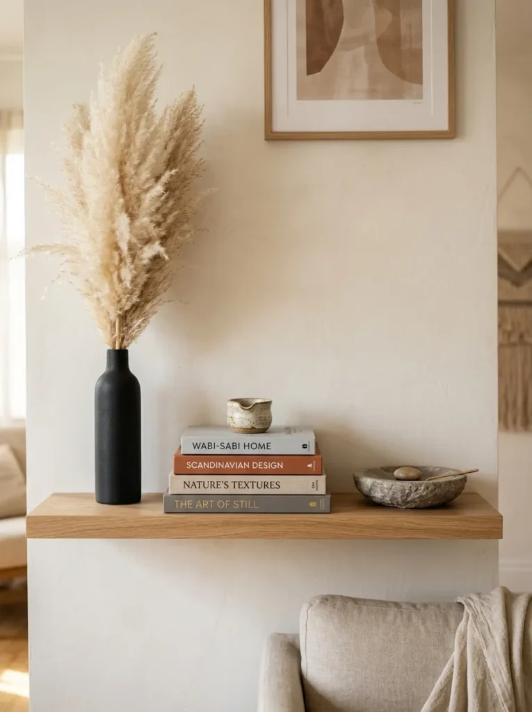
Vibe: The asymmetric anchor arrangement feels compositionally authoritative — the shelf that demonstrates the single most important styling principle through three objects and the deliberate space between them.
Why it works: The asymmetric anchor arrangement applies the fundamental principle of dynamic composition — tall-medium-low elements positioned off-center to create visual movement — to the specific constraints and opportunities of a shelf surface. A centered, symmetric arrangement of three objects creates static visual equilibrium; an asymmetric arrangement with the dominant tall element positioned at one end rather than the center creates directional visual energy that the eye follows across the shelf’s length. The design principle is directed visual movement: the eye enters at the tall dominant anchor, travels along the shelf to the medium plinth, and rests at the low grounding element at the far end — a journey that makes the shelf feel composed rather than placed. The negative space between the three elements is the compositional breath that makes the journey possible.
How to get it: Position the tallest element (minimum 45cm for a 90cm shelf) at the left end of the shelf — left-positioned anchors create the most natural viewing movement for left-to-right reading cultures. Choose the medium element (approximately half the height of the tallest) as the composition’s visual midpoint — a horizontal book stack with a small object on top achieves this height with more visual interest than a single medium-height object. Place the lowest element (maximum 10cm) at the right end for the grounding counterpoint. Maintain a minimum 15cm gap between all three elements — the negative space is as important as the objects.
Quick Win: Any three existing objects from anywhere in the living room — a tall vase, a medium book stack, and a small bowl — arranged in the asymmetric triangular pattern on any shelf immediately create a more composed arrangement than any number of objects placed without this structure. No new purchases required.
Shop The Look
| Product |
|---|
| Dried pampas stem large natural tall |
| Matte black ceramic vase tall narrow |
| Hardcover book set neutral warm spines |
| Natural stone dish low wide display |
| Natural oak floating shelf 90cm |
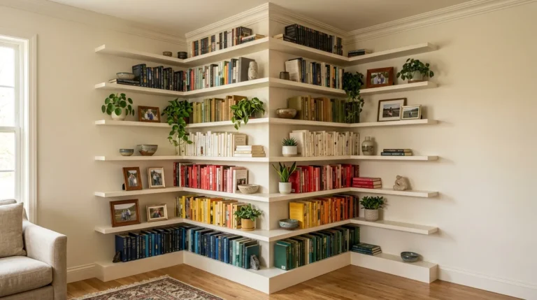
2. Colour-Gradient Book Display (COLOR)

Vibe: The colour-gradient bookcase feels richly wall-scale — the transformation of a functional storage unit into the living room’s most considered visual element through the arrangement of objects already owned.
Why it works: Colour-blocking books — grouping them by spine colour into sections that flow across the bookcase in a deliberate gradient sequence — is the shelf styling technique that delivers the highest visual impact from zero additional cost, because it uses the books already owned and simply rearranges their display logic from alphabetical or topical order to colour order. The design principle is collective colour contribution: individual book spines in random arrangement create visual noise; the same books grouped by colour create large-scale colour fields that work as wall-scale palette composition. The ceramic accent objects positioned at colour transitions serve as visual punctuation, and the trailing plant at the top shelf creates the organic reference that prevents the colour-blocked bookcase from reading as a purely geometric exercise.
How to get it: Remove all books and sort into colour families on the floor before replacing. Decide the gradient sequence — warm to cool, light to dark, or a specific palette arc — before beginning to replace. The gradient should read naturally across the bookcase in the same way a paint chip fan reads from light to dark: no abrupt jumps between unrelated colour families. Leave 25–30% of each shelf’s depth available for objects placed in front of the books — this foreground layer creates depth. Replace books with some spines outward and occasional small clusters of spines inward (showing only page edges) for rhythmic variety.
Shop The Look
| Product |
|---|
| Ceramic object set white matte transition |
| Trailing pothos plant top shelf cascade |
| Brass bookend set decorative minimal |
| Framed art print lean shelf natural |
| Dried botanical stem bookcase accent |
3. Organic Material Vignette (MATERIAL)
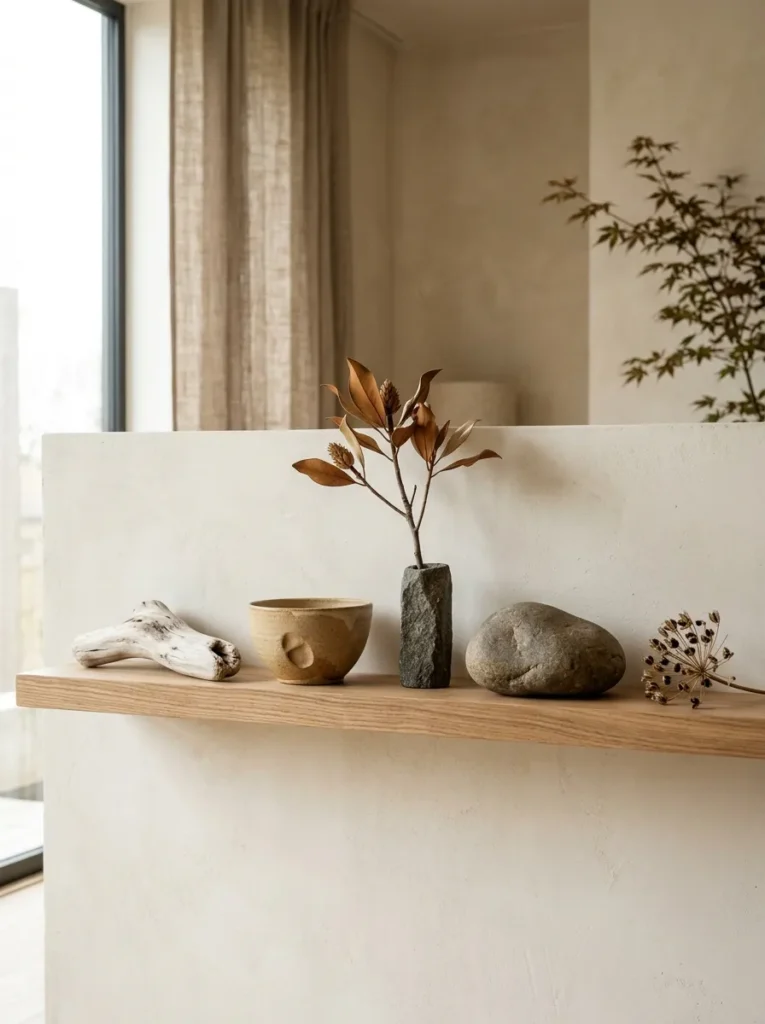
Vibe: The organic material vignette feels naturally meditative — five objects chosen so specifically for their material character that each rewards individual close attention.
Why it works: An organic material vignette applies the wabi-sabi philosophy of finding beauty in natural imperfection and material authenticity to the living room shelf — treating each selected object as a specimen of genuine natural or handmade quality worthy of contemplative display in significant negative space. The design principle is material narrative: every object in a successful organic vignette carries visible evidence of its origin or making process — the river stone’s water-polished surface, the driftwood’s weathered grain, the ceramic bowl’s maker’s thumb impression, the dried magnolia’s botanical precision — and these material stories make the shelf continuously interesting in a way that manufactured objects without visible process history cannot sustain.
How to get it: Source objects from three categories: found natural objects (river stones, driftwood, interesting seed pods and branches), artisan handmade objects (hand-thrown ceramics from local potters, small carved wooden pieces, hand-forged metal objects), and dried or preserved natural specimens (single botanical stems, seed clusters, dried shell collections). Apply a five-object maximum — more than five objects in an organic vignette begins to overwhelm the meditative quality of individual attention. Choose a natural wood shelf with a hard-wax oil finish (not varnish) — the penetrating oil finish suits the organic aesthetic better than the reflective surface of lacquer or varnish.
Shop The Look
| Product |
|---|
| Bleached driftwood piece natural 25cm |
| Hand thrown ceramic bowl sand glaze |
| Dried magnolia branch single stem |
| Large smooth river stone grey warm |
| Narrow natural stone vase display |
4. Gallery Ledge with Leaning Art (LAYOUT)
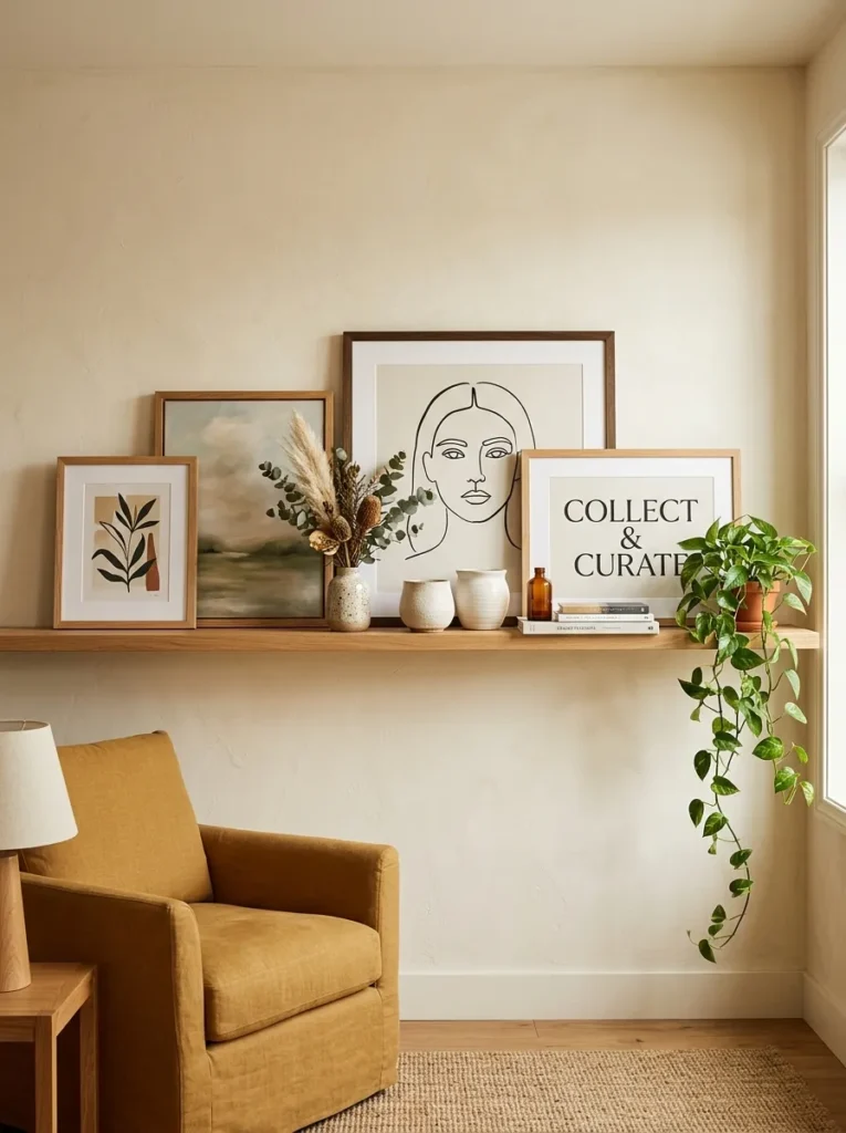
Vibe: The gallery ledge feels warmly editorial — the art display format that signals active curation rather than permanent installation, and that reads as more alive and more personally engaged than anything hung with a nail.
Why it works: A picture ledge shelf styled with leaning art creates a fundamentally different display register from a hung gallery wall — the leaning format signals ongoing curation, active engagement, and the confidence to treat art as a living part of the home rather than a fixed decoration. The design principle is editorial signaling: leaning art communicates that the display is being actively managed — that the person who lives here thinks about their walls and makes choices about them continuously rather than hanging things once and forgetting them. The ceramic objects placed in front of the leaning frames create the foreground depth plane that transforms a ledge with propped pictures into a genuinely layered display composition.
How to get it: Install a picture ledge shelf (with a small raised front lip to prevent frames from sliding) at 160–170cm from the floor — the height at which the art centers at comfortable standing eye level. Begin with the largest frame as the composition’s visual anchor, positioned slightly off-center. Place smaller frames at graduated positions along the ledge, allowing slight overlapping between adjacent frames for a casual, naturally gathered quality. Position ceramic objects in front of frames at varied depths rather than beside them — the object placed partially in front of a frame creates the three-dimensional layering that distinguishes a styled gallery ledge from pictures simply propped against a wall.
Shop The Look
| Product |
|---|
| Picture ledge shelf natural oak 90cm |
| Art print set botanical A4 natural frame |
| Small ceramic vessel foreground display |
| Dried botanical small arrangement end |
| Small trailing plant pot ledge end |
5. Warm Evening Light Shelf (LIGHTING)
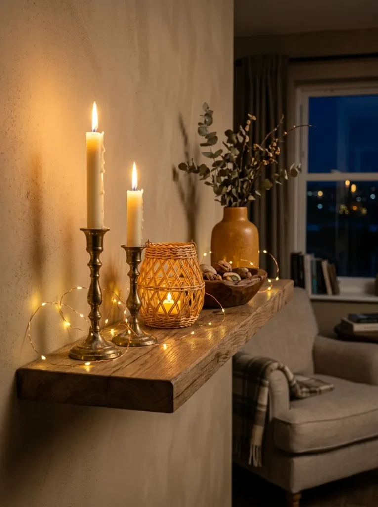
Vibe: The warm evening light shelf feels intimately atmospheric — the shelf that actively improves the quality of the room’s evening atmosphere rather than simply looking good in daylight.
Why it works: A shelf styled as a warm evening light installation is the shelf approach with the most dramatic daily impact because it transforms the room’s lighting quality — the most powerful single determinant of atmospheric comfort — by positioning warm light sources at eye level where their effect is strongest. The design principle is atmospheric layering through height: overhead ceiling lights create flat, functional illumination; warm light sources at shelf height (120–160cm from the floor) create the intimate, layered lighting quality that makes a living room feel genuinely warm and habitable rather than adequately lit. The combination of three light source types (pillar candle, LED fairy lights, LED tea light in lantern) creates a richer, more complex warm light than any single source.
How to get it: Combine three warm light source types in 2700K warm white LED temperature throughout: pillar candles in brass holders for genuine flame flicker (most atmospheric but requiring supervision when lit), battery-powered LED fairy lights looped along the shelf for always-available ambient glow, and an LED tea light in a woven lantern for the enclosed, focused warm light that creates visual depth within the composition. Position light sources at varied heights within the shelf arrangement — the candle holders at the tallest positions, the lantern at mid-height, the fairy lights along the shelf’s full width. The fairy lights should be looped rather than laid flat to create dimensional rather than linear light.
Shop The Look
| Product |
|---|
| Ivory pillar candle set 2 heights natural |
| Brass candleholder set 2 varied heights |
| Battery LED fairy light warm white 2m |
| Rattan lantern woven LED tea light |
| Matte amber ceramic vase warm display |
6. Trailing Plant Botanical Column (ACCESSORIES / MATERIAL)
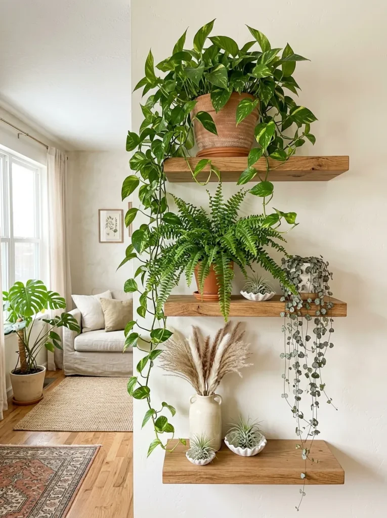
Vibe: The botanical column shelf feels lushly alive — the shelf installation that most powerfully uses the wall’s vertical dimension to create a living botanical composition rather than a static arrangement.
Why it works: A multi-shelf botanical column with deliberately chosen trailing plants creates a living display that links the individual shelf levels into a single unified vertical composition — the cascading growth of the trailing pothos connecting the top shelf to the middle, and the string of hearts connecting the middle to the lower, produces the visual continuity of a single botanical installation rather than three separate shelf arrangements. The design principle is vertical botanical continuity: when plant growth physically bridges the gap between shelf levels, the three shelves read as one continuous composition rather than three independent arrangements. This continuity is the quality that most distinguishes a genuinely botanical shelf system from a shelf with occasional plant pots placed on it.
How to get it: Position the most vigorous trailer (golden pothos) on the top shelf and train its growth to cascade naturally downward — do not prune growth that reaches toward the lower shelf level. String of hearts (Ceropegia woodii) provides the most delicate, visually interesting cascade for the middle shelf position. Water trailing plants by removing them from the shelf to a sink and replacing after draining — this prevents water from marking the shelves below. Supplement the living plant composition with dried botanicals on the lowest shelf for botanical interest at the level where living plants are hardest to maintain in lower-light conditions.
Shop The Look
| Product |
|---|
| Golden pothos trailing plant large |
| String of hearts trailing plant pot |
| Small fern terracotta pot shelf |
| Air plant tillandsia set ceramic dish |
| Tall ceramic vase dried pampas stem |
7. Painted Alcove Jewel Box (COLOR / LAYOUT)
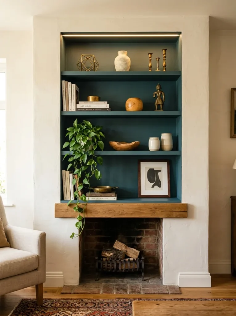
Vibe: The painted alcove feels jewel-box dramatically beautiful — the shelf display transformation that costs one pot of paint and creates the most visually rich shelf context available in any living room.
Why it works: Painting the interior of a recessed alcove in a deep, saturated tone creates the highest-contrast display context available for shelf objects — the same visual principle used in museum display cases and jewellery shops, where objects displayed against dark velvet backgrounds appear more luminous, more three-dimensional, and more valuable than the same objects against a white or neutral ground. The design principle is contrast elevation through dark ground: warm brass objects against a warm white wall read as decorative; the same brass objects against deep dusty teal read as luminous and precious — the contrast amplifies the brass’s inherent color warmth in a way that a low-contrast pale background cannot. The concealed LED strip at the alcove ceiling supplements natural light within the recessed space and dramatically improves the jewel-box quality in evening conditions.
How to get it: Apply painter’s tape at the precise alcove boundary — the line where the recessed alcove meets the projecting chimney breast. Paint two coats of the chosen deep colour on all recessed surfaces (back wall, side walls, and recess ceiling) using a cutting-in brush for the boundary edge and a small roller for the flat back wall. Install a warm white LED strip (2700K) along the alcove’s top edge concealed behind a 20mm timber batten — the batten hides the strip while allowing light to wash downward. Style the shelves with warm-toned objects that maximize the contrast benefit: brass, warm wood, terracotta, and ivory ceramics all glow most warmly against a deep cool background.
Shop The Look
| Product |
|---|
| Deep dusty teal interior paint matte |
| LED strip warm white concealed alcove |
| Brass sculptural object set display |
| Ivory ceramic vase pair alcove shelf |
| Painter tape precision edge clean cut |
8. Curated Book and Object Layering (LAYOUT / ACCESSORIES)
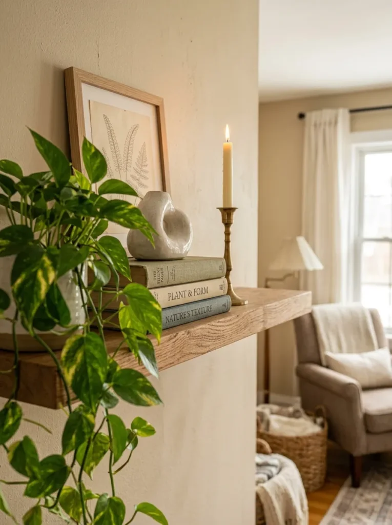
Vibe: The layered shelf feels warmly three-dimensional — the arrangement that creates genuine physical depth from a surface that appears, until well-styled, to offer only two dimensions.
Why it works: Depth layering — positioning objects at multiple points from the back of the shelf against the wall to the front edge — transforms the flat plane of a shelf into a three-dimensional display space with genuine visual depth. Most unsuccessful shelf arrangements position all objects at the same depth (usually centered from front to back), creating a single-plane display that reads as flat regardless of height variation. The design principle is depth plane differentiation: by explicitly assigning different objects to different depth zones (wall plane, mid-shelf, and front edge), the stylist creates a composition with the same three-dimensional quality as a designed garden border or a well-composed still-life painting. The horizontal book stack as a mid-shelf plinth is the most versatile depth-creating tool — it simultaneously provides height variation, book display, and a stable surface for smaller foreground objects.
How to get it: Before placing any object, mentally divide the shelf into three depth zones: the back third (wall to 8cm from wall), the middle third (8–18cm from wall), and the front third (18–25cm from wall, up to the shelf edge). Designate each zone for a different type of element: wall zone for leaning or propped pieces; middle zone for the main structural objects (book stacks, vases, larger ceramics); front zone for the smallest and lowest objects (trailing plants, low bowls, small stones). Ensure at least one object in each zone — the three-zone occupation is the minimum requirement for genuine depth perception.
Shop The Look
| Product |
|---|
| Small framed print A6 natural frame |
| Sculptural ceramic object display |
| Slim brass candleholder shelf display |
| Trailing plant small pot shelf edge |
| Horizontal book set warm spine display |
9. Seasonal Refresh Shelf (ACCESSORIES)
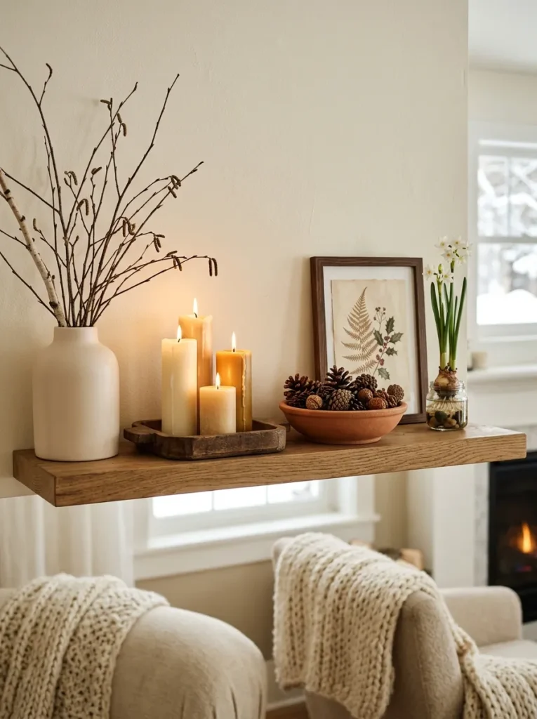
Vibe: The seasonal winter shelf feels warmly specific — the shelf that makes the room feel genuinely connected to the season outside the window rather than seasonlessly decorated.
Why it works: A seasonally updated shelf creates the most ongoing visual interest in a living room and the most emotionally resonant domestic environment by connecting the interior to the natural world’s seasonal rhythm — making the home feel responsive and alive rather than static. The design principle is seasonal material authenticity: using materials that are genuinely characteristic of a specific season (bare branches and forced paperwhites in winter, dried wildflowers in summer, fallen seed heads and pinecones in autumn, forced spring bulbs in early spring) creates a specificity and authenticity that generic “natural” decorating elements cannot achieve. The designated seasonal shelf — one shelf or section reserved for complete seasonal changes — allows the rest of the shelf arrangement to remain stable while one section celebrates the current moment in the year.
How to get it: Designate one shelf or one section of a larger bookcase as the rotating seasonal display zone. Change this section completely four times per year at the seasonal transitions — the discipline of complete replacement (removing all previous season’s elements before adding new ones) maintains the seasonal specificity that partial updates erode. Source seasonal elements from nature (fallen branches, pinecones, gathered seed heads from the garden), farmers markets (forced bulbs, seasonal flowers), and charity shops (small seasonal ceramic pieces at minimal cost). The tray used to group the candle cluster is the organizing detail that prevents the seasonal arrangement from reading as a scatter of objects rather than a composed display.
Shop The Look
| Product |
|---|
| Bare birch branch small bunch seasonal |
| Beeswax pillar candle set winter ivory |
| Pinecone collection natural display bowl |
| Paperwhite narcissus bulb forced glass |
| Small wooden tray candle grouping |
10. Monochrome Tonal Shelf (COLOR)
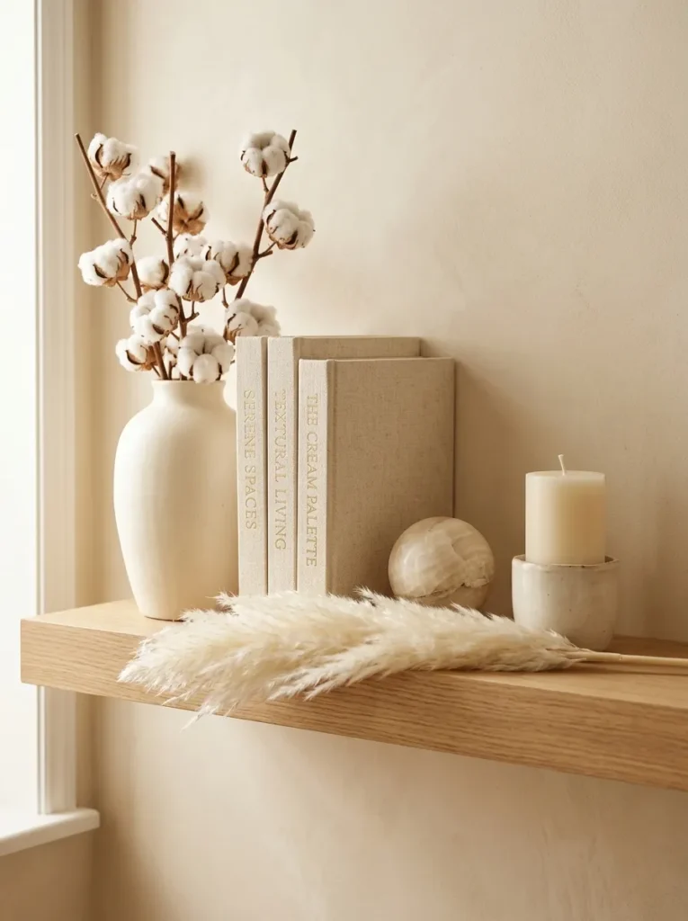
Vibe: The monochrome tonal shelf feels warmly serene — the discovery that when colour variation is removed, texture becomes the language of interest and the result is more sophisticated than any multi-colour arrangement.
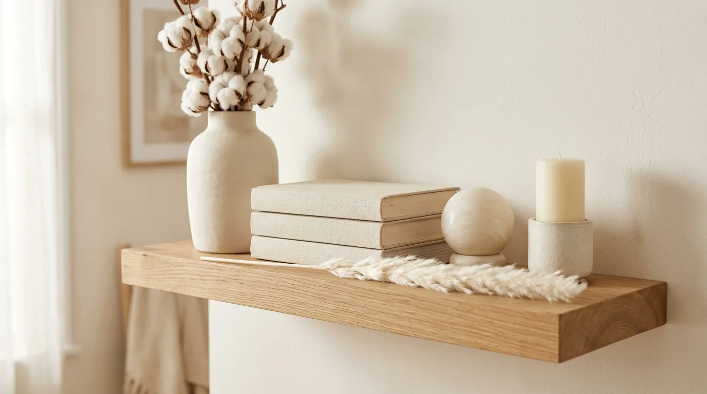
Why it works: A monochrome tonal shelf — every object within the same warm ivory and cream colour family — is the shelf styling approach that most powerfully demonstrates that visual interest does not require colour variety. When all colour variation is removed from a shelf composition, texture performs the entire visual differentiation role: the smooth polish of an alabaster sphere, the matte dusty surface of an undyed ceramic vase, the woven weave of a linen book cover, the feathery lightness of dried pampas, and the translucent solidity of a cream wax pillar — each of these textural qualities reads with greater clarity against its tonal relatives than it would against objects of contrasting colour. The design principle is textural clarity through colour restraint: restricting the palette focuses the eye’s attention on material texture rather than colour, revealing a richness of tactile interest that multi-colour arrangements obscure.
How to get it: Choose a specific warm tone — warm cream, natural ivory, or warm white — as the governing palette, then select every object strictly within that tonal range. Include at least five distinct textures within the palette: matte ceramic (absorbs light), polished stone (reflects light), natural fiber (diffuses light), dried botanical (transparent at edges), and textile (soft surface). Remove from the shelf any object that falls outside the chosen tonal range regardless of its individual quality. The horizontal pampas stem placed across the front of the arrangement is the Japandi design gesture that creates a visual break in the arrangement’s vertical emphasis and grounds the composition at the front edge.
Shop The Look
| Product |
|---|
| Cream ceramic vase 35cm matte natural |
| Dried white cotton stem bunch natural |
| Carved alabaster sphere small white |
| Cream pillar candle natural beeswax |
| Dried white pampas stem horizontal |
11. Personal Story Shelf (ACCESSORIES / COLOR)
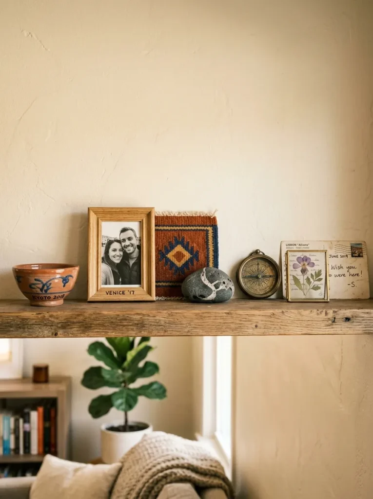
Vibe: The personal story shelf feels irreplaceably meaningful — the shelf that is the most honest portrait of its owner because every object was chosen by an actual experience rather than an aesthetic preference.
Why it works: A shelf styled as a curated personal story collection communicates the depth of the household’s experience and values in a way that no purchased display object can approach — because the bowl from a specific market in a specific city, the stone from a specific beach on a specific day, and the postcard from a specific person’s handwriting are all things that only the person displaying them could have chosen and assembled. The design principle is irreplaceable specificity: when every object on a shelf has a genuine personal narrative, the shelf collectively tells a story about the people who live there that makes it the most personal surface in any room. The visual challenge is maintaining aesthetic quality alongside personal meaning — displayed objects must be both personally meaningful and visually beautiful in the chosen arrangement.
How to get it: Edit from the full collection of personal objects — display only those with both genuine personal meaning and sufficient visual quality for display, and store items with meaning but insufficient visual quality. Apply the same material diversity principle as any well-styled shelf: ensure the personal story collection includes varied materials (ceramic, textile, stone, metal, paper) rather than only one type. Limit to 7–9 objects maximum to maintain the contemplative quality that allows each object’s story to be individually readable. Use generous negative space — personal story shelves are not the right context for dense, maximalist arrangements.
Shop The Look
| Product |
|---|
| Small natural frame photo display |
| Pressed flower glass frame small |
| Small brass compass decorative display |
| Postcard display prop lean shelf |
| Woven textile square small display |
12. Maximalist Layered Bookcase (COLOR / ACCESSORIES)
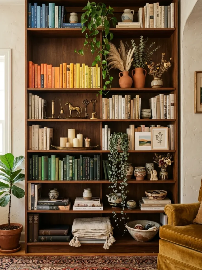
Vibe: The maximalist bookcase feels warmly abundant — the display that earns the distinction between “richly curated” and “cluttered” through consistent application of palette and material family discipline to generous collection.
Why it works: The maximalist curated bookcase navigates the fundamental tension between abundance and clarity through two specific disciplines that prevent visual richness from becoming visual noise: material family consistency (all objects within the warm brass, terracotta, and natural botanical palette regardless of type or scale) and structural grouping (objects clustered in groups of three or five rather than distributed individually across the shelf surface). The design principle is structured abundance: a maximalist shelf of 50 objects organized into 10 groups of five reads as designed and controlled; the same 50 objects individually distributed across the same shelf reads as clutter. The cluster — the small collection of objects deliberately positioned as a group — is the organizational unit that makes the maximalist approach work.
How to get it: Establish three non-negotiable organizing disciplines before adding any objects: a consistent material palette, book colour-blocking (even abundant bookshelves benefit from grouped rather than random arrangement), and a trailing plant at the top shelf level that creates the vertical reference point anchoring the full composition. Add objects in deliberate clusters — a group of three brass objects on one shelf, a group of three terracotta pots on another, a candle cluster on a small tray — rather than individually. Maintain 15–20% visible shelf surface within each shelf level (even in a maximalist arrangement) for the negative space that prevents complete visual saturation.
Shop The Look
| Product |
|---|
| Vintage brass object set 4 display |
| Pillar candle brass tray cluster |
| Terracotta pot small succulent set |
| Linen textile fold bottom shelf |
| Ceramic varied set warm shelf display |
13. Architectural Plaster and Stone Object Display (MATERIAL / COLOR)
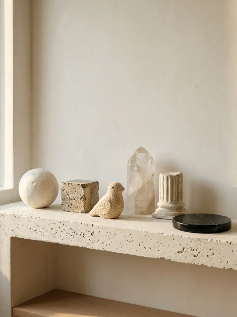
Vibe: The architectural object display feels sculptural and seriously considered — the shelf that reads like a museum’s conservation study collection and makes every other shelf in the room look like it has more decorating potential.
Why it works: A shelf styled exclusively with architectural plaster, stone, and concrete objects creates the most sculpturally rigorous shelf display available because all objects in the stone and plaster material family share the same fundamental material language (weight, density, surface complexity, light absorption and reflection) while offering maximum variety in surface quality — the matte dusty surface of raw plaster, the aggregate-visible surface of rough concrete, the carved detail of limestone, the crystalline clarity of quartz, and the deep mirror of polished marble all perform completely differently in directional light. The design principle is material family richness through surface variety: restricting the object palette to a single material family (stone and plaster) while maximizing surface variety within that family produces the most materially sophisticated shelf display possible.
How to get it: Source objects from architectural salvage dealers (plaster column fragments and limestone carvings), crystal and mineral suppliers (quartz points and polished marble discs), and craft suppliers (plaster casting molds allow simple sphere and column shapes to be cast at home for under $10). Position the shelf in a location that receives directional natural sidelight — the sculptural quality of stone and plaster objects is most fully revealed when light rakes across their surfaces at an angle rather than illuminating them frontally. Arrange with generous negative space between all objects — the breathing room allows each surface quality to be individually appreciated.
Shop The Look
| Product |
|---|
| Plaster sphere casting mold white |
| Concrete cube small decorative object |
| Quartz crystal point natural display |
| Polished black marble disc decorative |
| Limestone carving bird small natural |
14. Children’s Books and Wonder Shelf (SMALL SPACE / COLOR)
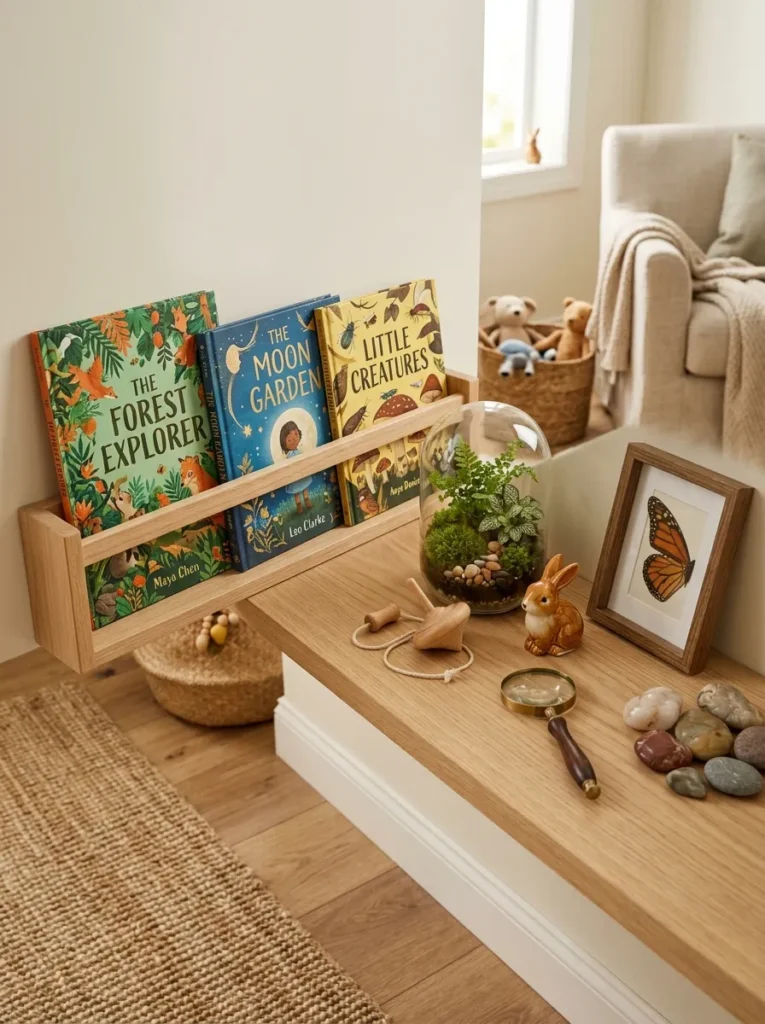
Vibe: The wonder shelf feels warmly inviting to curiosity — the family living room display that values the small person’s sense of discovery as much as the grown-up’s sense of style.
Why it works: A wonder and discovery shelf styled at child eye level — integrating face-forward children’s books, small natural curiosities, and tactile objects specifically interesting to children — is the family living room shelf approach that most honestly reflects the reality of a household that includes children while maintaining genuine visual quality. The design principle is dual-audience design: a shelf that serves a child’s curiosity and visual experience (face-forward illustrated books at reaching height, tactile objects, a terrarium with visible natural elements) while using the same compositional principles as any adult shelf (varied heights, material variety, generous negative space) creates a display that works aesthetically for adults while being genuinely engaging for children. The face-forward book display on a small ledge bracket is the specific functional detail that makes picture books part of the visual composition rather than hidden behind spines.
How to get it: Install the shelf at 90cm height — accessible reaching height for children aged 3–8 and comfortable viewing height from adult seated position. Source a small picture ledge (10–12cm depth with a 2cm raised front lip) for the face-forward book display section. Source the terrarium from a glass supplier or repurpose a glass jar — fill with pebbles at the base for drainage, a layer of horticultural charcoal, then sphagnum moss and decorative stones on top. Choose shelf companions that are genuinely interesting to children: smooth stones with natural patterns, small ceramic animals of good quality, natural objects with visual interest (interesting shells, feathers, seed pods).
Shop The Look
| Product |
|---|
| Small picture ledge face-forward books |
| Glass terrarium small display moss |
| Wooden spinning top natural craft |
| Small ceramic animal figure quality |
| Smooth natural stone collection display |
15. Rattan and Natural Fibre Boho Shelf (MATERIAL / COLOR)
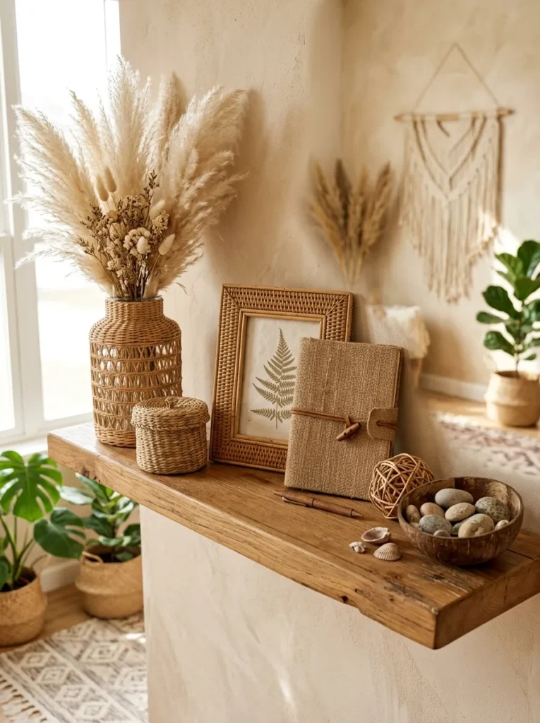
Vibe: The rattan and natural fibre shelf feels warmly textural and organically cohesive — the material palette that most naturally creates a unified, warm shelf display without requiring any deliberate colour coordination.
Why it works: A shelf styled entirely in the rattan, wicker, and natural fibre material family achieves visual cohesion through material family consistency rather than colour coordination — every object made from natural woven material shares the same warm honey amber tonal range and the same organic, handmade quality that creates unity without requiring the objects to match. The design principle is material family auto-coordination: natural woven materials (rattan, seagrass, jute, wicker, dried coconut) always coordinate with each other because they share the same natural origin and the same tonal range of warm honey to warm brown — no deliberate colour matching is required. The varied weave textures (tight seagrass weave versus open rattan weave versus twisted jute versus smooth coconut shell) create all the visual interest needed within the consistent material palette.
How to get it: Source objects from the rattan and natural fibre family from boho homeware retailers, import shops, and craft suppliers — every object purchased should be either woven natural fibre, dried natural material, or organic in origin (river stones, driftwood) to maintain material family consistency. The rattan-wrapped cylinder vase (a glass cylinder vase wrapped in soaked rattan cane using clear adhesive — a simple DIY project) is the most versatile natural fibre vase for this palette. The small wicker decorative sphere is available from craft suppliers and serves as the low spherical grounding element that every three-height composition needs.
Shop The Look
| Product |
|---|
| Rattan wrapped cylinder vase natural |
| Small seagrass woven basket display |
| Rattan picture frame natural botanical |
| Small wicker sphere decorative natural |
| Dried coconut bowl river stone display |
16. Stacked Books and Sculptural Objects (LAYOUT / MATERIAL)
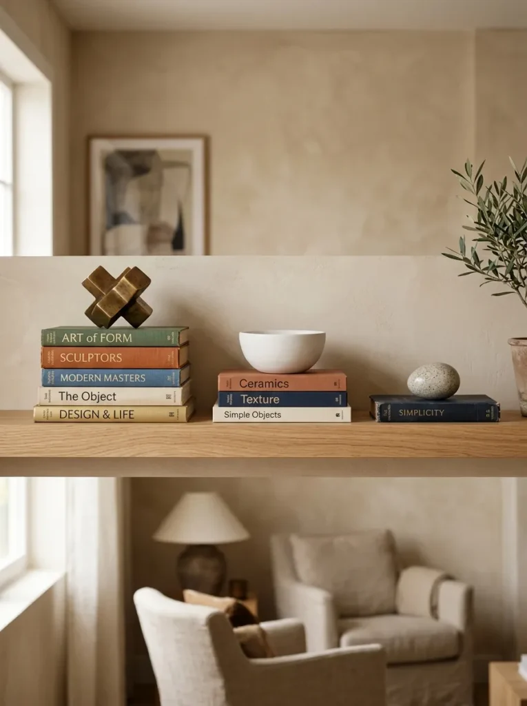
Vibe: The stacked book plinth shelf feels sculpted and purposeful — the arrangement that reveals the book as a design object in its own right rather than merely a reading vehicle.
Why it works: Using horizontal book stacks as varied-height display plinths is the shelf styling technique that most creatively repurposes an everyday object — the book — as a primary sculptural element rather than treating it as background content for more conventionally decorative objects. The design principle is object elevation through literal elevation: placing a beautiful object on a stack of books elevates it not only physically but perceptually — the deliberate construction of the plinth communicates that the displayed object is worthy of considered presentation, giving even a simple stone egg or smooth ceramic bowl a gallery-quality display context. The book stacks themselves become sculptural compositions, with their varied spine colors, thicknesses, and stacking arrangements creating visual interest at the plinth level independent of the objects placed on top.
How to get it: Choose book stacks for both their physical properties (total stack height when combined) and their visual properties (spine colour family, text size and style, cover quality). Build each stack from books whose combined heights achieve the desired plinth height — 25cm for the tall position, 15cm for the medium, and 4–6cm for the low. Ensure each stack is stable before placing objects on top — wider books at the base, narrower at the top, for a structurally secure pyramid shape. The object placed on each stack should be small relative to the stack’s top book — an object that overhangs the book’s edges significantly looks precarious; an object that sits within the book’s surface area looks composed.
Shop The Look
| Product |
|---|
| Horizontal book set warm spine display |
| Brass sculptural object small plinth |
| White ceramic bowl smooth matte plinth |
| Stone egg natural display small |
| Natural wood floating shelf display |
How to Start Your Stylish Shelf Decor Journey
Your single best first move is to completely empty one living room shelf before making any arrangement decisions — removing every object, book, and plant and leaving the surface bare for at least 24 hours. This deliberate emptying changes the creative dynamic from defensive (justifying the objects already present) to generative (choosing which objects genuinely deserve the space). Most people discover during this process that only 40–60% of the objects previously on the shelf serve the arrangement well, and that the shelf reads more stylishly after the edit than it did before — because editing is the most powerful styling tool available, and it costs nothing.
The most common mistake in living room shelf decor is approaching the arrangement from the perspective of filling the space rather than composing within it. A shelf that is completely filled with objects reads as storage regardless of the individual quality of those objects; a shelf with generous negative space reads as a display regardless of the simplicity of the objects present. Fix persistent visual clutter on any shelf by removing objects until the arrangement feels slightly under-furnished, then adding back two or three of the most important pieces — this deliberately under-filled feeling usually corresponds to the correct density of negative space.
Three objects under $30 each that create the most immediate improvement to any living room shelf: a tall dried botanical stem in a narrow ceramic vase ($12–$18) that immediately creates the dominant vertical element of the three-height composition; a smooth river stone or piece of bleached driftwood ($0–$8 sourced from nature or garden centers) that provides the grounding low element and introduces the organic material quality that manufactured objects cannot replicate; and a small trailing plant in a ceramic or terracotta pot ($6–$14) that provides the living cascading element that transforms a static shelf into something genuinely alive. These three objects create the three-height composition with organic material warmth for under $40 combined.
A single shelf styling refresh using existing rearranged objects takes one afternoon and costs nothing. A considered shelf refresh adding three purposefully selected new objects costs $25–$60. A comprehensive shelf decor transformation — painted alcove, new shelf system, complete complement of styled accessories, and botanical elements — costs $200–$600, producing a shelf arrangement of the visually rich, personally expressive quality that makes the living room feel completely considered from every angle.
Frequently Asked Questions About Stylish Shelf Decor for Living Rooms
What is the difference between a shelf that looks stylish and one that simply looks full?
The defining difference between a stylish shelf and a full one is the presence or absence of intentional negative space — the empty shelf surface treated as a positive design element rather than an oversight waiting to be filled. A stylish shelf uses negative space deliberately: the gaps between objects are sized and positioned to give each object visual room to breathe, to allow the eye to move between the composition’s elements without visual interruption, and to make the individual quality of each object visible and appreciable. A full shelf has no negative space — the objects are packed to the edge and the eye cannot settle on any single piece. The practical test: if removing one object from the shelf makes the arrangement look better rather than emptier, there are too many objects on the shelf.
How do I choose the right objects for a stylish shelf display?
The most reliable selection method is the three-criteria test: does the object contribute a unique height (not duplicating the height of any existing object in the arrangement), a unique material (not duplicating the material family of any other object), and a unique form (not duplicating the general shape of any other object)? An object that passes all three criteria adds genuine compositional value — height, material, and formal variety. An object that fails one or more criteria adds visual repetition rather than visual richness. Additionally, every object on a stylish shelf should either be genuinely beautiful on its own terms or carry genuine personal meaning — objects that are neither beautiful nor personally meaningful are filling space that better objects could occupy.
How often should I change or update my shelf decor?
The most effective approach is a two-level update rhythm: a small seasonal refresh (updating 20–30% of the shelf’s objects with seasonally appropriate elements four times per year) combined with occasional complete rearrangements (moving all objects to new positions, adding new pieces, and retiring others once or twice a year). The seasonal refresh maintains the sense of a living, responsive shelf without requiring complete reconstruction; the less frequent complete rearrangement prevents the shelf from becoming so familiar that it is no longer seen. The specific guideline: if you have walked past a shelf without noticing it for two consecutive weeks, it is time for a complete rearrangement.
What are the best plants for living room shelf displays?
The best plants for living room shelf displays are those that combine visual interest with genuine durability in the lower-light, irregular-watering conditions of a busy household. Trailing varieties for top shelf positions: golden pothos (the most forgiving indoor plant for irregular watering and low light), string of hearts (beautiful delicate trailing stems, tolerates irregular watering), and trailing ivy (fast-growing, visually generous). Structural varieties for mid-shelf positions: small ferns (beautiful fronds, require consistent moisture but suit the shelf environment in a well-humidified room), succulents in varied forms (low maintenance, sculptural forms), and small snake plant varieties (indestructible, strongly architectural). For lowest shelf positions in lower-light conditions: ZZ plant cuttings in small pots are the most light-tolerant choice available. All shelf plants benefit from being removed to a sink for watering rather than watered in place to prevent moisture damage to shelves and surrounding objects.
How do I style a shelf that has to serve both storage and display functions?
The most effective approach for a dual-function shelf is zone designation — explicitly assigning different shelves or shelf sections to storage versus display and treating the boundary between them as a design decision. Establish the rule: storage on lower shelves (where bending to access stored items is most natural), display on upper shelves (where objects are most visible from the room’s primary viewing positions). Within storage zones, use attractive storage vessels — woven baskets, ceramic canisters, linen-covered boxes — to contain functional items so that the storage element contributes to rather than disrupting the overall aesthetic. A beautifully woven seagrass basket containing charging cables and remote controls serves the storage function while contributing the natural fibre warmth of a styled accessory — the basket is simultaneously functional storage and a styled object, achieving both purposes without visual compromise.
Ready to Transform Your Living Room Shelves?
These 16 ideas span the full range of stylish shelf decor possibility — from the compositional authority of the asymmetric anchor arrangement and the meditative restraint of the organic material vignette, through the dramatic jewel-box richness of the painted alcove and the sculptural seriousness of the architectural object display, to the generous botanical living column and the warmly atmospheric evening light shelf, the personal irreplaceability of the story shelf and the family warmth of the wonder display, the maximalist abundance of the layered bookcase and the tonal sophistication of the monochrome cream arrangement — covering every shelf type, every aesthetic register, every budget, and every living room context from the compact urban apartment to the generously proportioned family home. Begin with the emptying exercise — one shelf, completely cleared, left bare for a day — because the decisions made from an empty shelf are always more considered and more stylish than those made by rearranging an existing arrangement that has accreted over months of adding objects without removing them. Today’s specific action: choose the one shelf in your living room that most consistently draws your attention for the wrong reasons — the cluttered one, the empty one, the one that has never quite worked — and apply the asymmetric anchor arrangement to it using only objects you already own, before purchasing anything new. When your living room shelves feel genuinely considered from every viewing position — when a guest pauses to look more closely and you feel pleased rather than apologetic — you will understand exactly why stylish shelf decor earns its dedicated, passionate community and the permanent place it holds at the top of every living room decorating Pinterest board. Save your favorites now, especially the painted alcove jewel box and the trailing plant botanical column — they are the two ideas that, once realized in your own living room, most completely transform the quality of the room’s visual presence from adequately furnished to genuinely designed.